I noticed last time I was on the Developers Website that the second most requested item was to import custom icons into the modeler. From the outside it might look like you can just add a font and it will work. So I thought it would be helpful to show how to do this with pure CSS, so that as a community we could lay the ground work for it to be added as a feature in future Mendix versions. By understanding how to create your own custom icons, you can add icons many more places than the modeler allows the current glyphicons to be placed.
To add a custom icon set to any project requires two core elements, an icon font and a CSS/Sass file mapping out all the classes.
Icon Font
Choose or create your icon font:
There are quite a few free icon fonts available on the internet. Some like Font Awesome are free and are nearly ready to use font files with CSS included. Some are just the font files and others are SVG or illustrator files. Let’s start with the most custom option: you have some svg icons that you want to use in your project. To do this you’ll need to create your own icon font at websites like Icomoon.
Here are a few tutorials that walk you through the ins and outs of creating your own icon font from scratch. By creating your own icon font through, not only will you get a ready-to-use font, but the CSS file with necessary classes will be mapped for you.
Files you’ll need:
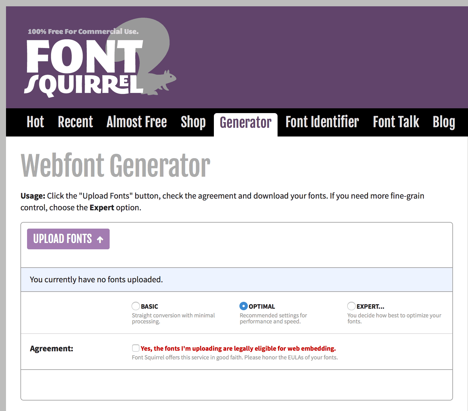
Once your icon font is created you will need to insure you have the font as multiple font file types. You will need these so it will work for every browser. For example .eot works best for Internet Explorer, but .woff works best for Chrome. Luckily, you can use Font Squirrel’s font converter to create all these files. Save the font files in a folder next to the css folder for easy file paths.
CSS/SASS file and Character Mapping
If you’ve found an icon font and have created all the necessary font files, but you didn’t create it in a service like Icomoon, the next step can be a bit tedious. This is where, as a community, we can benefit each other.
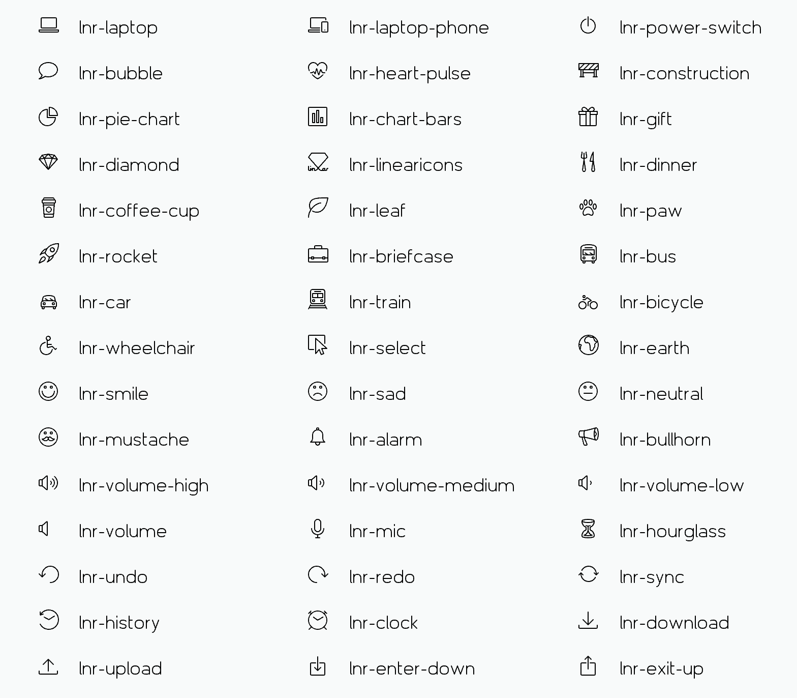
For every icon font set you should create each icon CSS file we need 3 elements. For the example below I will be using the Sass syntax so it can be connected to the Mendix UI framework, and I’ll be using the Linearicons, a crisp icon font.
First, import your font files, with @font-face. The syntax should look like this:
@font-face {
font-family: 'Linearicons-Free';
src:url('../fonts/Linearicons-Free.eot?w118d');
src:url('../fonts/Linearicons-Free.eot?#iefixw118d') format('embedded-opentype'),
url('../fonts/Linearicons-Free.woff2?w118d') format('woff2'),
url('../fonts/Linearicons-Free.woff?w118d') format('woff'),
url('../fonts/Linearicons-Free.ttf?w118d') format('truetype'),
url('../fonts/Linearicons-Free.svg?w118d#Linearicons-Free') format('svg'); font-weight: normal;
font-style: normal;
}
Second, create a class that declares the font you are using and set up baseline styles like font size, display, positioning, line-height, etc. In the case of Linearicons I’m using the class .lnr. In the majority of cases when using icons with Mendix, you’ll want the icon to precede the text or button and that is the reason you need to place the properties on the :before pseudo class. This way you can use multiple icon fonts and they all have unique naming class names.
.lnr {
&:before {
display: inline-block;
font-family: 'FontAwesome';
-webkit-font-smoothing: antialiased;
font-style: normal;
font-weight: normal;
vertical-align: middle;
margin-right: 0;
margin-top: 0;
font-size: 1.5em;
line-height: inherit;
-moz-osx-font-smoothing: grayscale;
}
}
Lastly you will need to create class names for each character. Often times the icon fonts will have most of this pre-defined. There should be a class name for each character.
.lnr-home:before {
content: "\e800";
}
As shown in Step 2, the character class is placed on the :before pseudo class. If you are interested in having the icon appear to the right of text, you can create additional class declarations to accommodate this. You will need both an initial class declaration and character maps like:
.lnr-a{
&:after{
…
}
}
and
.lnr-home-a:after {
content: "\e800";
}
Integrating new icons into your project
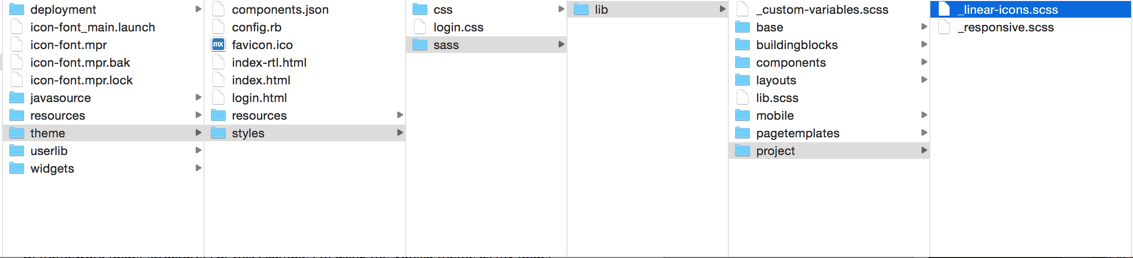
After all the classes have been saved, you will need to save your SCSS partial within the UI framework folder structure. For this example I’m using the Vanilla theme as my folder structure if you want to follow along.
- It’s useful to save it with a specific name, for instance _linear-icons.scss, so you can easily pick it up and reuse it on other projects
- A the partial into the theme > lib > project folder
- Open the lib.scss file in theme >lib
- At the bottom of the file add the line “@import folder/ linear-icons;”
- Make sure you have Koala or other Sass compilers watching the files so when you save the icons they are added to your project.
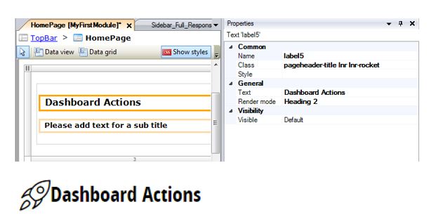
Using custom icons in the Modeler
Using your new icons is as easy as using any other class. As CSS classes, you can add the icons anywhere that has the class property in the Modeler. In order to use your custom class you need to add both the icon font declaration and the character you want to use.
I’ve included the linearicon CSS and fonts for download, to use as a template for the creation of your own icon font sets.