
This blog is the first in a series of build-along widgets to get familiar with building your own Pluggable Widgets for Mendix. The blogs will cover increasingly sophisticated concepts and will cover a range of use cases including getting familiar with Typescript and the Pluggable widgets API, running Machine Learning models in your browser, and building a basic WebAssembly game.
Where to begin
If you haven’t already you should check out the worked example to create your first Pluggable Widget:
Pluggable widgets use the React Javascript framework, we will touch on some React concepts in this series, but this is by no means a comprehensive introduction to React. So, if you need an introduction or a refresher, I highly recommend the following course (you may even spot the inspiration for this widget): React Tutorial: Learn React JS – Free 11-Hour Course
Purpose of this blog
In this blog we will cover:
- Pluggable widget project structure
- Testing setup and development
- React Concepts Introduction
- Leveraging external Libraries
What we are building
We are going to build a counter that can be increased or decreased with the click of a button, with a random colour change on click.
The end state of the project can be found here: GitHub – joe-robertson-mx/colourCount
Getting Started
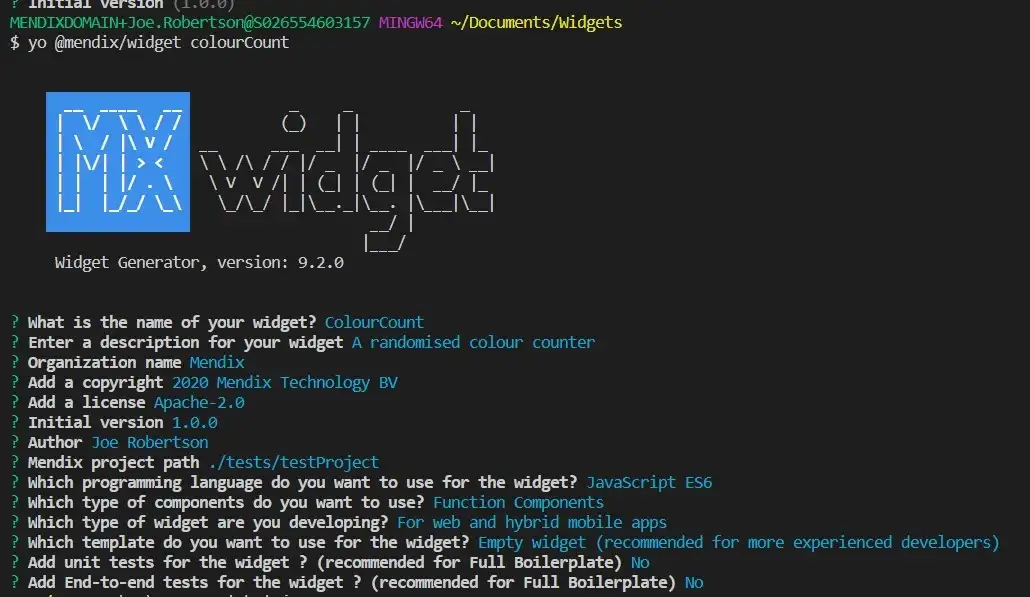
To begin with, we scaffold our widget using the Mendix Widget generator yo @mendix/widget color count. This gives us our HelloWorld implementation.
Folder structure:
Our widget folder has the following structure:
- dist — where our built and bundled code will be output
- node-modules — our node dependencies
- src -our src code folder
- components — each component folder jsx file
- ui — css for styling the widget
- package.xml — describes the widget structure
- colourCount.editorConfig.ts — config for preview in design mode in Studio Pro and Studio
- colourCount.editorPreview.jsx — component that provides preview in Studio Pro and Studio
- colourCount.tsx — the entry point for the widget
- colourcount.xml — the markup which describes the interface between the widget and Mendix
- package.json — describes our npm project and widget dependencies
- prettier.config.js — to allow us to modify the prettier rules for our code
Testing & Development Setup
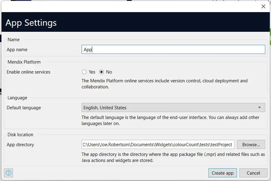
To facilitate testing, we create a new blank Mendix Project in the version we are targeting for our widget, in ./colourCount/tests/testProject

Get it running
Once that’s done, let’s run our build script and test our widget.
Navigate to your widget root directory from your terminal, then enter
npm run build
This will create a widget package in our dist/ folder and in the widgets folder of our test app.
To see that widget in action we just need to open our test application in Studio Pro and Press F4 to synchronize our file directory. We can then add our widget to a page the same way as we would any other widget.
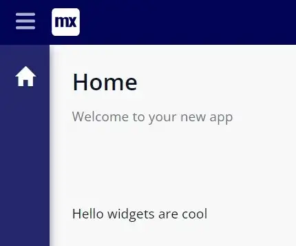
To configure our widget and to verify that parameters are being passed through from the modeler to the widget in the front end we can add some text to pass through.
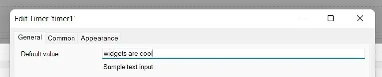
When we run the application we can see
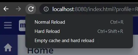
This deployment and testing process for our widget works, but it is a little slow. In order to accelerate the process, we can start the widget server by running
npm run start
This will watch our code for changes, and in order to see them reflected, we just need to clear the cache and force a reload.
This can be done in Chrome by opening the Chrome Developer Tools (Ctrl + Shift +i), right clicking the refresh button and selecting ‘Empty cache and hard reload’.
Writing Code
Time to code!
A couple of minor changes before we start
Let’s start with our react code, first let’s rename our components to something more sensible: Count.
First, we rename the components in the HelloWorld.jsx.
import { createElement } from "react";
import { Count } from "./components/Count";
import "./ui/ColourCount.css";
export function ColourCount({ sampleText }) {
return <Count sampleText={sampleText ? sampleText : "World"} />
}It is also best practice to rename the file to match the component within ColourCount.
We need to rename the CSS file at src/ui to ColourCount.css – so that it imports correctly. We also have to update the child component, to do this we first rename the HelloWorldSample.jsx to Count.jsx and update the name of the component within to Count.
export function Count({ sampleText }: HelloWorldSampleProps) {
    return <div className="widget-hello-world">
              Hello {sampleText}
           </div>;
 }
To speed up the development process we are going to change our editorPreview file so that it has no dependency on the rest of the code by updating it like this
import { ReactElement, createElement } from "react";export function preview() {
return <div />;
}export function getPreviewCss() {
return require("./ui/ColourCount.css");
}Before we start updating our components let’s rename our child component to something more sensible: ‘Count’. To do this we need to update the ColourCount parent component to reference the Count component contained in the components/Count file.
Our widget build can be broken down into 3 parts:
- Update the Mendix Widget interface to accept a number for the starting value of the counter
- Create the logic to change this number
- Add the random color change to the number
Update Mendix Widget Interface
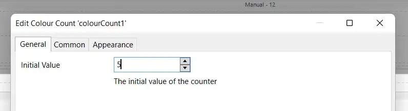
The interface between the Mendix model and your widget is defined in the ColourCounter.xml markup. We need to update ours to accept a number value, by changing the ‘sampletext’ property to the following:
<property key="initialValue" type="integer" required="true" defaultValue="5">
<caption>Initial Value</caption>
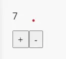
<description>The initial value of the counter</description></property>If we open our Mendix model, press F4 and update the widget. When opening the widget you will see our new interface.
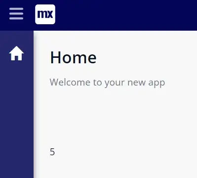
However, this is not yet connected to our component.
In order to do this we need to replace sampleText with initialValue in the ColourCount file:
import { createElement } from "react";
import { Count } from "./components/Count";
import "./ui/ColourCount.css";
export function ColourCount({ initialValue }) {
return <Count initialValue={initialValue} />;
}And in the Count file
export function Count({ initialValue }) {
    return <div>{initialValue}</div>;
}
if we rerun our application, we can see our initial value rendered:
The properties (or props) are passed down from the Mendix application to the ColourCount component, where it is destructured in the function and passed down to the Count component.
Read more about destructuring javascript objects.
Create the logic to change this number
Props shouldn’t be directly changed in React. Instead, we store properties that are changed in the component state.
In order to leverage state in a functional component, we use the useState hook.
Hooks were introduced in React 16.8 version. It allows you to use state and other React features without writing a class. Hooks are the functions that “hook into” React state and lifecycle features from function components. It does not work inside classes. Read more about Hooks in React.
Firstly we need to add useState to the imports.
import { createElement, useState } from "react";
Then we add the following code to the Count component.
export function Count({ initialValue }) {
    const [count, setCount] = useState (initialValue)
    return <div>{count}</div>;
}
When we call useState it returns an array of the state variable, and a function to set the state variable. This is immediately destructured into the count state and setCount function.
It accepts the initialValue as a parameter, which sets the value of the count variable on creation.
Now we can change the state, using setCount. When setting state, you can either simply pass in a value, or as in this case, you can use the previous state as a parameter in the function.
Knowing this we can add a function to increase the state value.
export function Count({ initialValue }) { const [count, setCount] = useState (initialValue)
const increment = () => {
setCount(prevState => prevState + 1);
}; return <div>{initialValue}</div>;
}We can do the same for a decrement function.
Now we need to update the JSX to render the HTML we want for our application:
export function Count({ initialValue }) {
   const [count, setCount] = useState (initialValue)

   const increment = () => {
      setCount(prevState => prevState + 1);
}; const decrement = () => {
setCount(prevState => prevState - 1);
}; return (
<div>
<p>{count}</p>
<button onClick={increment}>+</button>
<button onClick={decrement}>-</button>
</div>
);
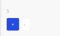
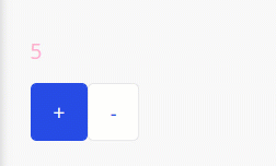
}When we run our application we can now increase and decrease the value in the state, which is displayed in the widget:
Add the random color change to the number
We now want to generate a randomized colour when the count changes. This would be a time-consuming piece of code to write, fortunately we can make use of a pre-written software package stored in the npm registry: randomcolor
The package provides a function that when called returns a randomized color as a string. Leveraging this package is easy: first, we install the package by running npm install randomcolor in our widget folder.
Then we start changing code in our Count file. First we import the function
import randomColor from 'randomcolor';Then we need to initiate some state to hold our color property
const [colour, setColour] = useState('')We also need the color to be reflected in the style of the widget to do this, we can use the style property for the HTML tag. The style property accepts a JS object with the style properties you wish to apply.
Read more about styling Dom elements using React.
Whilst we are here, we can improve the look of our buttons by using the inbuilt Mendix classes:
import { createElement, useState } from 'react'
import randomColor from 'randomcolor'
export function Count({ initialValue }) {
  const [count, setCount] = useState(initialValue)
  const [colour, setColour] = useState('')

  const increment = () => {
    setCount((prevState) => prevState + 1)
  }

  const decrement = () => {
    setCount((prevState) => prevState - 1)
  }

  return (
    <div>
      <p style={{ color: colour }}>{count}</p>
      <button className="mx-button btn-primary" onClick={increment}>
        +
      </button>
      <button className="mx-button" onClick={decrement}>
        -
      </button>
    </div>
  )
We now need to trigger the color to change, when our count variable changes. For this, we can use one of the key utilities available in React: useEffect.
useEffect is a hook, which calls a function (a side effect) on every render of the component. By adding the following we can set the color to a random value on render:
import { createElement, useState } from 'react'
import randomColor from 'randomcolor'
export function Count({ initialValue }) {
  const [count, setCount] = useState(initialValue)
  const [colour, setColour] = useState('')

  useEffect(() => {
    setColour(randomColor())
  }, [])

  const increment = () => {
    setCount((prevState) => prevState + 1)
  }

  const decrement = () => {
    setCount((prevState) => prevState - 1)
  }

  return (
    <div>
      <p style={{ color: colour }}>{count}</p>
      <button className="mx-button btn-primary" onClick={increment}>
        +
      </button>
      <button className="mx-button" onClick={decrement}>
        -
      </button>
    </div>
  )
When we run this in the browser we get…DISCO COUNT!
This is cool, but definitely not what we want. So why is this happening?
Well, if we put a console.log(‘Render’) in the useEffect we can see that the component is repeatedly rerendering and this is because components rerender on any change of state or props. So when we set the color state in the useEffect it causes a rerender and an infinite loop.
Fortunately, this is easy to fix. The useEffect hook accepts a 2nd parameter, which is an array of states and/or props to watch. This means the function will only run when one of the watched states/props changes. We only want the color to change when our count changes, so we update our useEffect to:
useEffect(() => {
    setColour(randomColor())
  }, [count])
Note: To just run the useEffect once, on component load add an empty array as the second parameter
Now when we update our widget…VOILA!

Recap
In this blog, we covered how to use Pluggable Widgets with Mendix, how to set up your development environment and some core React concepts including state, props, and useEffect.
The final code for the widget can be found here: GitHub – joe-robertson-mx/colourCount
What next?
Up next we will begin using Typescript, integrate directly with Mendix entities and attributes, and look at how to trigger actions in our Mendix model from our widget.
Let us know what you think of this post. Are there any widgets you would like to see? Please put any suggestions for future widgets in the comments here.
Resources
To learn more about pluggable widgets the following resources might be helpful: Getting Started – React, Build Pluggable Web Widgets,