
In our “Digital Execution Manual”, Mendix CTO, Johan den Haan is quoted as saying that when you create delighters “your users should feel the love in every detail.” Well, we hope you feel the love in this latest release.
Whether you are looking to provide users better insight into data with Data Grid, enhance user engagement with dark mode support, or wow users with native mobile look-and-feel; the Mendix 8.3 release brings user experience to the forefront.
Additionally, there are some enhancements to the development side. Activity logging, unnecessary conflicts and automatically reloading your environment will make working with Mendix even more intuitive.
Bringing both experiences together, Mendix 8.3 will give you a lot more governed control when it comes to the app store.
It’s a true delight! Let’s dive into specifics of these features.
Version control improvements
When working together with other developers on an app, you need to regularly integrate the changes you made with the changes from other developers. This means merging branches, reviewing changes and resolving conflicts from changes made by your colleagues and you. Mendix Studio Pro provides full-fledged version control to support workflows for development teams to do just this – and in this release, we’re making it even easier to work with this functionality.
We have made it easier to understand what other developers have changed:
- The changes made to an app are now significantly easier to navigate through a reworked structure of the Changes pane
- To reduce noise when reviewing changes, Studio Pro now optionally hides some purely visual changes (more will be hidden in upcoming releases)
- Increase available information when reviewing high-level changes by showing more details when integrating changes made in Studio
We have also reduced the number of conflicts that occur due to purely visual changes. This will reduce the amount of time that you need to spend on resolving conflicts.
These changes are the first results of our version control roadmap to make collaboration in development easier. Read further for details and stay tuned for more improvements during the coming months!
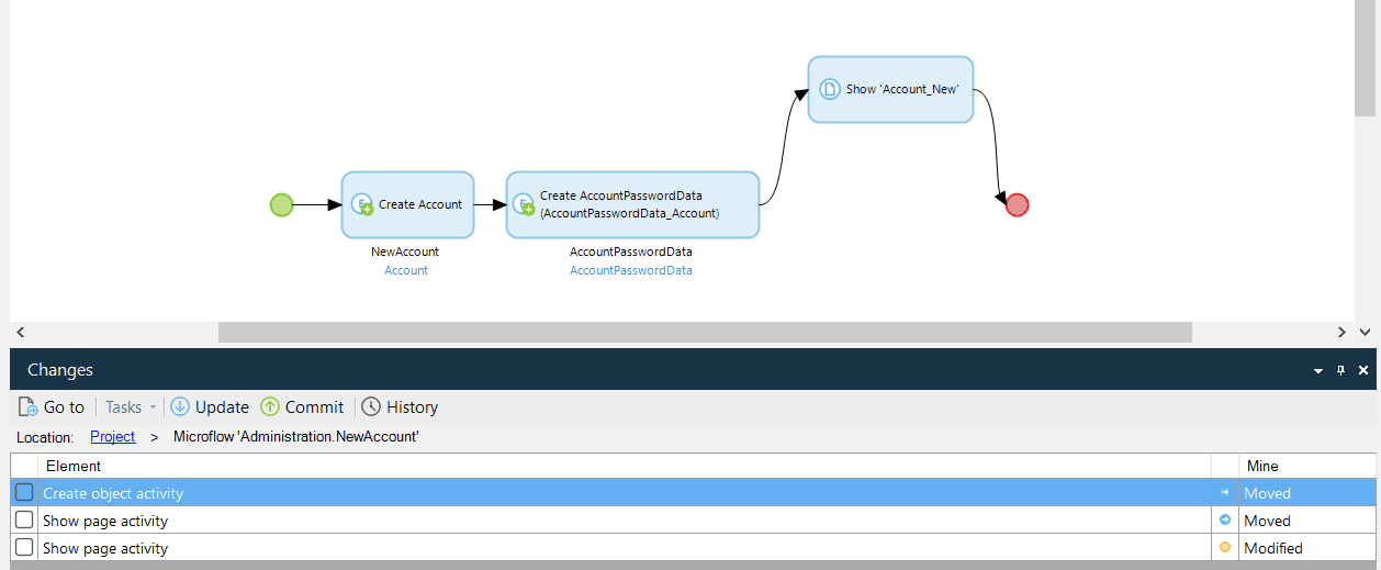
A new structure for the Changes pane
Navigating your way through the changes that you have made in the Changes pane is now easier than ever with the newly introduced master/detail view. You can now review the changes to a microflow, page, domain model or any other document without having to jump back and forth between the elements (e.g. activities, entities or widgets) and their properties. Instead, you can select an element on the left-hand side and its changed properties will show up on the right-hand side. And you can even navigate the element list with the ‘up’ and ‘down’ keys to make reviewing even faster!
The Changes pane was rebuild from the ground up and should you run into any issues, you can revert to the old version through Edit > Preferences.
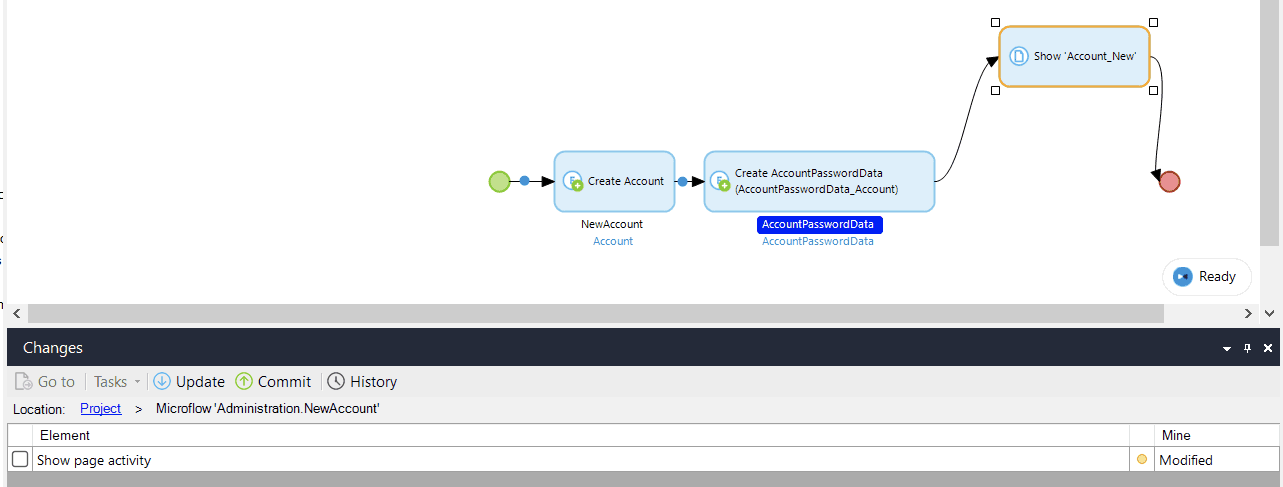
Move activity shows only single ‘change’ line item
There’s nothing more annoying than having unnecessary information on your screen. In the area of version control, we are often showing uninteresting changes. For example, when you visually move an activity in a microflow, it actually causes changes on a few different activities. We’ve started the process of eradicating that superfluous information with this release: moving an activity now only shows a change to a single activity, instead of to multiple.
Get more insight into what changes have been made in Studio
Developers in Studio Pro were able to see that work was done in Studio through the Version Control History of the branch on which Studio Collaboration is enabled. However, Studio Pro did not show which documents where changed. Now it does. This new capability gives developers in Studio Pro even more control over what comes in from Studio: it is now easier to review changes as they are integrated from Studio. And if you are looking for even greater control, you can simply move all work done in Studio to a separate branch altogether through the Branch Manager and explicitly merge those changes every once in a while.
Fewer conflicts for visual changes to microflows and domain models
Everyone knows the cases where a small change to the visual layout of a microflow or domain model has led to annoying conflicts with changes from other developers. This is costly: resolving these conflicts is a tedious and error-prone task. In many of these cases, Studio Pro can now choose the right way to resolve these conflicts for you: “real”, functional changes now always win from visual changes.
For example, if you changed the multiplicity of an association while another developer on your team moved the connection of the association to the entity from one corner to another, then Studio Pro automatically applies the change to the multiplicity and rejects the visual change. This means that you might have to reapply that visual change done by your colleague, but at least you don’t get a conflict on the entire domain model.
The same is true for microflows. If you moved an activity to elsewhere in the microflow while another developer on your team made a change to that activity, then merging those changes will not lead to a conflict where you have to choose between two versions of the microflow. Instead, Studio Pro automatically applies the “real” change and your visual-only change is discarded.
These purely visual changes such as moving microflow and domain model elements, and changing how associations and flows are connected, no longer lead to conflicts. This will save you a lot of time because it reduces the number of conflicts that you will have to resolve by hand. And this will allow you to focus on the important things: thinking about the complex & business-critical problems that your app solves.
Data grid with microflow sorting, paging support, and now search!
It’s very helpful to use the data grid with a microflow, for example, to retrieve data from another system. However, there has been a big pain point here: when using a microflow as datasource, you did not have the option to do server-side sorting or paging, which is a much needed functionality for UX and performance.
Here’s some happy news. In Mendix 8.2, we made it possible to do server-side sorting and paging when using a microflow as datasource in a data grid and with this release we also added search! This will make showing data from external systems a breeze!
Here’s how it works.
Mendix Studio Pro generates the model for you, so that it works out of the box with a single click, but you also have the flexibility to fully customize if needed.
To make this possible, we introduced a new system entity for Paging which contains information about the current page and sorting. When selecting a microflow, you get the option to generate the controls.
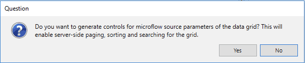
Clicking “Yes” generates a data view around your data grid, creates the widgets and nanoflows, and adds the Paging object including attributes for searching as an input to your microflow. The generated documents are nicely organized and named, so that your app is not polluted. Now you are ready to use these parameters for your integration, e.g. when calling a REST service.
This approach is fully flexible, so you have more control on the look and feel of the UI and data grid. For example, you can also move the paging controls below the grid or change the buttons.
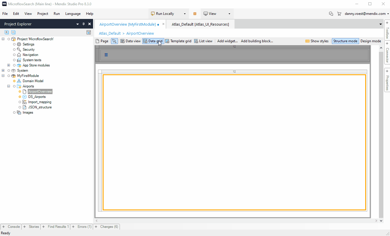
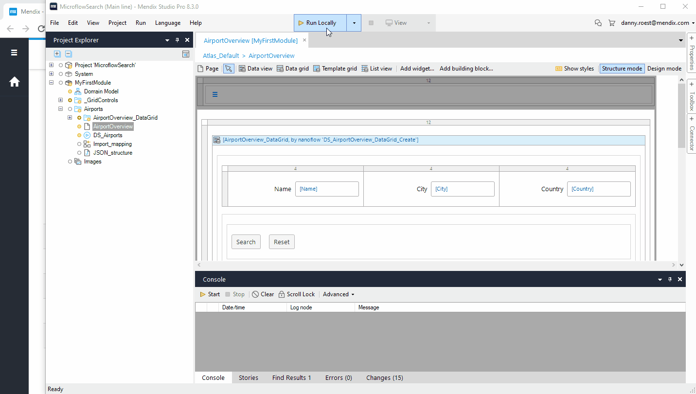
We created an integration that pulls a list airports which are retrieved from a REST service. Below you see how this is done in Studio Pro.
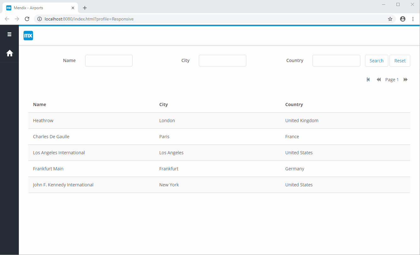
And here you see it in action.
See this how-to for more information how you could easily create these integrations.
Mobile
This month another release with many mobile related features that will make mobile developers and mobile customers happy.
Native building blocks
With this release we added building blocks also for native mobile development. Building blocks are a combination of widgets combined with styling. Whats the advantage of building blocks?
For many developers, it can be challenging to build a beautiful UI and/or creating a great UX. That’s were building blocks come in.
UX-experts can put their knowledge and skills into building blocks, which enables other developers to easily create a great UX and it also speeds up development. Another advantage of building blocks is that they can inspire developers and can be a great source to learn from.
At Mendix we are doing much research on mobile best practices and patterns by researching the top mobile apps. We will put this knowledge into new out of the box building blocks and release contains the first couple of useful building blocks.

Update your Atlas package to start using this all this greatness. New apps based on the Native Mobile Quickstart app have these building blocks automatically.
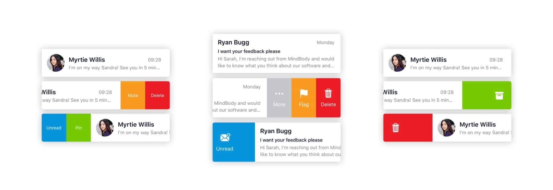
Make it swipe
A common pattern in mobile option is to swipe an item in a list, for example, to archive it, mark it as favorite, or show options. In this release, we made this easy for you to add this functionality to your apps. The standard patterns are supported out of the box, like archiving, toggle, showing options. It is very simple to use, you can use one of the building blocks or configure the widget yourself.
For existing apps, update to the latest version of Native Mobile Resources to get this great widget or update the AtlasUI module. New apps based on the Native Mobile Quickstart will have this widget automatically.
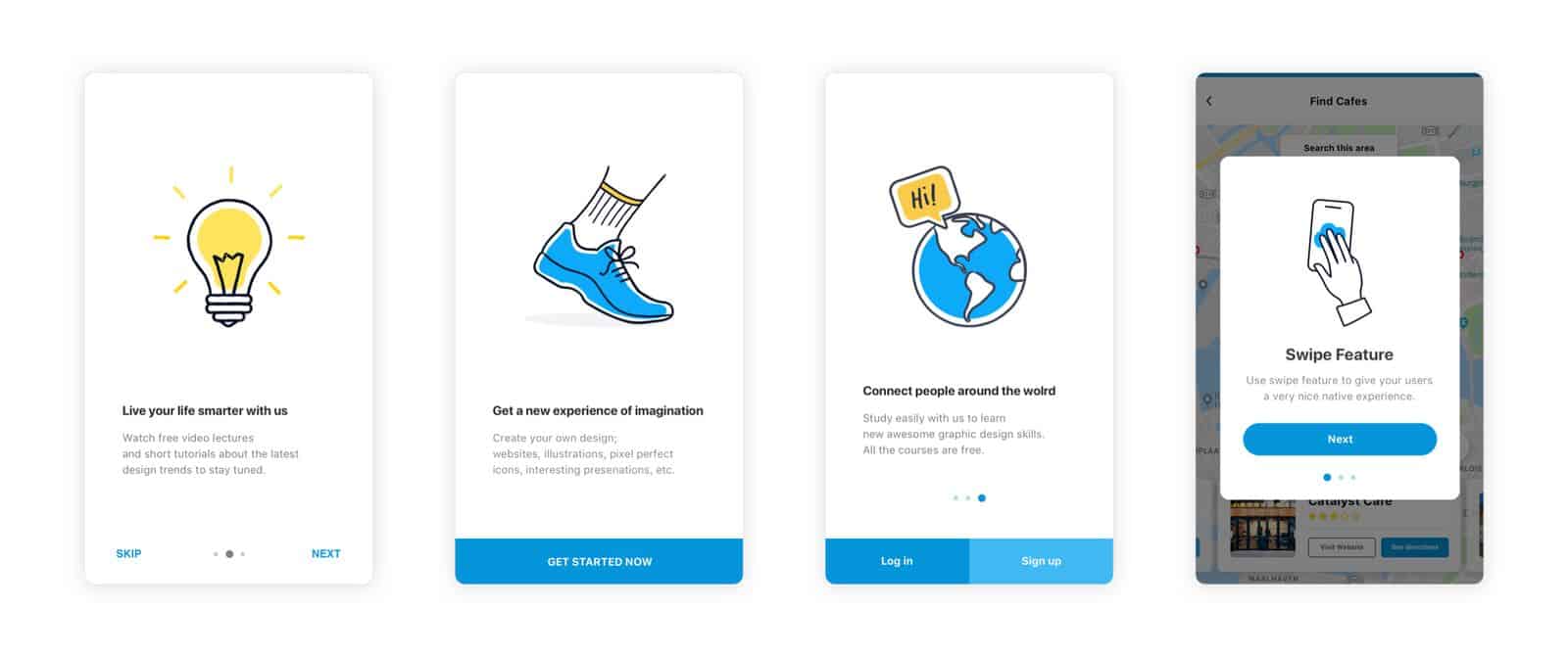
Introduction screens
When building mobile apps, there is often a need to show an introduction to inform your users about the app, or to introduce new features. Mendix 8.3 also contains the Introduction screen widget that lets you easily add this functionality to your native mobile apps. It has some standard easy-to-use features out of the box, including building blocks, but you can also fully customize it.
Similar to the List view swipe, for existing apps, update to the latest version of Native Mobile Resources to include the intro screens functionality or update the AtlasUI module. New apps based on the Native Mobile Quickstart will have this widget automatically.
Faster preview time
When starting an application with a native profile, the deployment process will now take less time because the native packager will start in parallel to the runtime. This results in shorter deployment times, allowing you to view your changes faster.
Make It Native app: styling debugging, faster, and more stable
The latest version of the Make It Native app contains several improvements to enhance the developer experience.
- Test at production speed: When the Enable dev mode is disabled, your app will run in production mode, which results in a faster app and less data is downloaded to the device.
- Stability: At last, we’ve improved the stability of the app by fixing an important issue with the QR code scanner on iOS, which could result in an error screen when loading the app.
- Styling debugging: When Enable dev mode is checked, you now have the option to inspect your styling and the structure of your pages, making it more easy to debug, test and inspect styling. You can do this by updating to the latest version of the Make It Native app and installing react-devtools. When running your app you can shake the device to open developer settings, from which you can toggle the Element inspector to start inspecting. See this doc for more information.
More styling options for top bar, bottom bar and status bar
We added new properties for styling the top bar, bottom bar and status bar so that you have more control to create that gorgeous mobile app. For example, it’s now easy to change the icon size in the bottom bar, or change the visibility and/or color of the status bar, and many more. The properties are documented here.


Automatically detect dark mode
The mobile world is continuously changing. For example, IOS 13 and Android 10 introduced Dark mode, which is a popular setting as many people nowadays like a dark mode. For Mendix Native mobile apps we already provided a dark mode, and the great thing with this release is that your interface can automatically switch to dark mode based on the setting of the device.
Native builder improvements
We are continuously improving the way you can build your mobile apps. With this release we added a new Prepare option that allows you to store your configuration so that you do not have to provide all the arguments for subsequent builds. Also, we simplified the build command and added new build arguments for more flexibility and control when building. For example, you can build only Android or iOS or skip certain aspects in shorten the build time.
Next to that, the new versions include more and explicit (error) messages to help you with building your apps or when something goes wrong.
As last–but certainly not least– we also added support for XCode 11 and iOS 13.
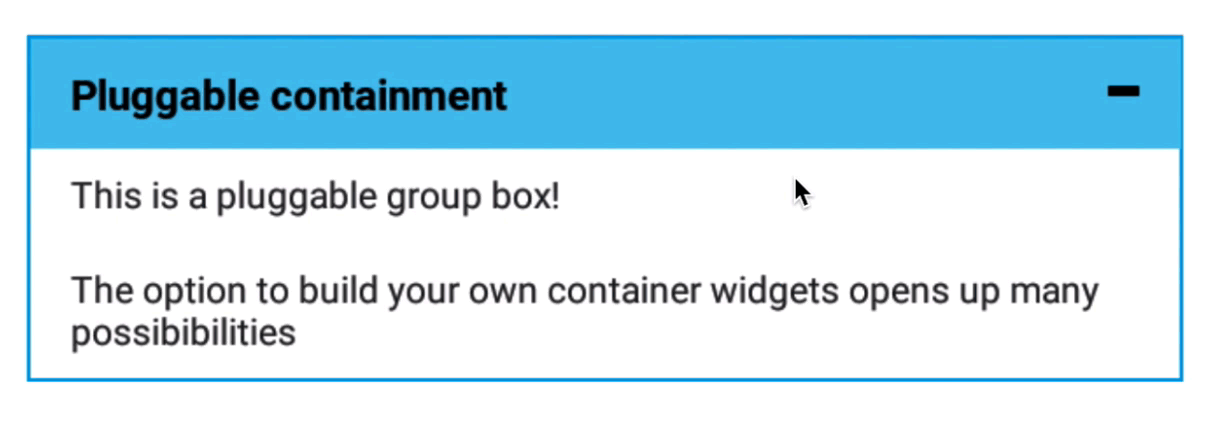
Build your own container widgets
At Mendix, we strive to have all the needed content (e.g. widgets) out-of-the-box so you can build great apps. However, there are (and always will be) needs for other widgets, variations, or other patterns. Thats why we believe pluggability (a.k.a. extensibility) is very important, as it allows developers to plug in new types of widgets or patterns that enables other developers to support many use cases.
With this release we added a very powerful feature: containment for pluggable widgets. This enables developers to build widgets that can contain other widgets. What makes news even greater is that this aligns perfectly with our support for ReactJS (for web apps) and ReactNative (for Native mobile apps), as you can easily use one of the many ready to use cool components out there.
The possibilities are endless! For example, the animations widget introduced with Mendix 8.2 was also based on this concept, same as the list view swipe widget in this release.
Have you ever dreamed of creating your own Group box to match the specific needs of your project? Then see this how-to. You could also think of a special tab container, a dropdown menu, a carousel, and many more. We hope to see some nice new widgets in the app store.
We made this all possible by introducing a new widgets property that is available for Pluggable widgets. When adding this property to your widget configuration, a placeholder is added automatically. You can even combine this with Object list properties, for example, if you want to have a dynamic set of placeholders (for example for your own specific Tab container).
Can’t wait to get started? See this how-to get started.
Thank you to community member, James Ramm, for dreaming together with us!
Mendix Studio: dynamic images and files
Studio users are now able to create and use dynamic images & files in their models using Studio.
- Build apps in Studio that let end users upload images and files, e.g. forms apps, inspection apps, data management apps, content management apps
- Build apps in Studio in which images from the database are shown in pages, e.g. showing a picture of the related asset in an asset manager app
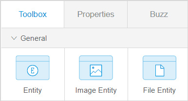
This is a big step forward for citizen developers who are trying to successfully solve business challenges that have a range of use cases. In 8.3, we introduced a new, smooth experience for bringing in images and files to any app using Studio. First of all, users can now create different entity types in the domain model, including an image entity and a file entity:
Moreover, in the page editor toolbox, we added new widgets that use an image entity or a file entity: an Image Uploader, a File Uploader, and a File Downloader.
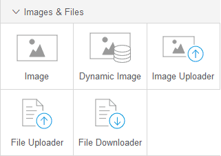
These widgets use an image or file entity as their data source and allow end-users to upload and download images and files. If you like to know more about this feature, see Image and File Widgets.
Delighters
This release contains (once again!) a lot of new delighters, that should make developers feel the love. A big shout out to our community by providing great ideas.
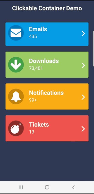
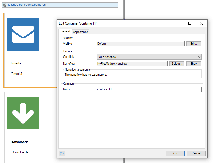
Clickable containers
Now you can add a click action to the Container widget in Studio and Studio Pro for both Web and Native pages. This makes it easy to make larger components clickable. For example you can now easily create cards that are fully clickable. Thank you Jurre Tanja and Mariëtte de Graaf for the contribution!
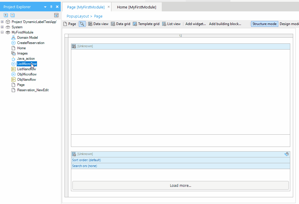
Dissolve and wrap container
We added a handy feature to Studio Pro that enables you to easily dissolve a container. For example if you have a couple of widgets and you want to remove the surrounding container, this can now be done with two clicks. Thank you Jason Teunissen and Paul Schreur for this suggestion on the the idea forum.
You can also easily wrap a widget now with a container instead of creating a container and adding a widget to it.
Layout grid column size per device
The width of layout grid columns on different device types can now be configured in Studio Pro as regular properties. No need to lookup and set the underlying bootstrap classes for the tablet and phone profiles anymore.
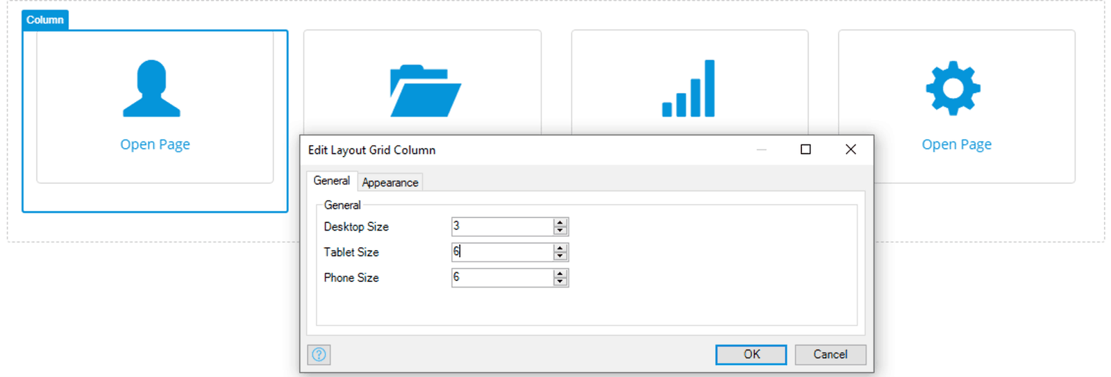
Thank you Allard Brand and Ronnie van Doorn for this suggestion.
Automatic reload after restart
Most of the changes with Mendix trigger a fast instant update of your app and your app is automatically reloaded. With this great delighter, your web or native mobile app will now automatically reload even when you’re making changes that require the server to be restarted. Now there’s no need to manually refresh anymore! This will keep your F5 key in better shape.
Quickly configure a widget by drag and dropping a microflow or nanoflow
Until now, microflows and nanoflows could only be dropped on a page to create a button. With this delighter in Studio Pro, it is now possible to drop a compatible flow onto a widget itself and the widget is configured automatically to use the flow as its data source. This will save you quite a lot of clicks! It can be used, for example, for data views, list views, and data grids.
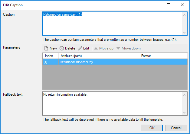
Fallback text for text templates
Text templates are a very powerful concept in Mendix that allow you to define dynamic multilingual texts. However, the data is not always available in the case you need to show something else, like another text. Previously you needed to use conditional visibility for such an instance, but we made that easier now in Studio Pro, by allowing you to specify a fallback text in case there is no context available.
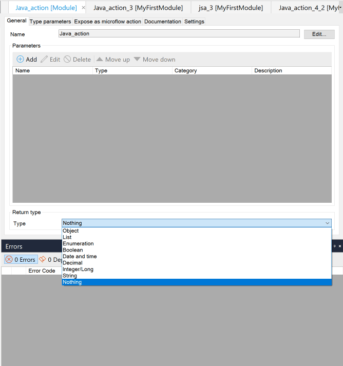
Java and JavaScript actions don’t need to return something anymore
For creators of reusable Java and JavaScript actions, we’ve introduced a small but really convenient improvement: you can now make explicit that Java actions don’t need to return a value anymore. This is convenient for actions that don’t return any values, like logging or other fire-and-forget calls to external services.
You can now set the return type of a Java or JavaScript action to Nothing, to indicate that the user won’t get anything back when calling the action. This makes these actions more similar to consume like you are used to with microflows! Thanks to Bart Tholen for suggesting this on the Idea forum!
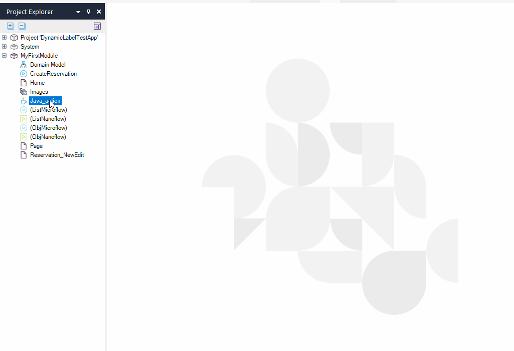
Show Java action source file in Explorer
Here’s a quick and simple delighter in Studio Pro: right-click on a Java action to reveal it in the Windows explorer. Occasionally there is a need to make a small change to a Java action or view the code of a Java action. With this feature, this is now much quicker because you can directly browse to it.
Improved tab container settings UX
A small change that for everyone that’s experienced those “huh, I thought I changed that” moments. When users open the properties of tab page in Studio Pro, they tend to change the name of the component instead of caption making some mistakes. The order of the fields is now improved.
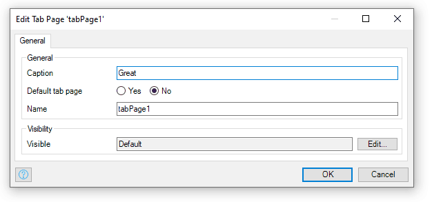
Thank you Jan van der Lubbe for this easy change that should prevent a lot of headaches.
Easily clear translations for removed languages
This delighter makes it easier to clear translates for removed languages. When removing a language in Studio Pro you are asked to remove all translation, so no more need to go to the complex Language Operations dialog to delete translations for languages that have already been removed.
(De)Select dependencies when exporting modules
When exporting a module package, often you do not need to include all the dependencies. Manually unchecking was time consuming, but with this delighter the list of dependent files can easily be deselected in Studio Pro by a single click with the new `Select / deselect all` button.
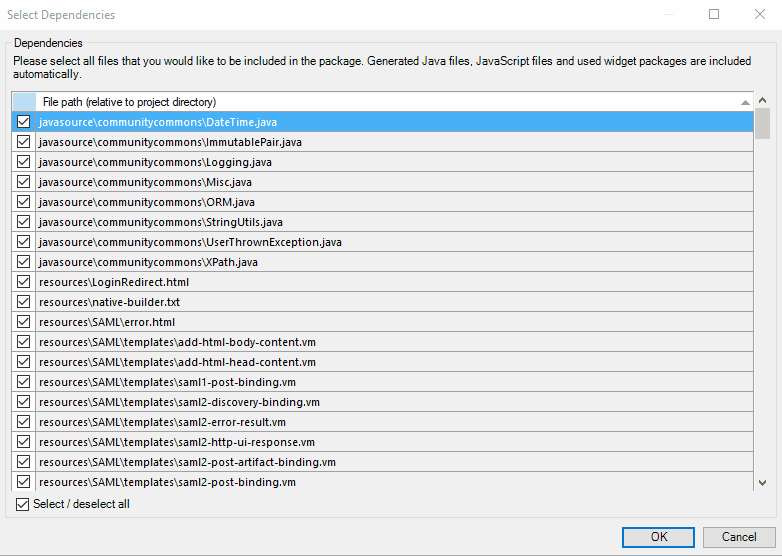
Thank you Robert Price for submitting this suggestion onto Idea forum.
Help URL in pluggable widgets
When building a widget, the documentation is also important for your users. With this feature, it is much easier to let developers find the documentation/help. When building a pluggable widget, you can configure the helpUrl in the the widget configuration. This will also show the help icon when opening the widget properties panel and works with the F1 button.
See the documentation on how to add it.
Instant next action recommendations even in most complex microflow designs!
Developer productivity and speed is a Core Principle of Mendix platform. Mendix Assist is one our recent AI-driven capabilities to strengthen speed among its many other added values. With this release, we have taken Mendix Assist to the next level by substantially enhancing the recommendation engine performance for very big microflows. In Studio Pro, Mendix developers now can enjoy next step recommendations in most complex microflow designs blazingly fast, which makes the whole development experience smooth and solid.
App Store
Flexible User Groups Private App Store
Full control and flexibility are indispensable when it comes to managing components that are private to your company. With the just-released Flexible User Groups, we’ve increased both.
Here’s how it works: You (if you are a company admin with the ‘CanManage App Store’ rights enabled) can now create User Groups for your company and assign your company’s app store components to those self-created groups inside your Private App Store.
The management of the components that you assign to a group can be restricted to only the members of the group. Additionally you can also add guest users to these groups, which allows them to download selected private content of your company.
Release Notes
Thanks to everyone who submitted their suggestions through the community forums. We love hearing your feedback and finding out what’s important to you. Isaac Asimov put it best when he said, “The true delight is in the finding out rather than in the knowing.” Want to find more detailed info on all the delighters? Check out the release notes.
And if you really want to be truly delighted, find out what all the buzz is about and download the latest release here.