Please note that this tutorial is based on a native app created in Mendix modeller version 9.24.0. Things may differ in other versions.
Prerequisites
To understand the content of this tutorial, you need basic knowledge of React Native and on how to implement the styling of a native mobile app in Mendix Studio Pro. If you are new to styling a native mobile app, please go through the relevant learning material from the Mendix Academy first.
What This Post Is About
In this post, we will go through how to modify Mendix default widgets to create an intuitive user interface for your native mobile app. These are requests that I commonly receive as a UX consultant working in the Expert Services team.
What This Post Is NOT About
Please note that this post is NOT a tutorial on how to create a custom native mobile app widget. Depending on the complexity of the widget, that may take a significantly longer time (and a bigger budget), which may not be an option for some clients.
The goal of this post is to demonstrate that we can achieve a reasonably delightful result with just React Native.
All the user interfaces shown in this blog post are my own creation.
LESSONS
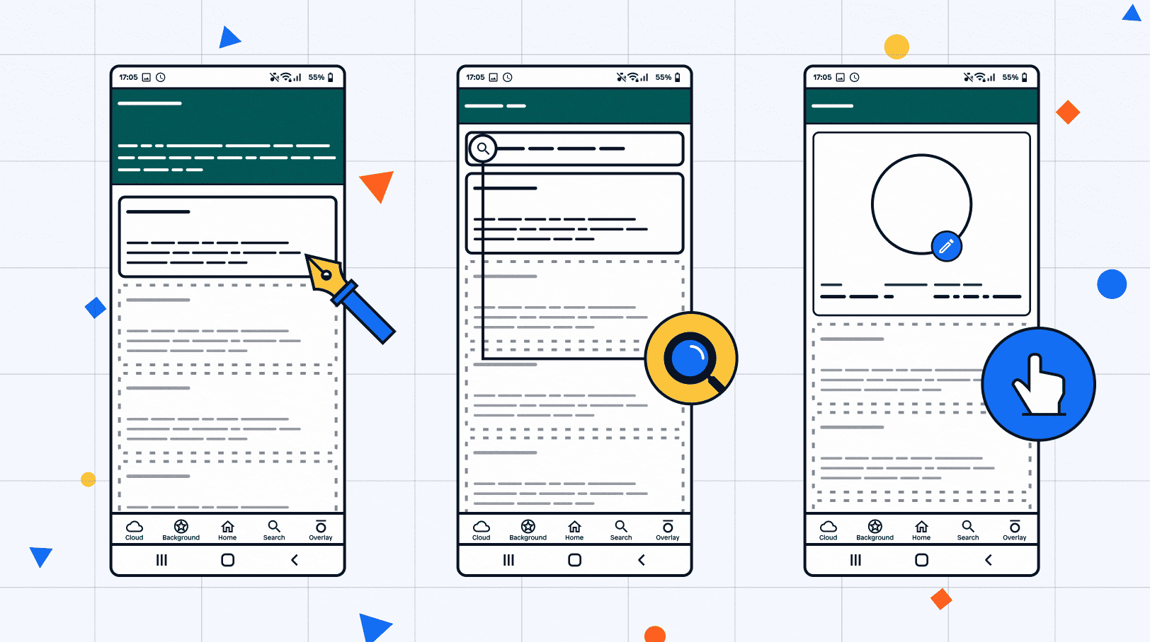
Below are the three styles that we will focus on:
Lesson 1: Extension of the Top Bar Section
Lesson 2: Search Bar with a Magnifying Glass
Lesson 3: Overlay Elements
Lesson 1: Extension of the Top Bar Section
One of the common requests I receive for native projects is to extend the top bar section. This allows the user to include an instruction on what the page is about. Below is an example of the result:

Step 1: Set up the theme structure in the modeller
Theme module: Before we work on the styling of the app, make sure that you have created a theme module for this app. If you are not sure how to do that, please refer to courses in the Mendix Academy.
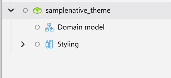
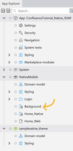
Create a new page: In this case, I renamed it “Background.”
Step 2: Add classes to the elements
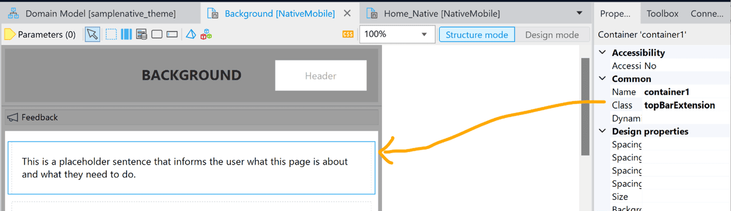
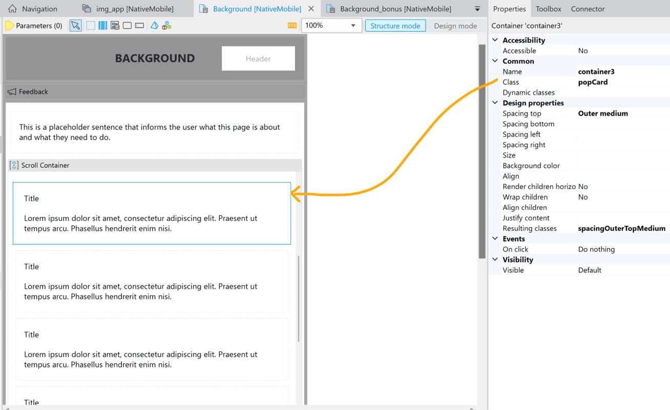
On the “Background” page, create a container around the instruction of the page and give it a class.
On the same page, I added content to demonstrate how the top bar will look when there are additional elements.
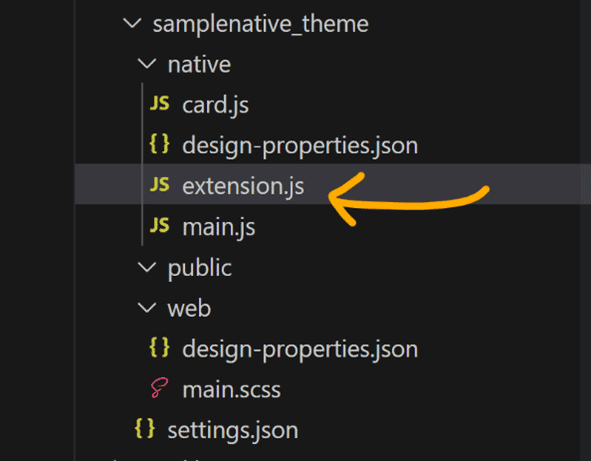
In your theme module, create a new JS file under “native” and rename it accordingly, e.g., “extension.js”. This aligns with the best practice of keeping the folder structure organized and the files recognizable.
Step 3: Implement the styling of the elements
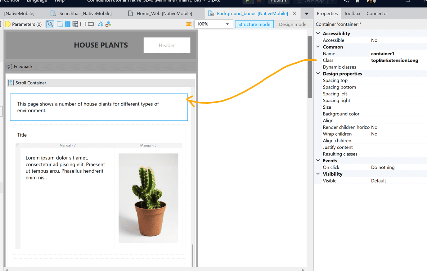
The key to creating a top bar extension is to attach it to the status bar without a gap in between. In the “topBarExtension” class, set “marginTop” to 0.
// - top bar extension section background
export const topBarExtension = {
  container: {
    marginTop: 0,
    paddingTop: 12,
    paddingBottom: 25,
    width: "100%",
    backgroundColor: "#586F63"
  }
}
Feel free to customize other elements to the style of your choice.
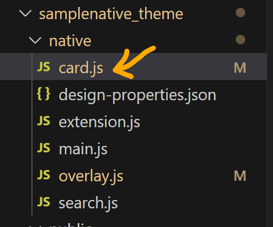
Create a new file “card.js”. This is used for adding style to the card that wraps around each subsequent element.
In the “card.js” file, add the “popCard” class:
// - the card that wraps around each subsequent element
export const popCard = {
container: {
borderRadius: 10,
marginLeft: 15,
marginRight: 15,
marginTop: 5,
marginBottom: 5,
borderWidth: 1,
paddingLeft: 20,
paddingRight: 20,
paddingTop: 10,
paddingBottom: 15,
borderColor: "#DDDDDD",
backgroundColor: "#FFFFFF"
}
}
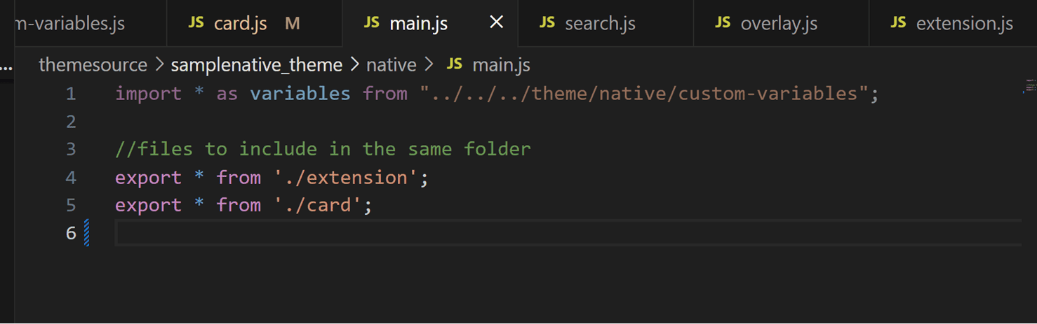
Make sure you import the newly created files to your “main.js” file:
End result

Bonus
Another common style is to have the main content partially overlap the top bar extension. Here is a preview of the end result:

To achieve this, we need to extend the padding of the top bar extension so that the subsequent element will not cover the content in the top bar section.
Step 1: Update the modeller
Step 2: Update the code
Below is the updated code for the top bar extension. I gave it a different class “topBarExtensionLong” and added it to the same “extension.js” file.
// - top bar extension for the overlapping card style
export const topBarExtensionLong = {
container: {
marginTop: 0,
paddingTop: 12,
paddingBottom: 65,
width: "100%",
backgroundColor: "#586F63"
}
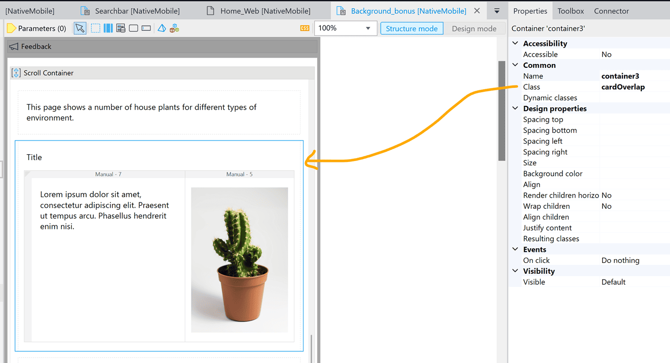
}To create the overlapping effect, we need to change the top margin to a negative unit so that it goes beyond its top margin. Below is the code for this style. I gave it a separate class “cardOverlap” to differentiate it from the previous one. I also added it to the same “card.js” file.
// - card for the overlap style
export const cardOverlap = {
container: {
borderRadius: 10,
marginLeft: 15,
marginRight: 15,
marginTop: -35,
marginBottom: 5,
borderWidth: 1,
paddingLeft: 20,
paddingRight: 20,
paddingTop: 10,
paddingBottom: 15,
borderColor: "#DDDDDD",
backgroundColor: "#FFFFFF"
}
}
End result

Lesson 2: Search Bar with a Magnifying Glass
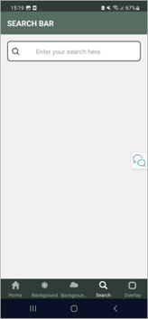
Another common request from clients is to add a magnifying glass icon to the search bar. This can help the user immediately identify the search box.

Step 1: Set up the data and create a nanoflow
Note that you need to have an entity set up in the domain modeller as follows before you implement the styling of the element.
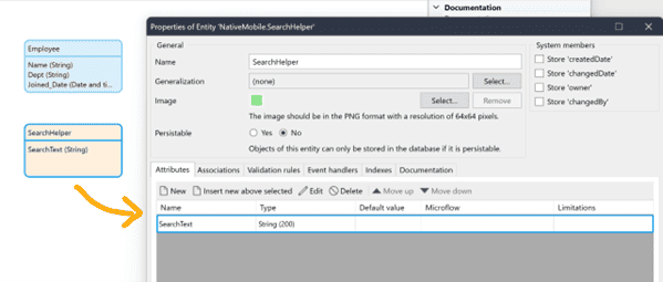
• Attribute: SearchText (a limited string attribute)
• Persistable: No
In Mendix, the search bar is basically a text box with search functionality. By default, it is not possible to add an icon to the text box. As a result, we need to create a layout grid and place the icon in one column with the textbox in another.
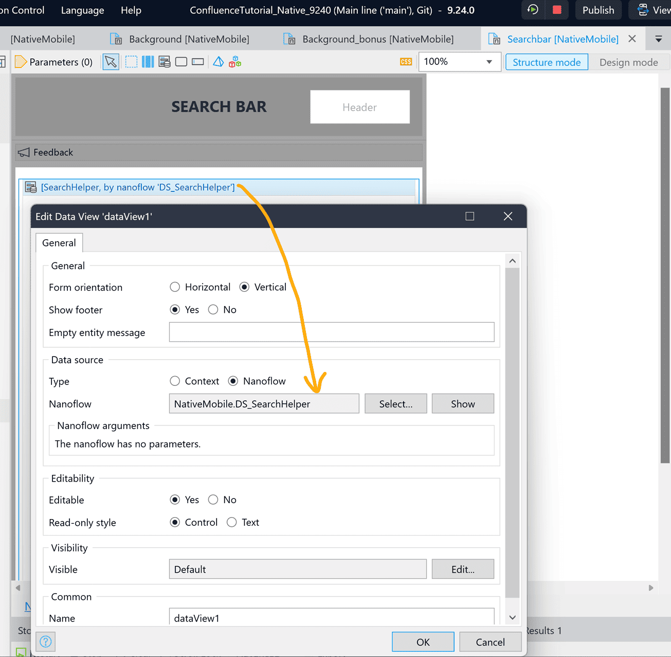
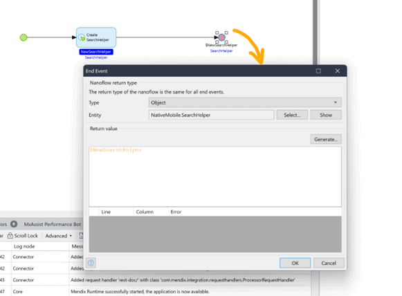
On the modeller, drag in a data view and retrieve the data source by calling a nanoflow. Create a new nanoflow “DS_SearchHelper”.
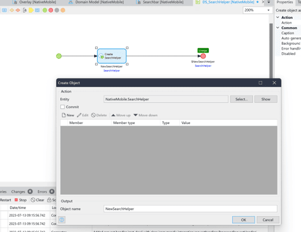
Inside the data view, create a container and give it a class “searchBar”. This will simulate the border of the search bar.
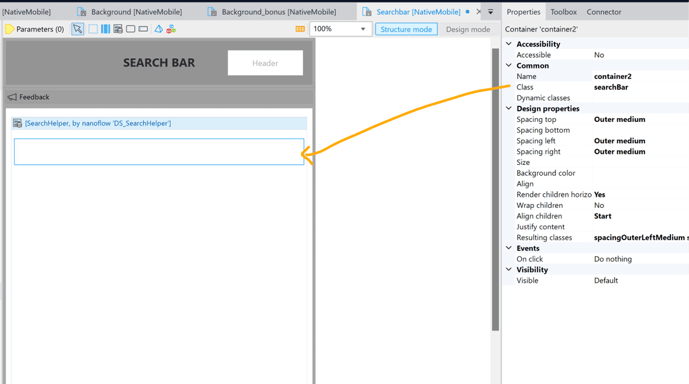
Inside the container, create a two-column layout grid (of 2:10 ratio). Add a magnifying glass image on the left. (You will need to upload it to an image collection first).
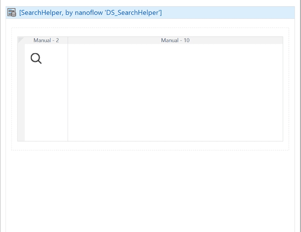
On the right, add a textbox with the attribute “SearchText” and a class “SearchInput”. This is the actual text box. We will style it in a way that it blends into this search bar.
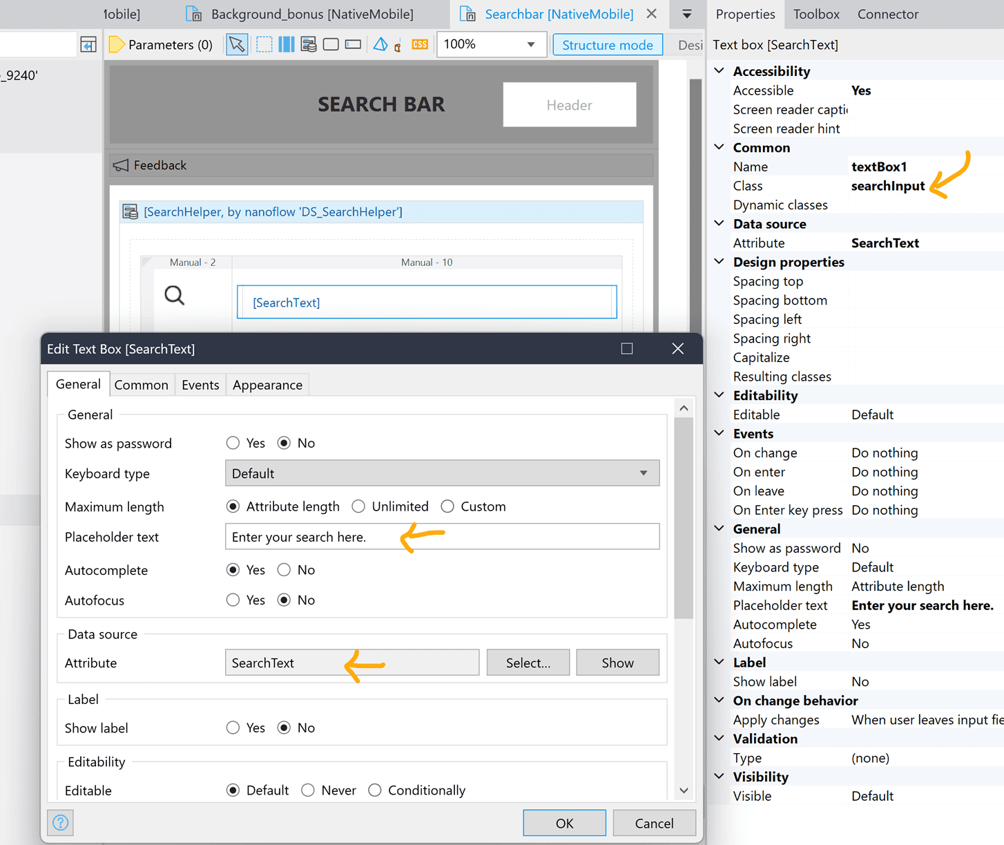
You can also add an optional placeholder text for your search box.
Step 2: Implement the style
Create a “search.js” file. Make sure it is imported in the “main.js” file. In it, we will add the code for the “searchBar” class and the “searchInput” class.
//the container that acts as a search bar (with the icon)
export const searchBar = {
container: {
borderRadius: 8,
backgroundColor: "#ffffff",
borderWidth: 2,
borderColor: "#555555",
height: 50,
paddingLeft: 10,
paddingRight: 10
}
}
//the actual search input field
export const searchInput = {
input: {
backgroundColor: 'transparent',
borderColor: 'transparent',
//placeholder text color
placeholderTextColor: "#A4A4A6",
fontSize: 16,
borderRadius: 50
}
}End result:
Lesson 3: Overlay Elements
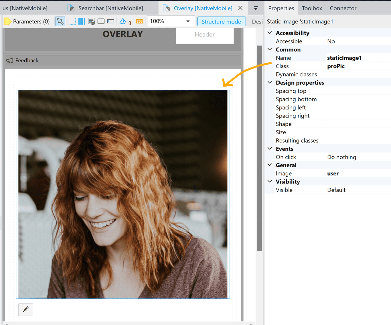
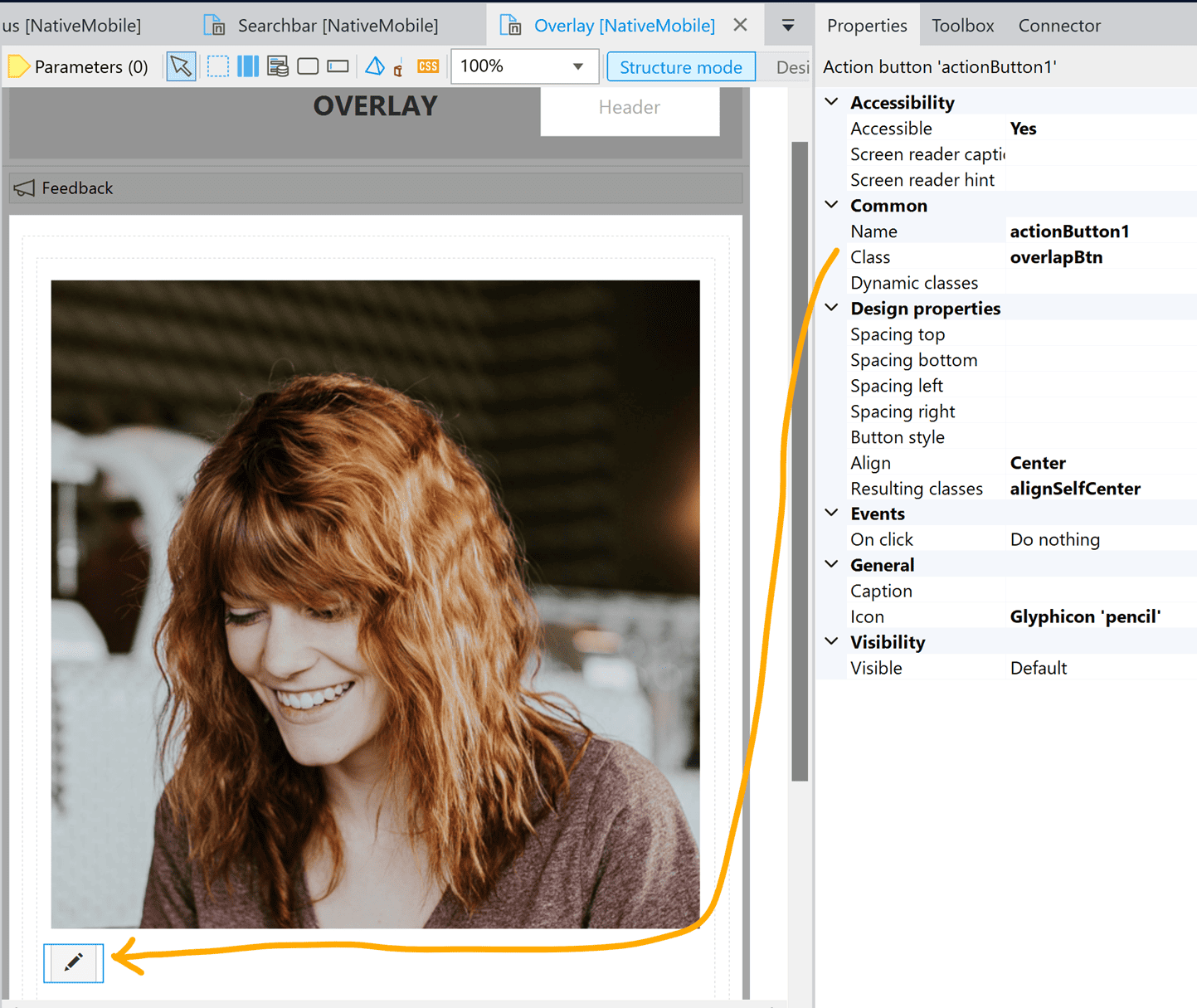
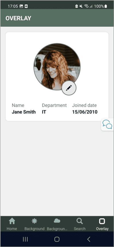
Finally, we will look at how to create an overlay effect in which one element is partially overlapping another. In this example, we will create a button that partially overlaps an image.

Step 1: Set up the layout
From the toolbox, drag an image and a button to the page. Change the icon on the button accordingly.
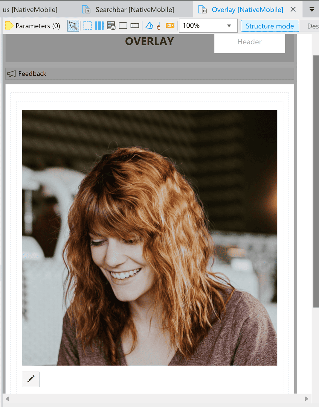
Give the image a class “proPic” and the button “overlapBtn”. We will style them later.
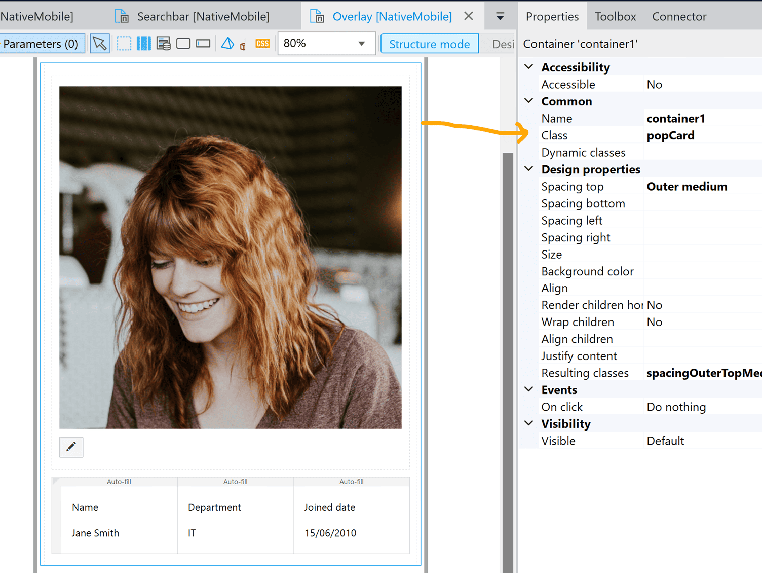
I created a layout with some text elements underneath the image and the button. This is, however, optional. If you would like to do the same, here are the instructions:
- Create a container that wraps around the image and the button. Add an “outer medium” spacing to the container. Align the container center.
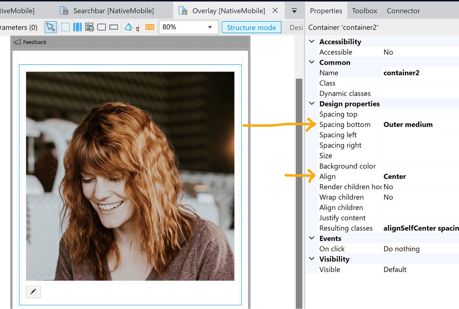
2. Below the container, create a layout grid and add some text elements within. Wrap everything in a container and give it the class “popCard” (which we used in Lesson 1).
Step 2: Implement the style
Create a new file “overlay.js”. Make sure to have it imported in “main.js”. The key to creating an overlapping element is to manipulate the left and/or right margin of the element so that it is deliberately positioned against another element on the screen.
To achieve that, we need to add give the associated margin a negative unit. The rationale behind is similar to creating the effect of having elements bleeding into the top bar (in the bonus section of Lesson 1).
//profile pic
export const proPic = {
image: {
borderRadius: 100,
width: 150,
height: 150,
},
container: {
borderWidth: 2,
borderColor: "#777777",
borderRadius: 100,
width: 150,
height: 150,
marginTop: 25
}
}
//button to edit the profile pic
export const overlapBtn = {
container: {
borderWidth: 2,
borderRadius: 50,
width: 32,
height: 32,
backgroundColor: "#E7E7E7",
marginRight: -75,
marginTop: -32,
borderRadius: 50,
borderColor: "#777777"
},
icon: {
color: "#000000",
size: 18
}
}
End result:
That’s all for today! Thank you for going through the tutorial. If you have any questions, feel free to let me know ([email protected]).