In this post I will highlight one of the available progress bar widgets, which is a great tool for displaying the progression of a workflow to the user.
Why use a progress bar widget?
When going through a multi-step process in your app (such as completing an order form or doing a survey), having a visual indication of how close you are to being done leads to a great user experience. That‘s where the progress bar widget comes in. This widget gives developers the power to display an end user’s progression visually using several different styles to ensure the progression message is delivered successfully to the end-user.
Finding the progress bar widget
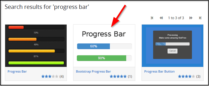
You can find the progress bar widgets in the Mendix App Store. There are several progress bar widgets listed when you search for “progress bar,” but the main focus of this blog will be the Bootstrap Progress Bar widget created by Flock of Birds:
Widget functionality
At its heart, the Bootstrap Progress Bar widget simply displays the appropriate progress bar with a number between 0 and 100 to indicate the percentage of completion. It is also possible to display text after the number in the progress bar (for example, you can display ”75” or ”75% Complete”).
Configuring the widget
The first thing you’ll need to do is link the widget to the correct Progress attribute and Bootstrap Style:
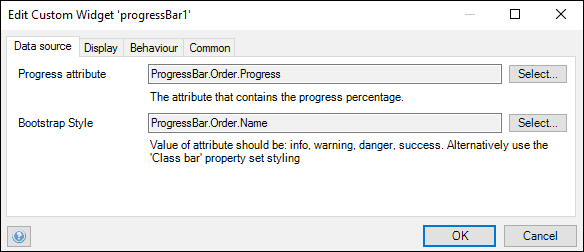
The progress attribute is the integer that displays the progress completed, and it should be set to a number in the range of 0 to 100. The Bootstrap style can be used to alter the appearance of the progress bar if it is one of the following values: info, danger, or success. The Bootstrap style can be linked to the progress attribute through microflows so that, for example, a progress of 0% could be displayed in the progress bar in the “danger Bootstrap Style” while a progress of 100% could be displayed in the progress bar in the “success Bootstrap Style.”
You can also adjust several display settings, such as what the progress bar displays after the percentage value, the width of the widget in the app, the color switch value, and the appearance of the bar itself.

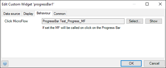
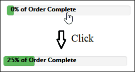
It is also possible to give the progress bar an on-click action through a microflow as shown below. One use case for utilizing a microflow action is when the user wants to update the progress bar completion percentage based on new information filled in on the user’s current page.
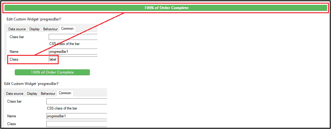
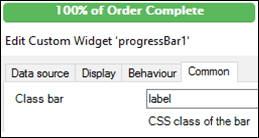
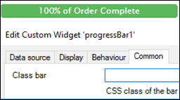
On top of the example mentioned above, you can also apply CSS styling to your progress bar and the text contained within the bar.
This simple yet effective widget is a great way to visually illustrate the progression of a workflow, and it gives Mendix developers the advantage of adding an easy-to-use progress bar to their pages!