Build Widgets in Mendix with React Part 3 - Kanban

Mendix is the number one low code platform, which allows makers to develop applications considerably faster than traditional coding. The Mendix frontend is built using React and developers can extend their applications using Pluggable Widgets.
In this blog we are going to learn about how to make permanent data changes in your application from your widget, combining widgets to create slick end-user experiences, custom hooks, and more…
This is the third blog in a multi-part series, blogs 1 & 2 can be found here: Build widgets in Mendix with React — Part 1 — Colour Counter and Build Widgets in Mendix with React Part 2 — Timer.
Before we start, a little disclaimer: For this build, we take advantage of some of the features of VS Code, instructions may vary if you prefer another IDE.
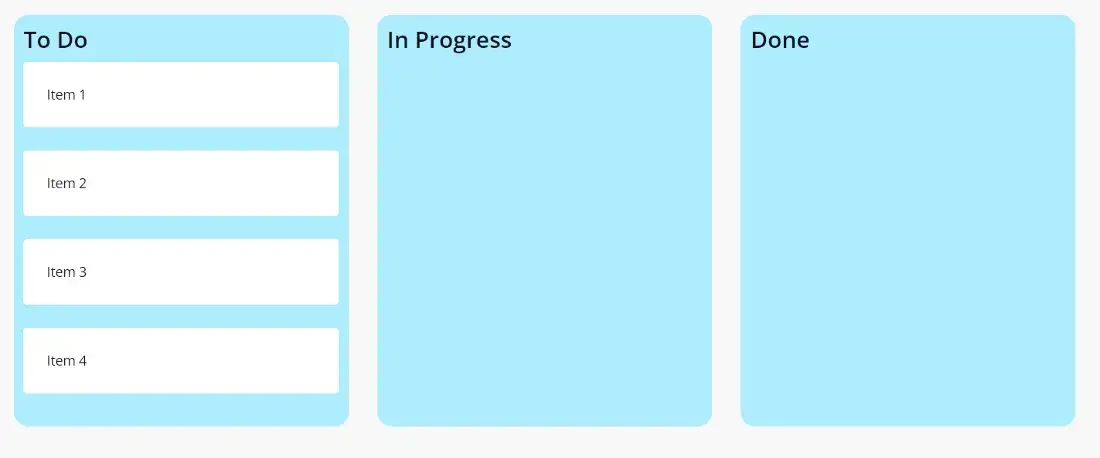
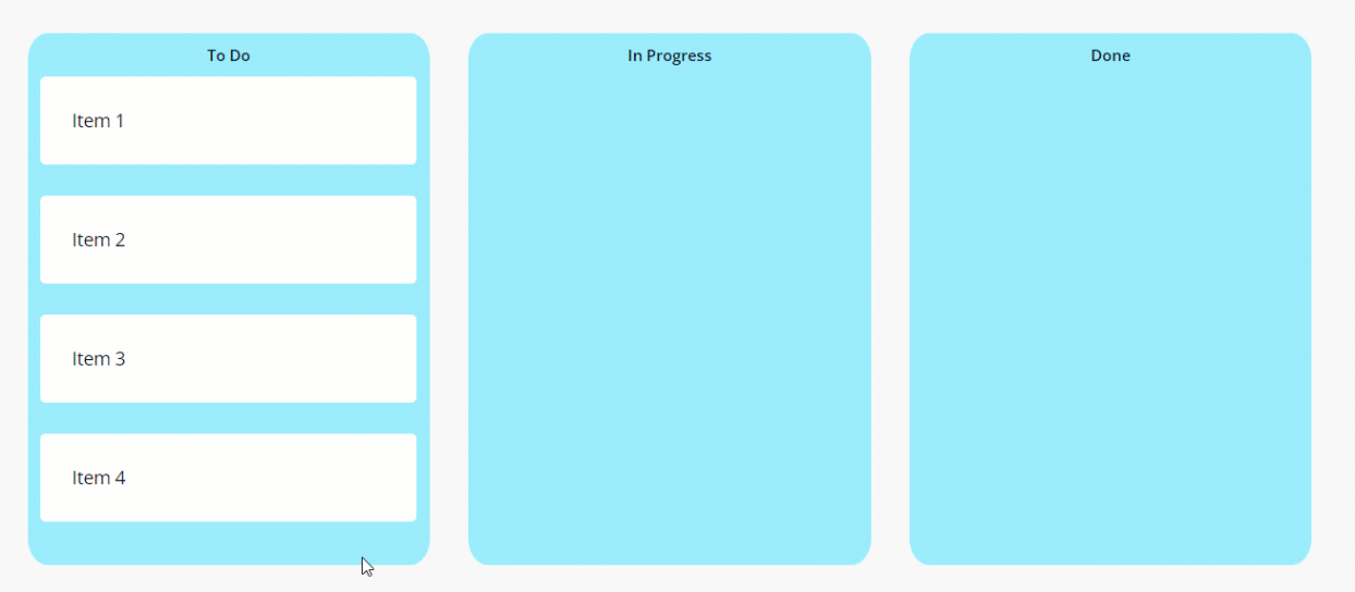
What we are building
Mendix has recently released Epics, a new fully featured story management tool!
As part of this, there is a really nice component that allows you to drag and drop your stories. I thought it would be cool to try and build something similar.
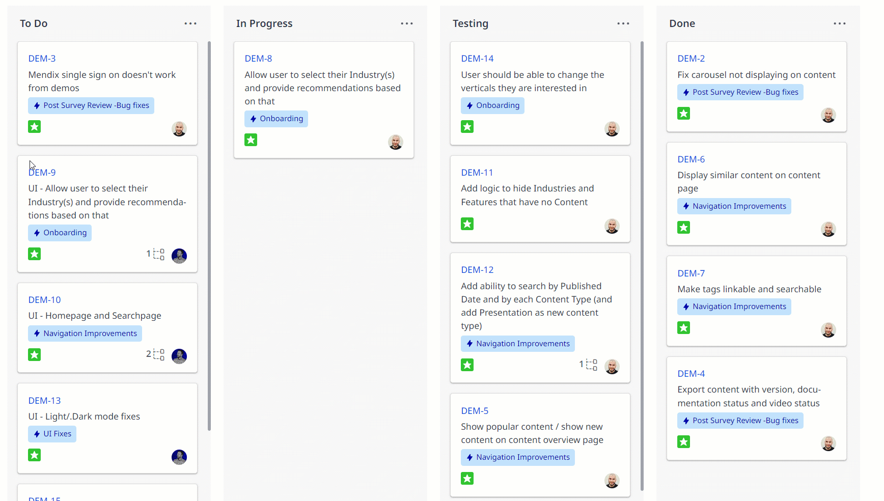
There are a few things every Kanban board should be able to do:
- Allow users to set the Kanban stages
- Be able to change the stage of an item by dragging
- Be able to change the sort order of items in a section by dragging
Getting Started
To start we scaffold the widget by running the widget generator to quickly scaffold a widget. Run the command:
yo @mendix/widget kanban
When configuring the widget properties, select the default options, while making sure to use Typescript.
Next, we are going to update the interface between our widget and the Mendix by updating Kanban.xml. To do this, we add a list of Datasource items to allow the user of the widget to specify what Mendix entities they want to use.
We have two options for actually rendering the items within the widget, we could use traditional JSX, or we can allow the user to build the design they want within Mendix. The second option has three main advantages:
- Prevents prescribing the structure the child data must be displayed in
- Doesn’t hide code in harder-to-edit compiled widget files
- Allows users to take advantage of the WYSIWG editor within Mendix
Rendering the List
Option two wins! To implement this we can use the ‘widgets’ tag from the Pluggable Widgets API. The updated Kanban.xml now contains:
<property key="items" type="datasource" isList="true" required="true">
    <caption>Items</caption>
    <description>List of items</description>
</property>
<property key="widgetList" type="widgets" required="true" dataSource="items">
    <caption>Content</caption>
    <description>Widgets using data source</description>
</property>
Next, we can update our Kanban.TSX file to contain:
export function Kanban({ widgetList, items }: KanbanContainerProps): ReactElement {
    return (
        <div>
              {items.items && items.items.map(item => {
                   return widgetList.get(item);})}
        </div>);
}
There are a few things happening in the above code so I will break them down:
- “widgetList ”is our widget interface into the Mendix model, if we right-click on “widgetList” and click ‘Go To Type Definition’ we can see our documentation for this type.
export declare interface ListWidgetValue {
    * Returns widgets configured by user in form of a react node
    rendered based on provided object item.*
    * @param item Instance of {@link ObjectItem} from the linked
    data source.*/
get: (item: ObjectItem) => ReactNode;
}
This basically tells us, that there is one get function for our widget, which expects something called an ObjectItem in order to render a ReactNode
- “Items ”is our data source which we can access as a ListValue (a Mendix-defined type), if we right-click on “items” and click ‘Go To Type Definition’ we can see our documentation for this type. From this documentation I can see that I can access an array of ObjectItem, using the .items property
We can then use the built-in function JS map to iterate through each element in the items list and use the ‘get’ function of the item to return the result.
- We then wrap our function in curly braces to show it is JavaScript and wrap it in a parent div in order to render each item
- Lastly, we add a ternary expression to avoid calling the function in the event that there are no items in the list.
Testing
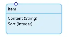
To test our implementation we set up a test project in the ‘tests’ folder of our widget, just like we did in Blog 1.
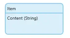
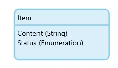
We add an entity called Item with the string attribute Content
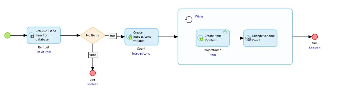
Then we add some microflows to create some $Items in the After Start Up Microflow.
We can then build our widget from the terminal with npm run build .
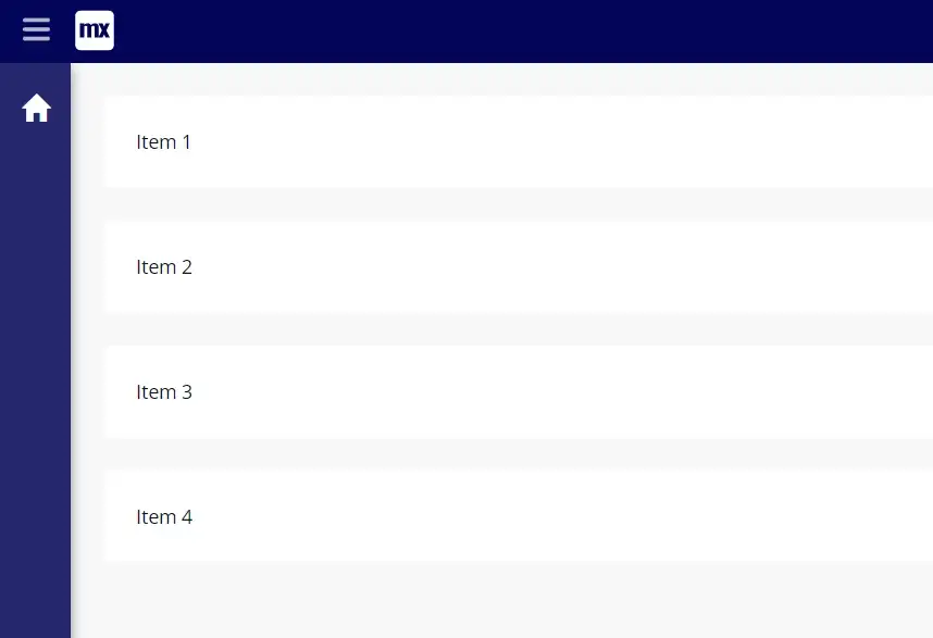
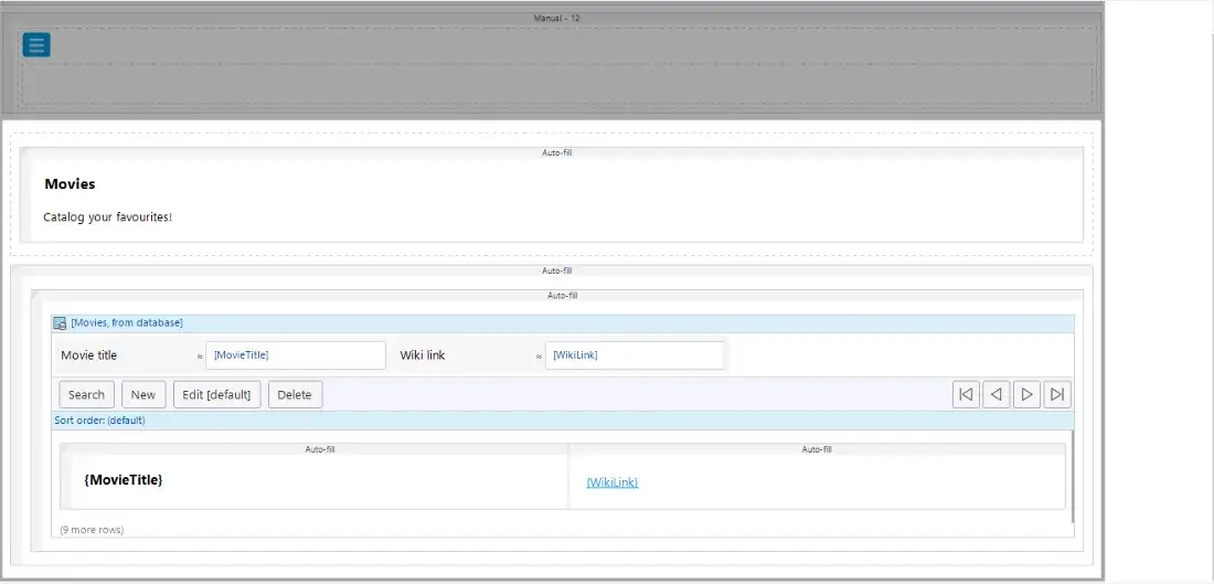
When we return to our Mendix model and press F4, our widget is available to be placed on our homepage.
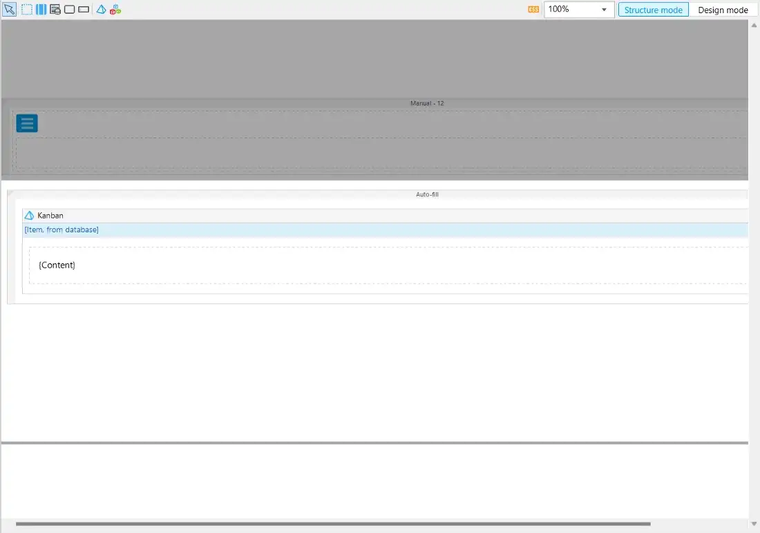
Here I’ve added a simple container with the class ‘card’ and a string displaying the content. And Voila! It renders.
Drag ‘N Drop
Having a static list is a good start, but we need to be able to move those items around!
Let’s choose our react drag and drop library. We could build this ourselves (and some smart Mendix developers already did!) but there is a very broad selection of well-supported, highly used libraries.
I’ve gone with react-beautiful-dnd as it has an easy-to-use API and is very feature-rich.
We then import our drag and drop library by navigating to our widget directory (./kanban) and running the command
npm i react-beautiful-dnd .
From reading the documentation there are three main areas we need for our widget:
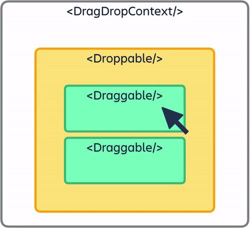
<DragDropContext />– Wraps the part of your application you want to have drag and drop enabled for<Droppable />– An area that can be dropped into.<Draggable />– What can be dragged around
Step 1 — Draggable
So let’s start at the lowest level and convert our Items to be draggable.
First, let’s break our ItemList out into a separate function, but keep it within our component for ease of development for now (we can move it into a separate component later).
export function Kanban({ widgetList, items }: KanbanContainerProps): ReactElement {
const ItemList = (): ReactElement => {
        return (
             <div>
                   {items.items && items.items.map(item => {
                        return widgetList.get(item);})}
             </div>);
}
    return (<div><ItemList /><div>)
}
In order to make each list item draggable, we need to wrap the widget in a Draggable component, which expects a unique id for the draggable item — an index to order the items, and a child function to render the component.
Following the documentation from the react-beautiful-dnd library for the rest of the implementation, we end up with the following code.
const ItemList = (): ReactElement => {
    return (
        <div>
            {items.items &&items.items.map((item, i) => {
                return (
                     <Draggable
                          draggableId={item.id}
                          index={i}
                          key={item.id}
                     >
                         {provided => (
                             <div
                                 ref={provided.innerRef}
                                 {...provided.draggableProps
                                 {...provided.dragHandleProps}
                              >
                                  {widgetList.get(item)}
                             </div>)}
                     </Draggable>);
               })}
         </div>);
};
What we have done here is wrap our widget component in a ‘draggable’ wrapper which allows us to pass down a reference and props.
References are a concept that we haven’t covered yet in these blogs and are a key part of React, they are essentially a way of accessing elements within your page, and in this instance are intended for keeping track of what is being dragged: Refs and the DOM – React.
Step 2— Droppable
Now that we have our Draggable components we need to create the drag-drop canvas.
To do this we need to wrap our ItemList of Draggable components in a Droppable container using a pattern very similar to the one outlined above:
<Droppable droppableId="list">
    {provided => (
        <div ref={provided.innerRef} {...provided.droppableProps}
             <ItemList />
        </div>
    )}
</Droppable>
Step 3— Context
Lastly, we need to provide the drag-drop context in which the functionality exists:
<DragDropContext onDragEnd={onDragEnd}>
    <Droppable droppableId="list">
        {provided => (
            <div
                 ref={provided.innerRef}
                 {...provided.droppableProps}
             >
                 <ItemList />
             </div>
         )}
    </Droppable>
</DragDropContext>
The context expects a function to call once an item has been dragged. For now, let’s just log that the function has been called.
Our code currently should look something like this:
export function Kanban({ widgetList, items }: KanbanContainerProps): ReactElement {
    const ItemList = (): ReactElement => {
        return (
            <div>
                {items.items &&
                    items.items.map((item, i) => {
                        return (
                            <Draggable
                                draggableId={item.id}
                                index={i}
                                key={item.id}
                             >
                                {provided => (
                                    <div
                                        ref={provided.innerRef}
                                        {...provided.draggableProps}
                                       {...provided.dragHandleProps}
                                    >
                                        {widgetList.get(item)}
                                    </div>
                                )}
                            </Draggable>
                        );
                    })}
            </div>
        );
    };
function onDragEnd(result: DropResult): void {
        console.log("Dragged");
    }
return (
        <DragDropContext onDragEnd={onDragEnd}>
            <Droppable droppableId="list">
                {provided => (
                    <div
                         ref={provided.innerRef}
                         {...provided.droppableProps}
                     >
                        <ItemList />
                    </div>
                )}
            </Droppable>
        </DragDropContext>
    );
}
If we run npm run build and rerun our Mendix app, we can now drag around our cards! Kind of…
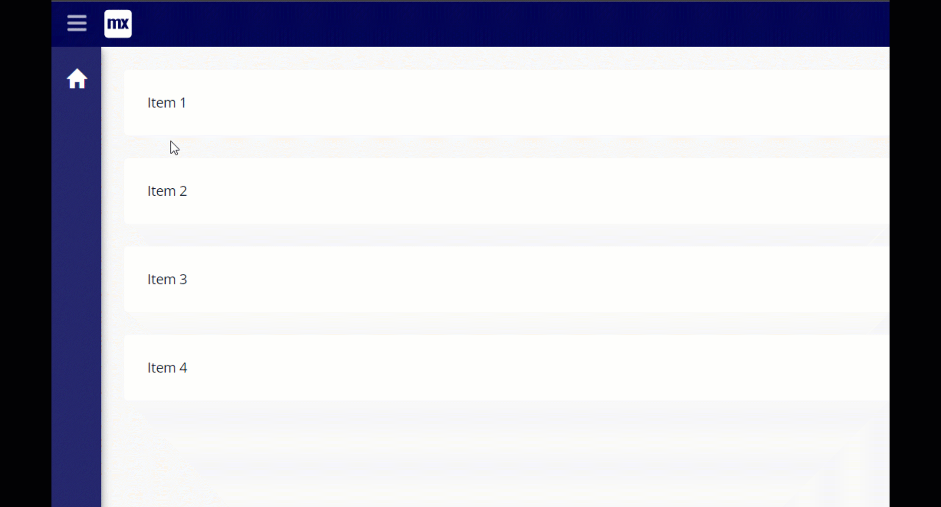
We will revisit this problem later…the most important part is that we can drag our Items around.
Multiple Columns
So we can drag stuff up and down in one list, but what we really want to do is to be able to drag items between columns to determine the status.
We want our users of the widget to be able to specify how many columns they want.
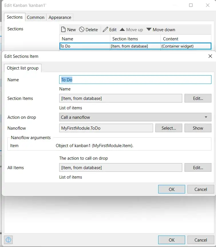
To do this we can use ‘Objects’ in our Kanban.xml. We just need to wrap our existing properties in an object list like so:
<property key="myObject" type="object" isList="true">
    <caption>Sections</caption>
    <description/>
    <properties>
        <propertyGroup caption="Object list group">
            <property key="sectionName" type="string" required="true">
                <caption>Name</caption>
                <description>Name</description>
            </property>
            <property key="sectionItems" type="datasource" isList="true" required="true">
                <caption>Section Items</caption>
                <description>List of items</description>
            </property>
            <property key="widgetList" type="widgets" required="true" dataSource="sectionItems">
                <caption>Content</caption>
                <description>Widgets using data source</description>
            </property>
        </propertyGroup>
    </properties>
</property>
The keen-eyed amongst you will also notice that I added a name to allow us to keep track of our columns.
If you open Mendix we can check out our lovely new interface:
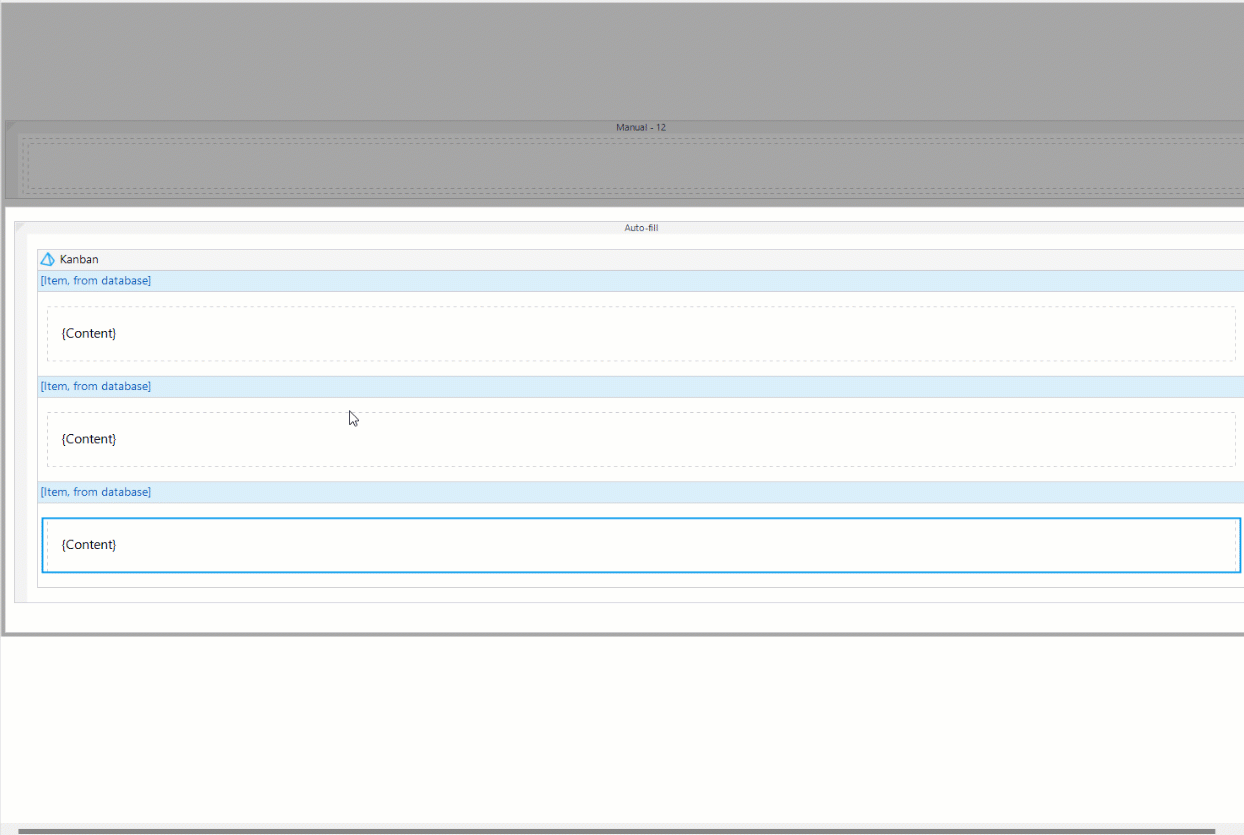
Cool, but now we have to render our columns, let’s head back to our widget…
This is actually quite simple.
First, let’s update our JSX to render a column for each object:
<DragDropContext onDragEnd={onDragEndObj}>
    {myObject.map((obj, i) => {
        return (
            <Droppable droppableId="list">
                  {provided => (
                      <div ref={provided.innerRef}
                               {...provided.droppableProps}
                       >
                          <ItemList />
                      </div>
                   )}
            </Droppable>
          );
    })}
</DragDropContext>
We should also make the droppableId unique and pass some props to our ItemList.
<DragDropContext onDragEnd={onDragEndObj}>
    {myObject.map((obj, i) => {
        return (
            <Droppable key={i} droppableId={i.toString()}>
                  {provided => (
                      <div ref={provided.innerRef}
                               {...provided.droppableProps}
                       >
                          <ItemList
                             items={obj.sectionItems}
                             widgetList={obj.widgetList}
                           />
                      </div>
                   )}
            </Droppable>
          );
    })}
</DragDropContext>
This means we also need to update our item list to accept the new props, and whilst we are here we might as well refactor it into something a little easier to read — I end up with two new files in my component folder:
Draggable.TSX
import { ReactElement, createElement } from "react";
import { Draggable } from "react-beautiful-dnd";
import { ObjectItem, ListWidgetValue } from "mendix";
export interface DraggableProps {
    item: ObjectItem;
    i: number;
    widgetList: ListWidgetValue;
}
export function DraggableItem({ item, i, widgetList }: DraggableProps): ReactElement {
    return (
        <Draggable draggableId={item.id} index={i} key={item.id}>
            {provided => (
                <div ref={provided.innerRef} {...provided.draggableProps} {...provided.dragHandleProps}>
                    {widgetList.get(item)}
                </div>
            )}
        </Draggable>
    );
}
And ItemList.TSX
import { ReactElement, createElement } from "react";
import { ListValue, ListWidgetValue } from "mendix";
import { DraggableItem } from "./Draggable";
export interface ItemListProps {
    items: ListValue;
    widgetList: ListWidgetValue;
}
export const ItemList = ({ items, widgetList }: ItemListProps): ReactElement => {
    return (
        items && (
            <div>
                {items.items &&
                    items.items.map((item, i) => {
                        return <DraggableItem item={item} key={i} i={i} widgetList={widgetList} />;
                    })}
            </div>
        )
    );
};
Styling
We need to add some style to our Kanban board, to turn it from an ugly duckling into a beautiful swan.
We will do this in two main ways:
- Making use of CSS classes and the ‘className’ prop every dom element has
- Leveraging in-line styles to make use of properties calculated in our code (i.e. column width)
First, let’s update our Kanban.css file to
.kanban-col {
    margin: 15px;
    padding: 10px;
    background: #9bedff;
    border-radius: 15px;
}
.kanban-col h6 {
    text-align: center;
}
We can then use a few additional dom elements, our classes, and styles and end up with:
import { ItemList } from "./components/ItemList";
import { KanbanContainerProps } from "../typings/KanbanProps";
import "./ui/Kanban.css";
export function Kanban({ myObject }: KanbanContainerProps): ReactElement {
function onDragEnd(result: DropResult): void {
        console.log("dragged");
    }
return (
    <div style={{ display: "flex" }}>
        <DragDropContext onDragEnd={onDragEnd}>
            {myObject.map((obj, i) => {
                return (
                    <Droppable key={i} droppableId={i.toString()}>
                        {provided => (
                            <div
                                className="kanban-col"
                                style={{width:`${100/
                                        myObject.length}%` }}
                                ref={provided.innerRef}
                                  {...provided.droppableProps}
                            >
                                <h6>{obj.sectionName}</h6>
                                    <ItemList
                                       items={obj.sectionItems}
                                       widgetList={obj.widgetList}
                                     />
                                     {provided.placeholder}
                            </div>
                        )}
                    </Droppable>
                );
            })}
        </DragDropContext>
    </div>
    );
}
Hold on…..what is that? ${100/myObject.length}%
This is a template literal that allows you to quickly build strings in JS, by writing strings in “ and wrapping expressions in ${}.
But back to the widget…we now have user-defined columns, with Items.
Drag N Drop Action
Now we want our Drag and Drop to actually do something…

To do this we are going to make use of the Pluggable Widget action API in combination with a data source.
So, first things first let’s add two new properties to our object in our Kanban.xml
<property key="action" type="action" dataSource="allItems" required="true">
      <caption>Section Items</caption>
      <description>List of items</description>
</property>
<property key="allItems" type="datasource" isList="true" required="true">
      <caption>All Items</caption>
      <description>List of items</description>
</property>
By linking our action to a data source we can execute the action with a parameter from Mendix. This will allow us to change attributes on our items.
Now we can update our “onDragEnd ”function to execute the action.
By reading the documentation for react-beautiful-dnd we can see that onDragEnd receives a result object which allows us to access the draggableId and droppableID. We can use these to work out what Item is being dragged and where it is being dragged to (and therefore what action we need to call).
The first thing to do is destructure our result and find the correct object:
const { source, destination } = result;
const destObj = myObject[parseInt(destination.droppableId, 10)];
Here we are parsing the droppableId (which we set to the index of the objects), and using it to retrieve the object from the myObject array.
Once we have the correct object we can get a representation of the item being dragged, by finding it in the list of allItems.
const destObjItem = destObj.allItems.items!.find(item => {
            return item.id === result.draggableId;
        });
Note we need to specify allItems for every object because actions can only be called on items that belong to the same object.
We can then execute an action on the object :
const actionOnObj = destObj.action!.get(destObjItem!);
        if (actionOnObj.canExecute) {
            actionOnObj.execute();
        }
We splash in a few checks to make sure the item was dragged to a list, and our final function should look like this:
function onDragEnd(result: DropResult): void {
        const { source, destination } = result;
        if (!destination) {
            return;
        }
        const destObj = myObject[parseInt(destination.droppableId,
        10)];
        const destObjItem = destObj.allItems.items!.find(item => {
            return item.id === result.draggableId;
        });
        const actionOnObj = destObj.action!.get(destObjItem!);
        if (actionOnObj.canExecute) {
            actionOnObj.execute();
        }
    }
So this has set us up nicely to have a working drag-and-drop Kanban board, we just need to do a couple of things in Studio Pro. First, let’s add a Status attribute with our various statuses.
Then let’s add a nanoflow for each status we want to set.
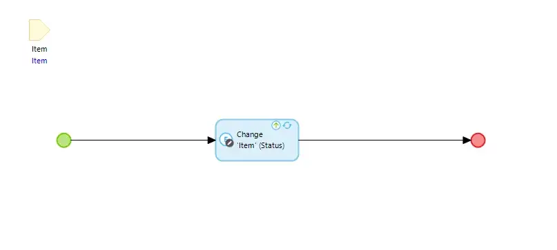
Now let’s configure each of our sections by setting the items to be all the items with the relevant status, and the correct on-drop action, and add a link to all of the items in the database for AllItems.
And we have drag and drop!
Sorting
We are almost there, we just have one more thing to do which is to introduce sorting. For this, we are going to use a useful pattern for getting data out of Pluggable Widgets.
Ideally, we would manage this entirely using values on the ‘Item’ but there is currently a limitation with the Pluggable Widget API, where attributes for objects that are part of lists cannot be directly changed. This limitation is on the roadmap to be removed. In the meantime we can take the following approach:
Let’s start by storing the sort order in the Mendix entity: Item.
Whilst we are at it, I will update my ASU to repopulate the database every time with Items with a Sort value:
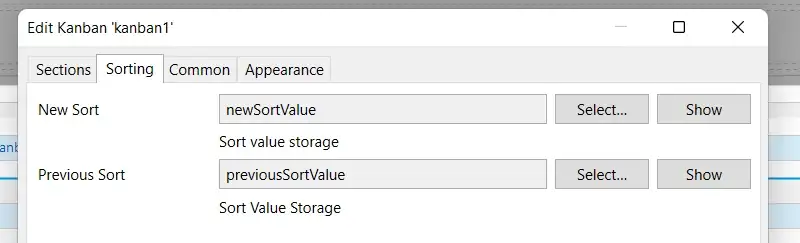
So back to our widget, let’s update the Kanban.xml to have a new ‘Sorting’ property group, which we can use to store the previous and updated sort index when we drag an item.
<propertyGroup caption="Sorting">
<property key="newSort" type="attribute" required="true">
    <caption>New Sort</caption>
    <description>Sort value storage</description>
    <attributeTypes>
            <attributeType name="Integer"/>
    </attributeTypes>
</property>
<property key="prevSort" type="attribute" required="true">
    <caption>Previous Sort</caption>
    <description>Sort Value Storage</description>
    <attributeTypes>
            <attributeType name="Integer"/>
    </attributeTypes>
</property>
</propertyGroup>
We can then update our onDrag function to pass out these properties to our Mendix model:
function onDragEnd(result: DropResult): void {
        const { source, destination } = result;
        if (!destination) {
            return;
        }
        const destObj = myObject[parseInt(destination.droppableId,
        10)];
        const destObjItem = destObj.allItems.items!.find(item => {
            return item.id === result.draggableId;
        });
        prevSort.setValue(new Big (source.index))
        newSort.setValue(new Big (destination.index))
        const actionOnObj = destObj.action!.get(destObjItem!);
        if (actionOnObj.canExecute) {
            actionOnObj.execute();
        }
    }
If we return to our Mendix model we can use these values to build out our sorting logic.
Let’s set up an Entity to hold our previous and new sort values.
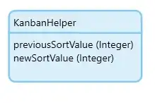
Then let’s wrap our widget in a data view that provides this entity:
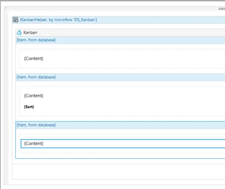
We can then configure our widget to pass the sort values into the entity.
Given we have wrapped our widget in the data view, we can now add our KanbanHelper as a parameter to our actions which are executed onDrag.
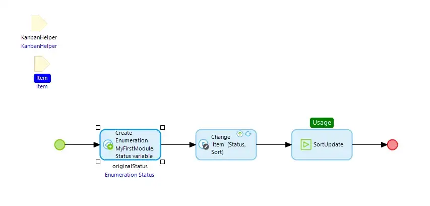
We do 3 main things in each of our onDrag nanoflows:
- Store the starting status of the Item (this determines whether the Item has changed column, for sorting calculations)
- Update the Item to the new Status and the newSort value
- Implement sorting logic to the rest of the Items
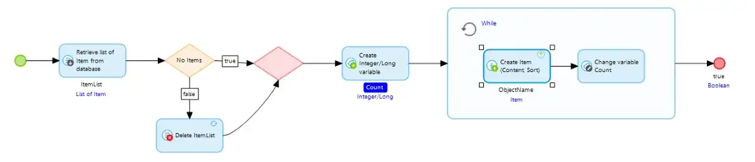
For the Sorting logic we can build it out in a Sub nanoflow:
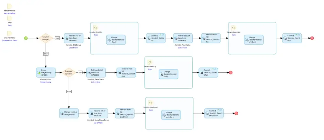
I won’t go into the details of how this was put together here, but the nanoflow can be found in the resources section of the Github repo.
Then when we run our application and test it one last time…
Summary
Now we have an all-singing, all-dancing Kanban board! We used the react-beautiful-dnd library, the composable nature of Mendix widgets, and a few simple(ish) nanoflows to build a fully functional, user-definable Kanban board.
The end state of this widget can be found here: GitHub – joe-robertson-mx/kanban-widget
If you were able to implement this Kanban board and want to show off what you built, share it in the comments below.
Up next we are going to take a look at implementing maps in our Pluggable Widgets, and in the process explore how to use complex external libraries, and include custom files in our build.