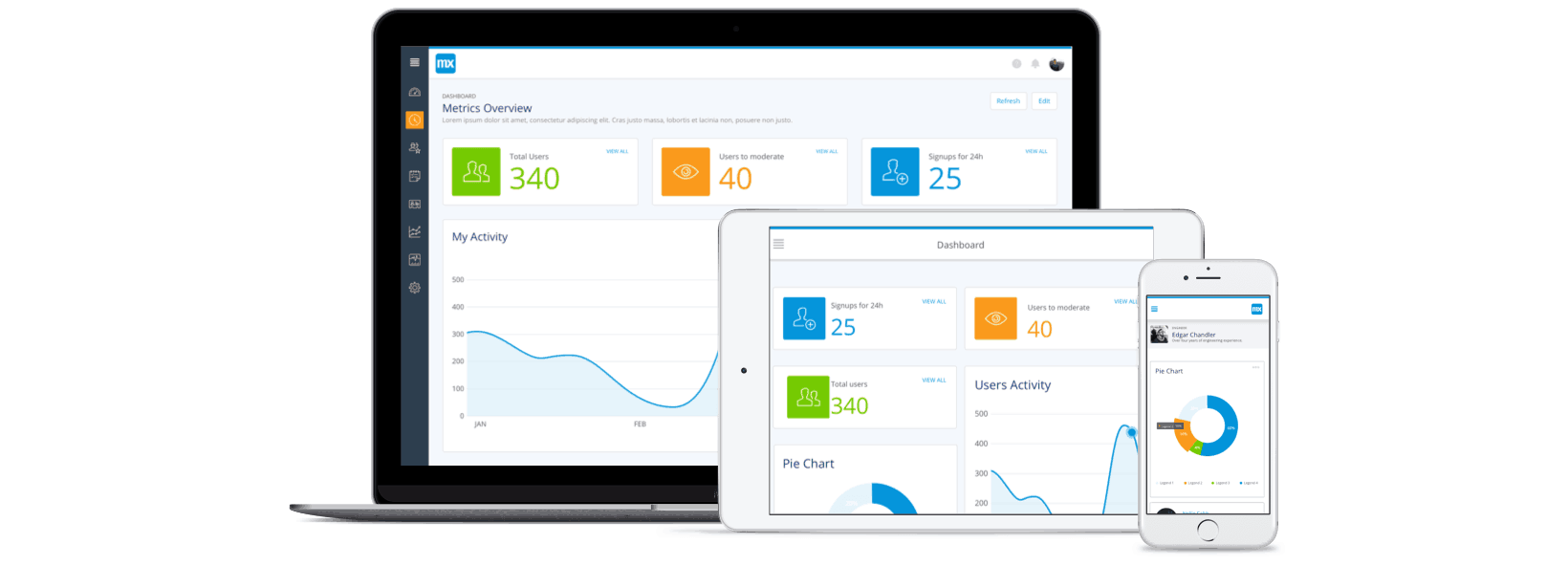
Adoption of low-code development platforms is surging as organizations look to close the gap between business demand for custom applications and IT capacity to deliver it. Such platforms enable a broad range of users—from professional to citizen developers—to build web and mobile applications 10 times faster than traditional development approaches, while promoting an iterative, user-centric approach that helps ensure business outcomes.
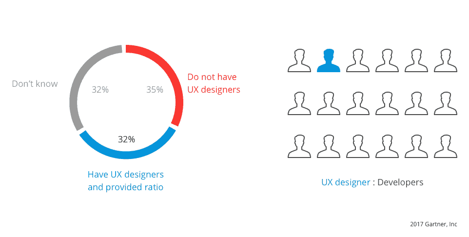
Another key aspect to ensuring applications deliver their intended benefits is designing the right user experience. The challenge here is that most enterprises lack sufficient UX resources. A Gartner survey reveals that, on average, enterprises have just one UX designer for every 17 developers, while 35 percent of organizations have no UX design competency at all. This means there simply aren’t enough designers to support existing development teams; the issue is compounded by the shift toward multiple, autonomous teams developing apps in parallel.
If you lack in-house UX resources and your developers don’t possess UI/UX skills themselves, how can you possibly enable your development teams to build engaging user experiences at scale? The key is to put ready-to-use, easy-to-leverage UI components that adhere to best practices in the hands of every developer within your organization.
That’s exactly the philosophy behind Atlas UI, our layered, componentized UI framework that enables individuals with little or no UI design skills to quickly assemble rich user experiences. We designed Atlas to capture and leverage UI design best practices—whether ours or your own—ensuring consistent, engaging UX across a portfolio of applications. Let me explain further.
Design great UIs consistently leveraging Atlas’ out-of-the-box design language
More than just a UI framework, Atlas UI comes out of the box with its own design language based on common UI patterns and best practices we see within our customer base. The Atlas design language includes a pattern library of professionally designed, ready-to-use UI elements, including navigation layouts, page templates, building blocks (preconfigured assemblies of UI components) and widgets. In addition, a publicly available style guide outlines the core design principles behind Atlas UI and provides recommendations for when to use individual components.
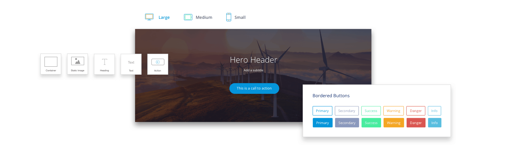
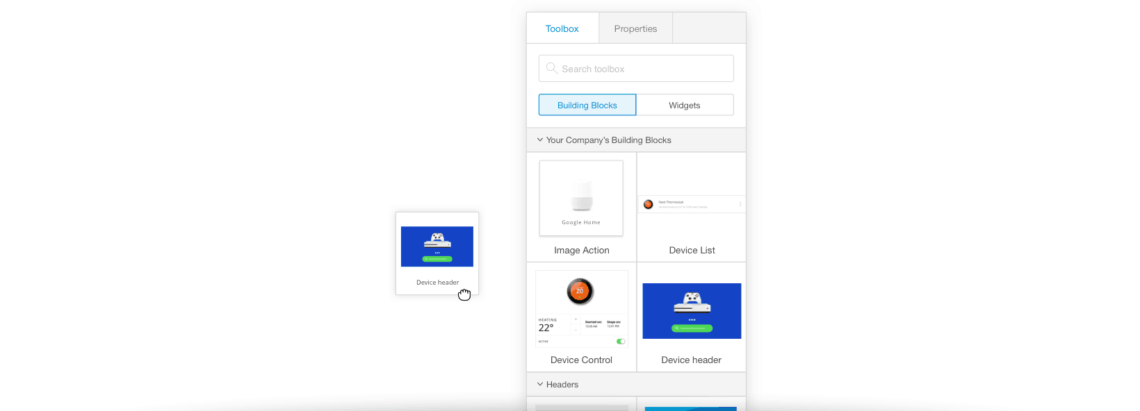
What makes the pattern library and style guide immediately usable to developers is that they’re seamlessly integrated into the WYSIWYG Web Modeler. For instance, a variety of page templates, grouped by type, are presented within the Create New Page flow. In addition, building blocks and widgets are available directly within the toolbox, so your developers can drag and drop them onto the canvas to quickly construct pages. Building blocks are particularly useful for developers without UI design skills, as they assemble multiple widgets in pre-configured layouts (with optimal proportions, spacing and individual design properties) to implement common UI patterns like headers, lists, timelines, and wizards.
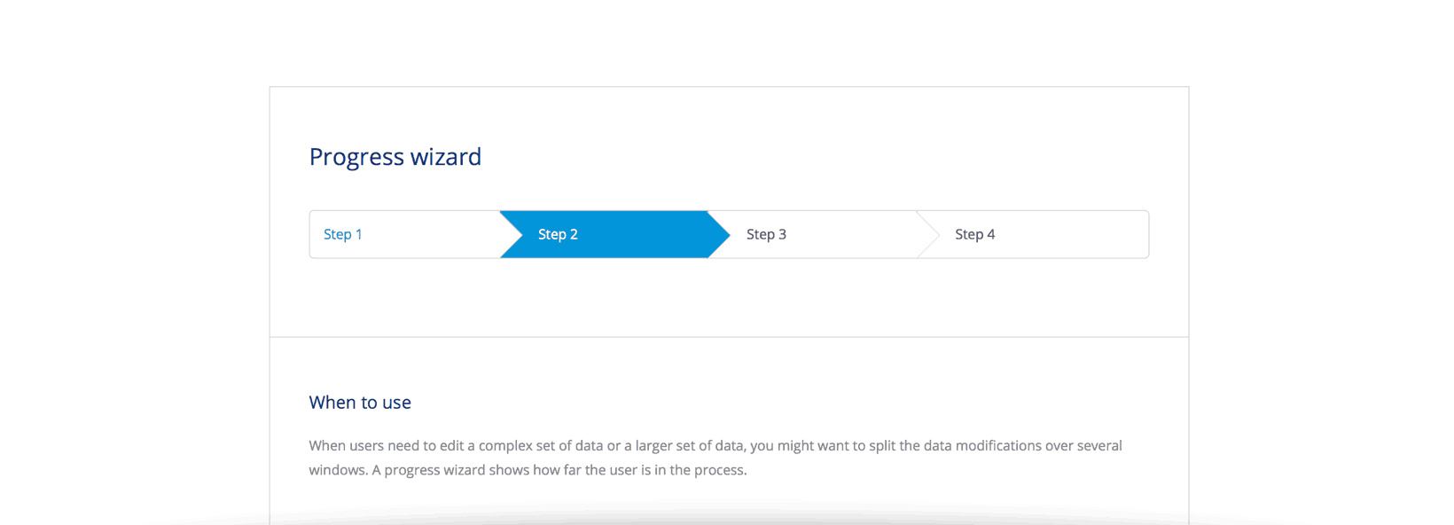
Best of all, because the style guide is integrated into the modeler too, the UI components not only look great out of the box; they include guidance to ensure that developers use them in the right scenarios and therefore deliver the right UX. Developers can simply click on the ‘i’ icon for a specific build block or page template and they’ll be brought directly to the page on the Atlas website illustrating common scenarios for when that component should be used. See the example below.
For organizations without in-house UI/UX resources, Atlas UI’s out-of-the-box design language is a great way to start leveraging UI best practices consistently across your team of developers. Developers and even business analysts can leverage these UI components to easily create great user experiences, without needing front-end development or UI design skills. And with the Theme Customizer, they can easily customize the application with your brand’s logo, color scheme, and typography.
Leverage your organization’s UI best practices with a company-specific pattern library
As the team grows and gains experience developing with Mendix, they may want to infuse their own UI best practices into the development of Mendix apps. For many customers, this will mark their first steps towards creating an enterprise design language that defines a unified set of UI/UX design rules which promote consistency and harmony across multiple applications.
To do this, Atlas UI allows you to customize or replace the out-of-the-box pattern library with your own company-specific version. As my colleague Arjan Hendriksen illustrates in this how-to post, this process starts with extracting common pages and UI patterns from existing Mendix apps, and promoting them as reusable page templates and building blocks. Of course, these could also be created from scratch.
For example, a consumer bank might design a standard card building block for its online banking and mobile app that provides customers with a visually appealing overview of their accounts. Or an insurance company could create its own progress wizard to guide prospective customers through the quote & buy journey consistently across its entire line of insurance products.
Once you have converged on a core set of company-specific UI elements, you can create a customized version of the Atlas UI Resources module (containing the pattern library) and ship it in your private App Store. You can then make the UI Resources module available as a company-specific starter app that’s available directly in the Create App flow for developers to choose by default. Organizations with different UI and branding requirements for specific audiences (e.g. employee and customer-facing apps) can even publish multiple starter apps.
These capabilities—along with a (living) style guide that describes your organization’s design principles and provides recommended use cases for your company-specific UI components—ensures that all developers working in Mendix have access to your organization’s UI best practices directly within their toolbox. All new apps are themed automatically as a starting point. Then, developers can pull from an array of company-approved page templates and building blocks to speed UI design while ensuring consistency with the broader app landscape.
Deliver great UX consistently at scale without additional UX resources
Deliver great user experiences doesn’t necessarily require hiring an army of UI/UX resources. For most enterprise IT organizations, that simply isn’t an option. The key, instead, is putting UI design best practices into the hands of every developer, so that they can build engaging user interfaces without needing assistance from designers. This is exactly what Atlas UI does, both through the out-of-the-box design language that includes ready-to-use UI components as well as the ability to create your own company-specific pattern library and embark upon the journey to defining your enterprise design language.
There may be no end in sight to the enterprise UX skills shortage, but that doesn’t mean your team can’t close the enterprise UX gap and deliver engaging, highly usable applications at scale.