Design Thinking vs. Agile: Combine Problem Finding & Problem Solving

Your company’s development methodology — Agile, Lean, design thinking, or a combination of the three — can determine the success of a project. In addition, 70% of projects fail to deliver their promises to customers, which makes the dev framework all the more critical.
Many IT leaders believe that adopting a single development methodology will fundamentally address this issue — but which is the right choice? Read on to learn more about design thinking, the part that Agile and Lean play, and how to ensure your product is best suited to match what users need.
What is the Agile design methodology?
Agile is a software development methodology that helps organizations stay responsive to change. Small businesses, Fortune 500s, and even the FBI follow the Agile methodology.
Gartner defines Agile as a “development approach that delivers software in increments by following the principles of the Manifesto for Agile Software Development.”
That means Agile is a flexible and iterative software development methodology designed to adjust quickly to feedback.
There are various types of Agile frameworks:
- Scrum
- Crystal
- Dynamic Systems Development Method
- Feature-Driven Development (FDD)
Each approach follows the main principles of Agile. These principles focus on the people doing the work and collaboration between business and IT.
A fundamental tenet of effective Agile development is seeking frequent end-user feedback to iterate the proper outcomes. Early on, this includes:
- Establishing the project business goals
- Writing user stories
- Creating backlogs
Throughout the Agile process, the team shares working demos to gather feedback and uncover new needs. Users should be able to submit issues, suggestions, and ideas through embedded feedback mechanisms within the software. Users should also be able to submit their feedback during development and once the product is in production.
Ideally, there’s a closed loop that brings feedback directly into the development environment, enabling ongoing iteration.
Low-code development platforms are beneficial here. With regular interaction points through meetings and demos, developers can continually gather new insights. Devs can use these insights to adapt and better align the software with both user and business goals.
Where does Lean fit in with Agile and design thinking?
Without Lean, there wouldn’t be Agile.
Lean is a production methodology that started in the manufacturing industry. Lean originally helped companies eliminate waste, boost innovation, and optimize processes.
Lean originated in Venice in the 1450s, but Henry Ford was the first to use it in the production process in 1913.
When it comes to software development, Agile follows many of the same principles as the Lean methodology, including:
- Fast and frequent iterative development
- Short feedback loops, or “sprints”
- Disciplined, error-proof processes
Design thinking versus Agile
Now, you might be wondering, “Is design thinking just another name for the Agile manifesto and framework?”
That’s a great question. Both frameworks depend on response to feedback, but there is a core difference.
While Agile is an approach to problem solving, design thinking is an approach to problem finding. Design thinking is an iterative process of developing new ideas, challenging assumptions, and redefining problems. It calls for a high degree of design empathy and understanding of end users.
The 5 stages of design thinking
The goal of design thinking is to identify alternative solutions that might not necessarily be apparent. There are five stages of design thinking:
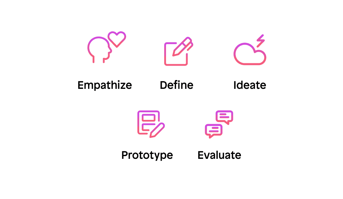
1. Empathize
Understand people, their behaviors, and their motivations. People often don’t know or can’t articulate these things explicitly. Understanding emerges through viewing users and their behaviors in context to identify patterns, ask questions, and challenge assumptions.
2. Define
Create an actionable problem statement to define the proper challenge to address. Define the set of needs that are important to fulfill based on the organization, its goals, and the perspective of end users.
3. Ideate
Leverage brainstorming, mind mapping, sketching, or paper prototypes to step back, go wide, and create innovative solutions.
4. Prototype
Bring ideas to life by showing instead of telling. Quickly create working prototypes to get something into users’ hands and begin to collect real-world feedback.
5. Evaluate
Learn from users’ experiences, iterate, and repeat the process as needed until reaching a Minimum Viable Product (MVP).
Better together: Agile and design thinking
Together, design thinking and Agile create a user-centric environment focused on rapid, frequent iterations to reach optimal outcomes. Use design thinking to identify the correct problems and use Agile to build solutions to solve those problems iteratively.
The principles of design thinking bring a strong user focus, while Agile is an excellent way to deliver solutions incrementally. The dev and design teams keep user needs front and center throughout the process.
For teams looking to leverage Agile and design thinking for the first time, here are three recommendations to keep in mind:
Start small. Focus on high-value, low-risk opportunities to gain experience using design thinking and Agile together. Then, as your capability matures, take on more challenging initiatives.
Create cross-functional teams. To facilitate the required creativity, create cross-functional teams that work together to design and develop solutions. The team should be physically co-located with end users to promote frequent collaboration.
Balance design and development. Agile teams are often inclined to “just start coding,” mixing two methodologies for the first time may create tension. Plan how much time to spend on design thinking before beginning development.
Ensure the team understands the value of the design empathy, definition, and ideation phases. Demonstrate how to leverage design thinking throughout the entire process. The team should be prepared to uncover new user insights, reframe problems, and develop with a renewed sense of why.