
In November 2016, global mobile Internet usage outstripped desktop usage for the first time ever. Since then, the trend has only continued to favor mobile. With any new application development targeting consumers, mobile apps are expected. That expectation is only growing for enterprise applications as well. IT organizations are now faced with these demands, and without the commensurate increase in budget to manage multiple codebases.
Mendix provides a solution for this IT organization pain point. With the Mendix platform, it’s easy to build one multi-channel app and deploy it to all of your target devices, including mobile apps that can be released in both the iOS and Android app stores. While a powerful capability, be sure to consider your strategy when developing a multi-channel app. Simply trying to build every bit of functionality in an app for every device is wasteful. Instead, when you consider your multi-channel strategy, follow these three best practices.
1. Understand your target audience: Build a user role – device type matrix
It’s important to think about which types of users will log into your app, how they’ll access it, and for what purpose. Does your system administrator need a mobile interface? Does your sales team on the road need a desktop interface, or will a mobile app suffice? Do your consumers expect a mobile app as well as a web interface, and do the capabilities need to be the same on all devices? Think about mobile banking: a mobile user is typically trying to accomplish a single goal when he or she opens the app – perhaps checking a balance. For a more complex function like opening an account, the web interface is the way to go. In short, be sure to understand how and why your users will interact with your application before you start building desktop and mobile interfaces for every use case.
A user role – device type matrix will help you understand where to focus UX and development resources. Consider an app for the hospitality industry, perhaps offering core functions for a small hotel. In this app, your hotel guests will book rooms and order room service during their stay, while the front-desk will handle guest check-in, the housekeeping crew will manage daily room cleaning, and the kitchen will fulfill room service orders. Here’s a sample matrix for the app:
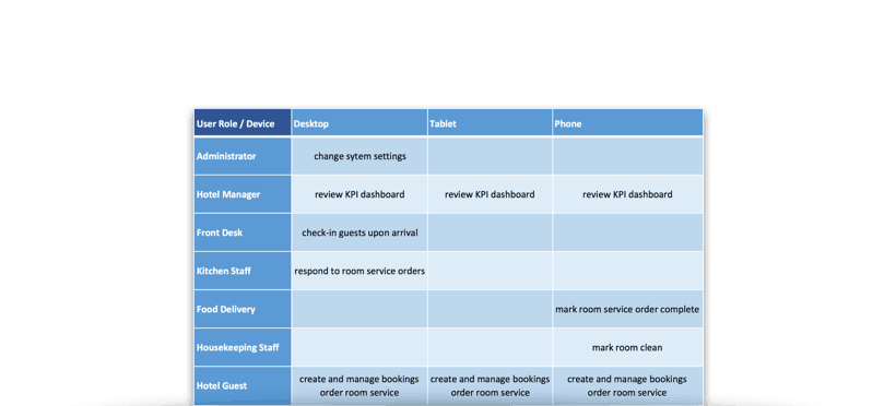
In this example, you should probably concentrate on building a clean, multi-channel interface for your guests. On the other hand, the kitchen staff will need just a few simple desktop pages to be effective. With this matrix in hand, a product owner will know where to focus UX and development efforts.
2. Consider the difference between a website and an app
Most of the literature regarding multi-channel design focuses on websites. Sites are primarily for consuming content, while apps are for interacting with data (creating, editing, consuming). Consuming content is similar on desktop and mobile; a user will mostly be reading text or looking at images or videos. On the other hand, creating and editing data happens much differently on a mobile device than it does on a desktop. Reconsider the guidance that comes from this literature when developing your multi-channel strategy.
Manual data entry via onscreen keyboard is much slower than on a full-size device, but a mobile device also has a number of sensors that a desktop probably does not. Almost every phone available today offers GPS, two cameras (and therefore a barcode scanner), a compass, a light sensor, a fingerprint sensor, etc. The list of sensors continues to grow with every new device that hits the market.
Think about how you book a hotel on your laptop versus in a mobile app. On the web, you usually need to enter your location, while on mobile the device knows where you are and can pre-fill that information. Similarly, logging into your bank on the web will require a username and password, while on mobile you can usually just use your fingerprint to authenticate. Each device type has its own strengths, and it’s important to take advantage of those strengths when developing a multi-channel strategy.
3. Optimize your design pattern: Consider a mix of responsive and device-specific design
Now that we have a framework for understanding the who, why, and how an app will be used, we’re ready to think about the actual process of design and development. Responsive design has been an important topic in the web development world for the past several years. That’s no surprise – the prospect of building just one interface that works well on every device is tempting. Given its benefits, the Mendix platform supports responsive design via the Layout Grid widget.
In practice, though, responsive app design is not a panacea. It’s important to balance the use of responsive design with device-specific design. For pages where content is primarily consumed, responsive design works well. Try visiting Mendix.com on a desktop and then a mobile device, and compare how sections of content rearrange itself from horizontal columns into stacked rows without loss of usability. On the other hand, when data is created or manipulated, simply stacking columns of data on top of each other will result in a less than ideal interface.
In short: use responsive design for pages where users will consume content, and consider device-specific design for pages where users will create or manipulate data.
Takeaways
When developing a multi-channel strategy for your app, it would be easy to head down a path where every page and function is developed for every device. Or, at the other end of the spectrum, all development could be focused on just one device type. This, however, will not provide your customers, partners or employees with the best user experience. Following these three best practices will instead help your team balance feature functionality across all of your supported platforms, and even how to go about designing those features.