
It has long been recognized that customers interact and transact with businesses using a multitude of devices, often beginning with one and switching to another midstream. Increasingly, employees, partners, and suppliers require the same flexibility depending on their roles and the contexts in which they’re using applications.
Designing seamless and engaging multi-channel user experiences, therefore, is essential to all enterprise application development scenarios, whether B2E, B2B, or B2C. Yet, few IT teams have implemented multi-channel design best practices, leading to subpar UX that negatively impacts app adoption and user productivity.
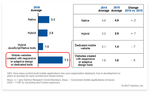
So, what’s the best approach for delivering multi-channel user experiences that drive adoption and successful business outcomes? Responsive app design is one approach that has grown in popularity in response to the continued proliferation of mobile device form factors. According to a recent Gartner survey1, the number of organizations using responsive or adaptive design has increased dramatically compared to a year ago:
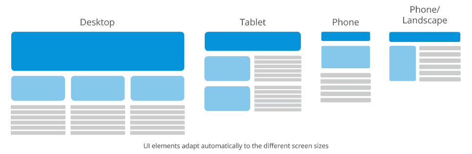
With responsive app design, the app’s UI elements automatically adjust their visibility, size, and layout to adapt to the different screen sizes and orientation of different desktop, tablet, and smartphone devices. This approach offers the following benefits:
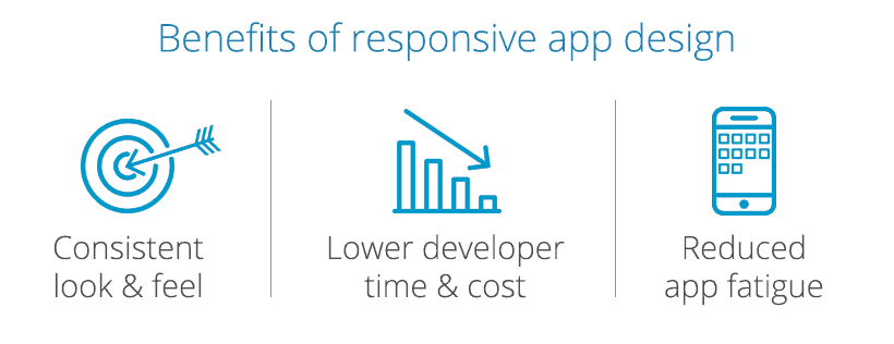
- Consistent Look and Feel – Because responsive app design automatically adjusts the application’s layout for different screen sizes and orientations, the approach ensures a consistent look and feel, as well as functionality, across any device type.
- Lower Development Time and Cost – Rather than building multiple device-specific apps, IT teams can build one app that runs on any device, saving development time and money. App maintenance is also simplified.
- Reduced App Fatigue – Responsive web apps help combat “app fatigue,” as users don’t need to install yet another app on their mobile device(s).
Responsive app design is necessary but not sufficient
Responsive app design also has its drawbacks, though, including lack of discoverability in app stores (a concern particularly for B2C apps) and the need for constant connectivity. Moreover, the approach is not a ‘silver bullet’ for great multi-channel user experiences. That’s because it doesn’t account for the fact that the same user will have different expectations and requirements for each device type. For instance, an insurance claims adjustor will have different needs when using an application from his mobile device versus in the office; and these needs should dictate a unique set of features for each device type.
In the end, providing a consistent look and feel that adapt to device form factors alone isn’t sufficient. For most enterprise app scenarios, your users will require more tailored experiences and capabilities by device than what responsive app design alone provides. At the same time, you’ll need to ensure a high degree of cohesion across that continuum of devices. By that, I mean providing consistent data and functionality when users switch from one device to another, so that they can continue where they left off, without having to re-enter data or start over.
Augment responsive app design with device-specific experiences
With enterprises looking to build a growing number of applications to drive operational efficiency, customer efficiency, and revenue growth, the stakes are high for delivering great user experiences. To ensure successful adoption, IT teams need to focus on more than just look and feel; they must create desirable, contextual, and highly usable apps that provide a consistent multi-channel experience.
Great multi-channel user experiences must also factor in a user’s needs and behavior on a given device to provide tailored device-specific capabilities.
The key is to leverage responsive web design as a foundational element for multi-channel UX and augment with device-specific experiences to make users feel truly at home on each channel. Responsive design provides a fast, efficient way of ensuring UI consistency on any device, but great multi-channel user experiences must also factor in a user’s needs and behavior on a given device to provide tailored device-specific capabilities.
1 Gartner, Inc., “Survey Analysis: The Mobile App Development Trends That Will Impact Your Enterprise in 2017,” April 26, 2017, Adrian Leow and Van L. Baker