
Updated Studio Pro look and feel
The first release after Mendix World is always an exciting one. After months of keeping new features and plans to ourselves, we finally get to start sharing them with the world!
The 9.6 release contains some major improvements that expand on the consistent look and unified experience we’ve introduced in 9.0. Included in this release are updates to the Studio Pro interface, a redesign of App Explorer, new widgets, metrics, Data Hub 2.0 updates, company-specific onboarding and so much more.
Let’s start with Studio Pro.
Studio Pro
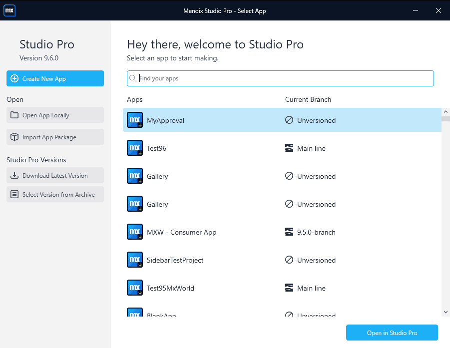
When launching Studio Pro you’ll be welcomed with an improved interface for selecting and managing your apps, making the whole process from start to finish more intuitive and straightforward.
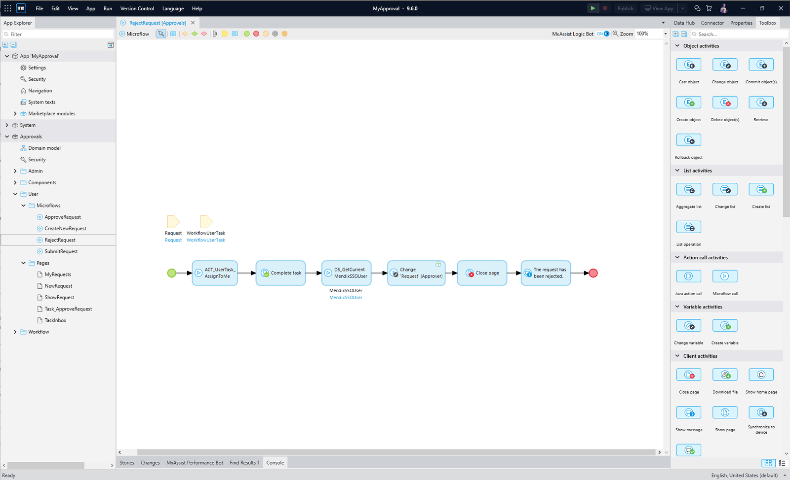
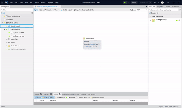
Additionally, the App Explorer has been redesigned to be in line with the new style of Studio Pro. Not only have we refreshed the look and feel but some of the functionalities have been improved as well. These will help you navigate your way through App Explorer even faster.
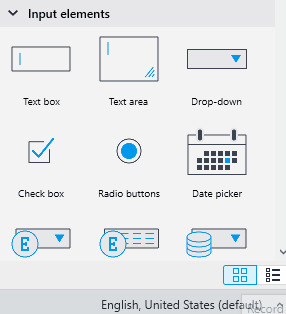
Next to the App Explorer, we’ve also greatly improved the Toolbox by adding a tile view. Larger icons will help you recognize the actions and improve the consistency between Studio and Studio Pro.
We did not stop at logic. Tile view is also available in the page editor and our widget icons got a redesign to improve their recognizability. Additionally, we’ve created better categories, making widgets easier to find.
One of the biggest advantages of tile mode is that the tiles for building blocks display a preview, giving you a better idea of what to expect while making it easier to choose the right building block for your project.
Prefer the list view over the tile view? We’ve got you covered! For each toolbox you have the option to switch between the list view or the tile view and select your preference.
New widgets
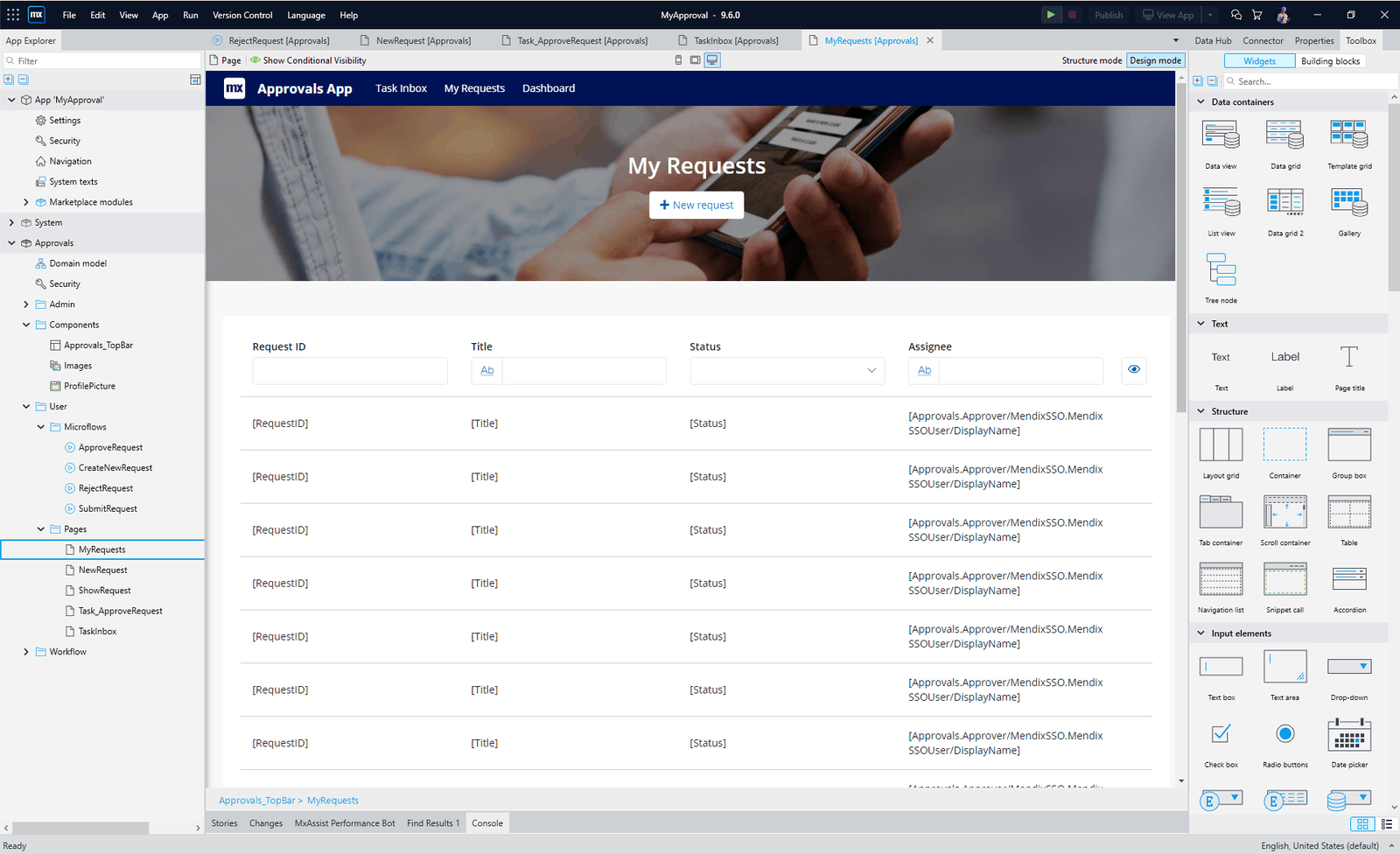
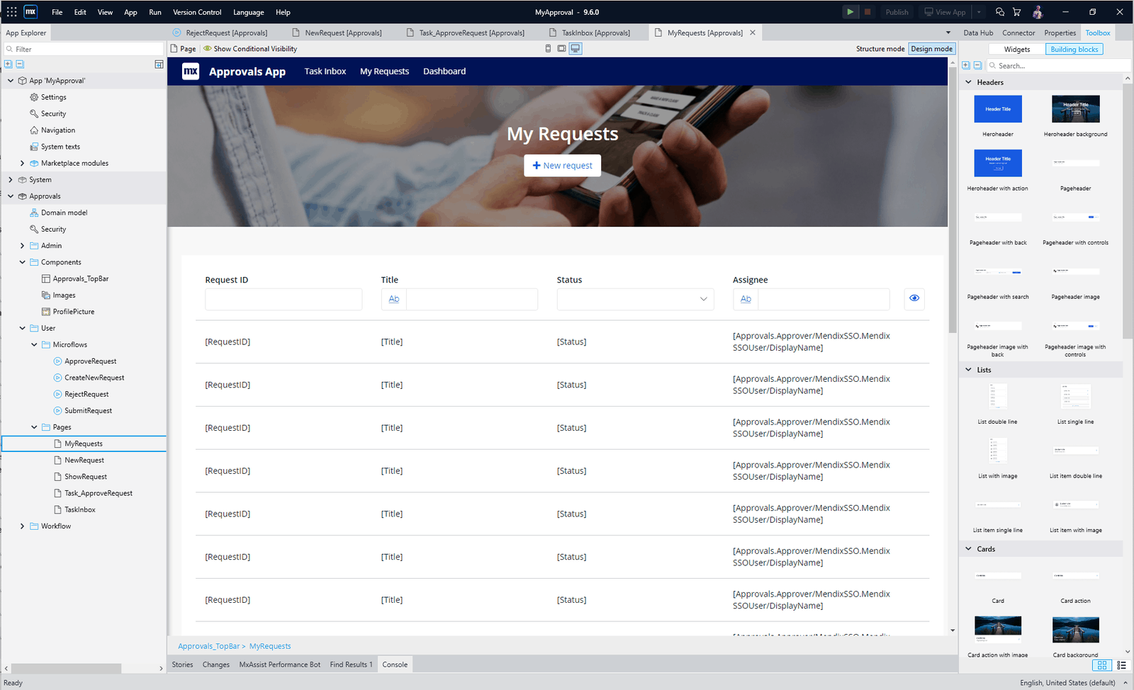
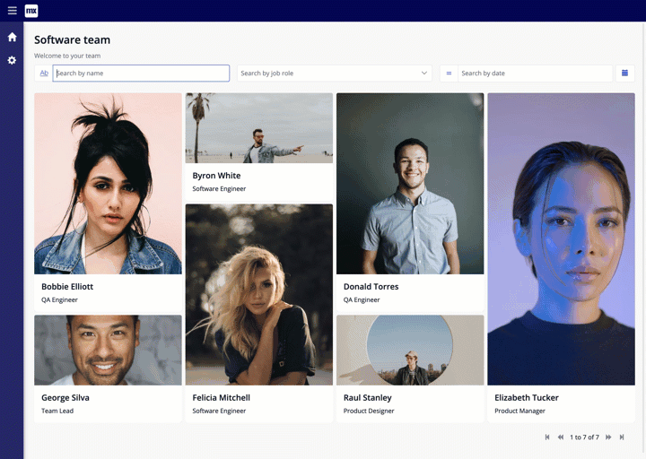
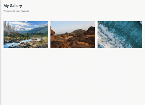
Gallery widget
New data-intensive widgets was one of the big announcements for next-level, front-end as a part of Johan’s keynote at Mendix World 2021. In this release, we’re unveiling the first two data widgets: Gallery and Treeview. Both will be released as part of our new Data Widgets module.
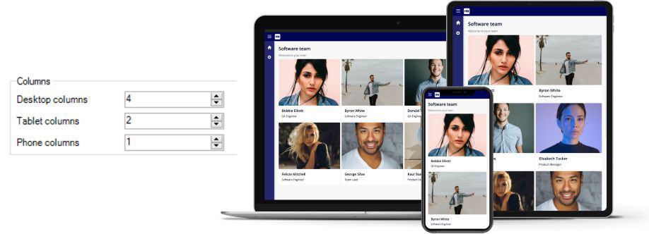
Adaptable, composable, limitless. Three words I’d use to describe the new Gallery widget.
Adaptable
With its new responsive grid design, select the number of columns you need for each device, for a modern, adaptable design.
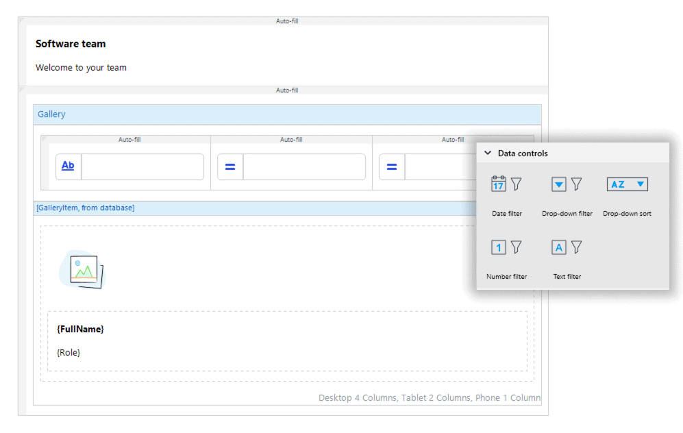
Composable
Reuse those same filtering and sorting widgets that we introduced in Datagrid 2, along with any other widget in our pluggable toolbox. Together, you can build any UX you need.
Limitless
Featuring conditional styling, options for positioning your paging, empty placeholders and virtual scrolling, there are limitless options to what you can create with the new Gallery. We can’t wait to see what you build!
Tree view
Next on our list for data intensive widgets is the tree view. Trees are always high up on the most-requested widget list. While there are a few great widgets knocking around in the marketplace, their usage always requires changes to your domain model. Few fit with an existing domain model, something that heavily influenced the design of our new widget.

We are very excited to announce the release of the Tree widget, found in our new Data Widgets module, it can be used to create tree-like UIs by combining multiple tree node widgets together, with each node widget representing a level in the tree. The tree widget is fully composable – it can contain any widget from the Mendix toolbox – and customizable, with options to animate and customize the icon for open and close of the tree node.

This is just the first in a line of tree style widgets that we are going to create – there are many more planned. Keep an eye on future releases, if trees are your thing.
All-in-one image widget
Too much to choose from, can often leave us in a spin. The decision around an image should be simple and straightforward – it shouldn’t depend on whether one wants to load the image statically, dynamically or by a URL – we should have one widget to do it all.
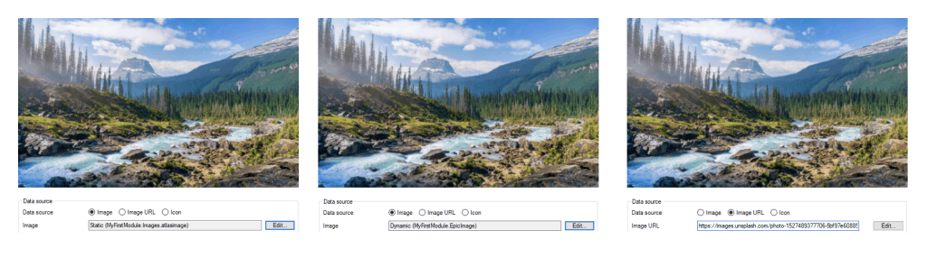
Introducing the new all-in-one Image widget! It supports showing static, dynamic, and images from a URL, but what makes it the one solution for everything-image, is its support for rendering icons and images as a background.
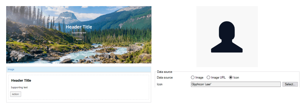
One last feature to tell you about, is the lightbox option – great for when you want to enlarge your images for a closer look. It’s truly the widget for all your image needs.
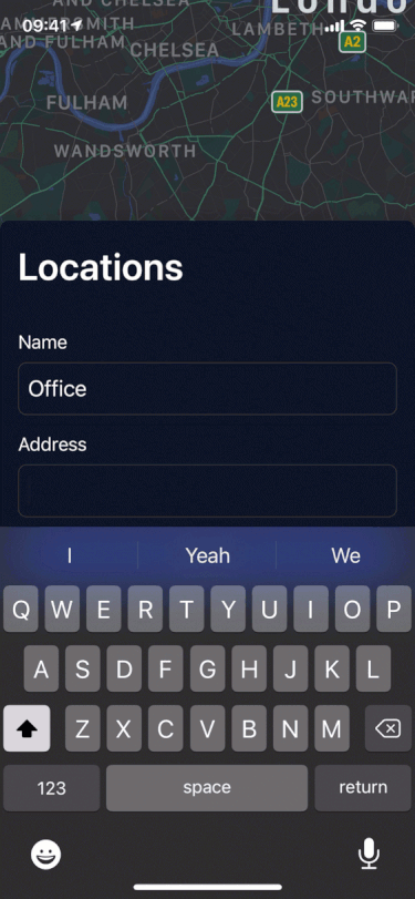
Native Maps
This is turning out to be quite the release! Not to leave our Native out, we have an exciting new update for native maps: dynamic maker support. You can now mark batches of locations by adding an entire list of markers at once using the new marker list setting.
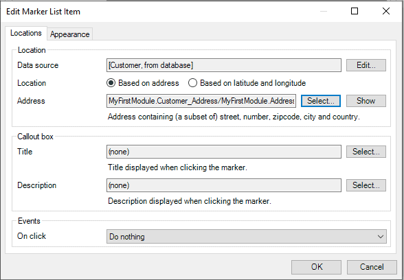
Now you can use all the usual Mendix data source settings, as well as the same marker requirements and customizability as the individual markers. This is a great new feature that enables you to deliver that next-level map front-end experience to all your users on both Android and Apple devices.
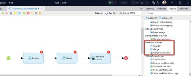
Metrics
Now let’s talk about metrics! Metric activities in Studio Pro put data into Micrometer, which can be read with Datadog (public cloud), or other tools such as Prometheus/InfluxDB (non-public cloud).
Two types of metrics:
- Counter: Increasing count for “number of logins”, “tickets created”, etc …
- Gauge: Measure an absolute value such as “open tickets”, “number of files on filesystem”, etc…
Kickstart app development with the Forms Template
Do you need a survey in a short amount of time? Or do you need to create an onboarding app for your new employee? The Forms template will help you quickly make many different kinds of forms. It includes ready-to-use wizard steps and you can customize the different types of questions. For the administrator, it provides a clear overview of all submitted forms which can be easily exported to excel.

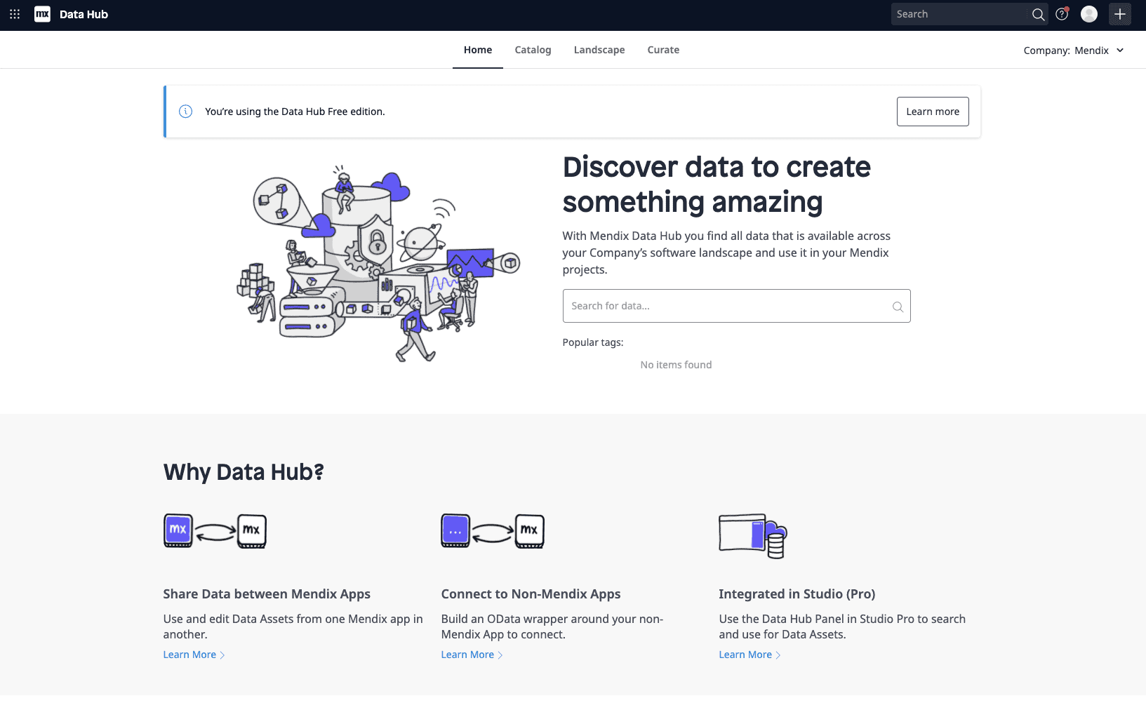
Data Hub 2.0
Data Hub can now be used by everyone. Every organization is by default on our Data Hub Free edition. This allows you to retrieve or edit 1000 objects per application, per day, for each runtime instance when deployed.
Control Center integration
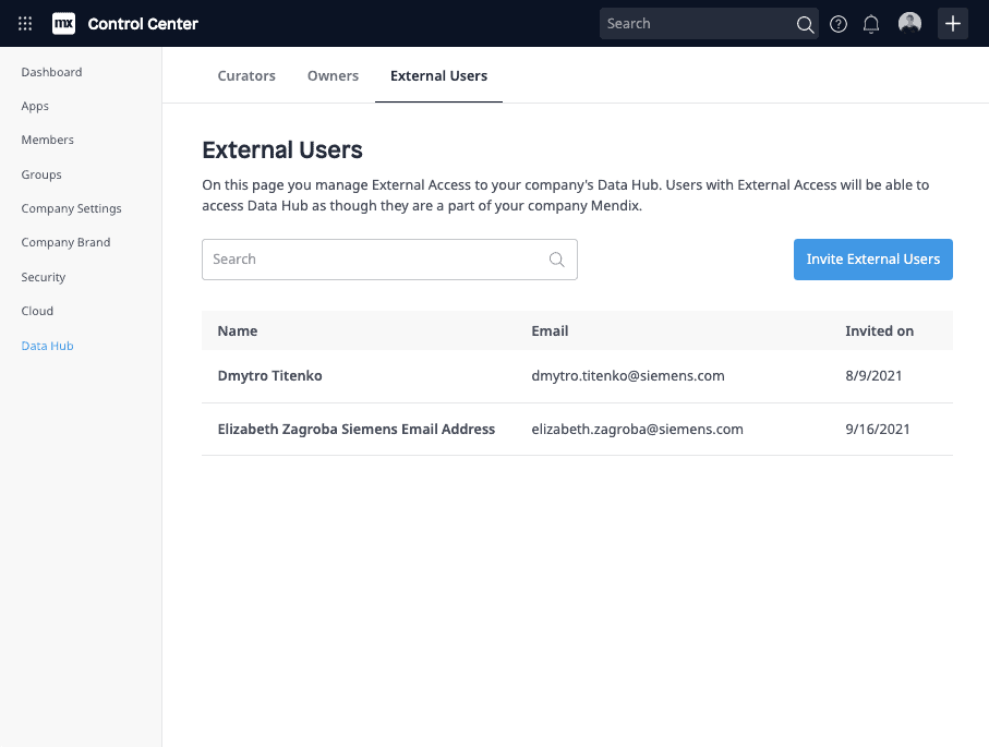
Mendix admins can now manage the Data Hub centrally from the Control Center. Here, admins can manage Data Hub owners, curators, and external user roles.
External Access
It is now possible to invite collaborators from outside of your organization into the Data Hub. Users with External Access will be able to access Data Hub as though they are a part of your organization. External Access users can be managed by Mendix admins through the Data Hub section in the Control Center under the External User tab.
External Entities
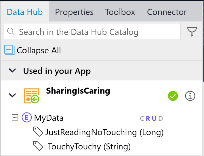
With Mendix 9.6 we made the next big leap in evolving Data Hub External Entities. We have recently added support for OData v4 in Published OData services, which is now based on JSON. But that’s not the biggest part! You can now enable write capabilities, directly from your published service!
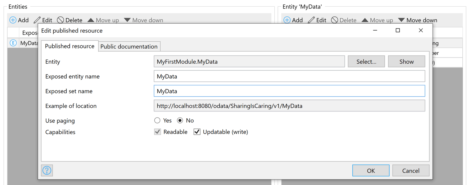
Once published, the information will be available both in Data Hub Catalog and on the Data Hub pane in Studio Pro.
When building apps on top of write-enabled External Entities, you can enjoy the simplicity of low-code. Build pages on top of external data, let users update the information, and send back the updated object. That’s it!
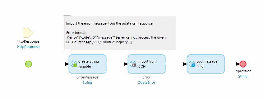
OData Error handlers
Before Mendix 9.6, Mendix would show a default error message if your External Entities encountered any problems, like an unavailable service. In this release we’ve added the possibility to define a custom error handling microflow in your consumed OData service document.
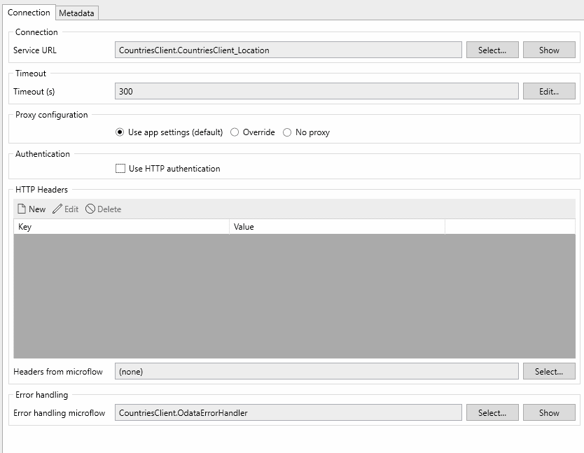
Anytime your use of external entities fails, your error handling microflow will be called. This microflow can provide a custom message to be displayed to your users.
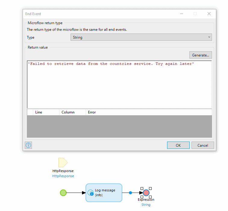
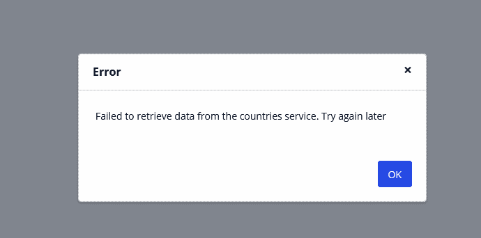
The result of the error handling microflow will be shown in a dialog.
For more advanced situations you have access to the HttpReponse object containing more info about the OData call. The full OData error payload is available here, and can be used for more advanced error handling.
Company-specific onboarding
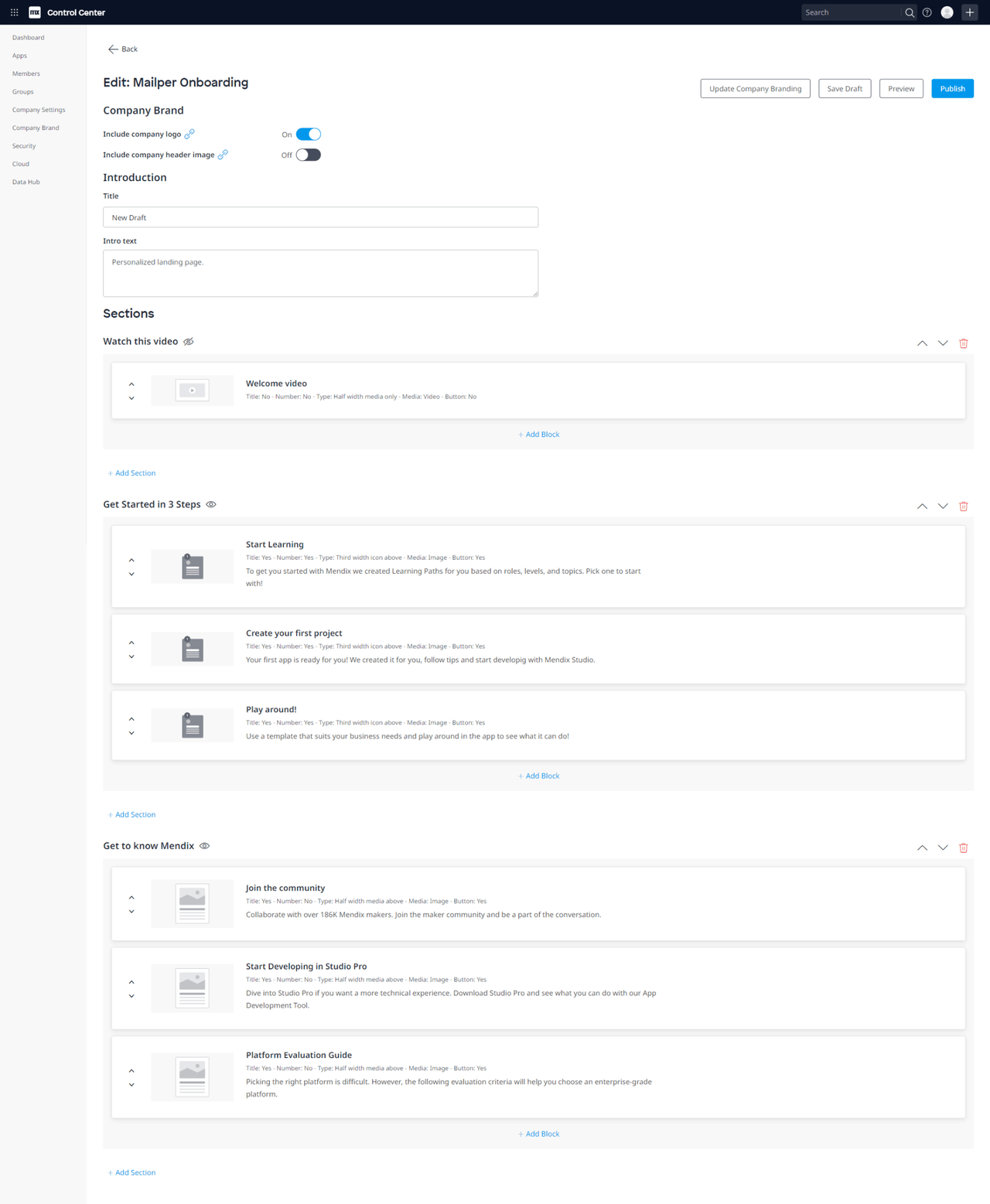
And now one for the company admins! We have two brand new features to help you onboard new Mendix users at your company: Company onboarding email and the company onboarding page.
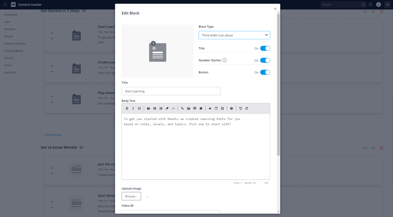
You will now be able to configure your company onboarding page to display your company brand and contain step by step instructions on how to get started with using Mendix at your company. Here you can link to guidelines, company manuals, videos or any other material that would help users understand your company’s way of working on the platform, and will enable them to get started quicker, with less hassle. More experienced makers can also use it as a company knowledge base on all things Mendix, and visit there any time they need to check best practices.
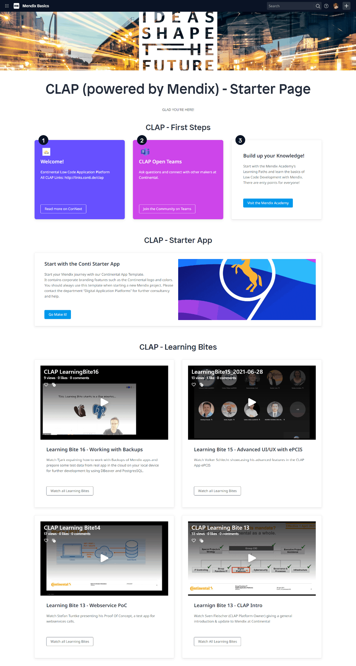
Need some inspiration? We got you! Have a look at how Continental configured their company onboarding page with a combination of guidelines and videos they had already made. Breaking down information into manageable chunks and organizing it per topic pretty much guarantees Mendix makers at your company will keep coming back to the page whenever they need to verify how something is done.
The company onboarding page is easy to use and highly configurable – you can edit it, work on drafts, and preview how it looks before publishing to your company’s user base. If you have configured your Company Brand in the Control Center then you can use the logo and images saved there on your onboarding page.
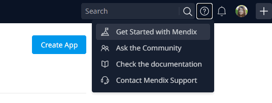
Once published, the page will be the place where brand new users land after signing up, but it is also accessible through the “Getting started with Mendix” link in the “?” menu of the main navigation. If you do not have company onboarding set up, this link will lead to the default Mendix onboarding page.
Your IT team can also customize the onboarding email that all users of your domains receive when they join the Mendix platform. The email can be used to introduce your company IT team, share your company welcome message, and also provide a link to your company onboarding page or other guidelines for using the Mendix platform. You can test the feature and save the drafts before publishing.
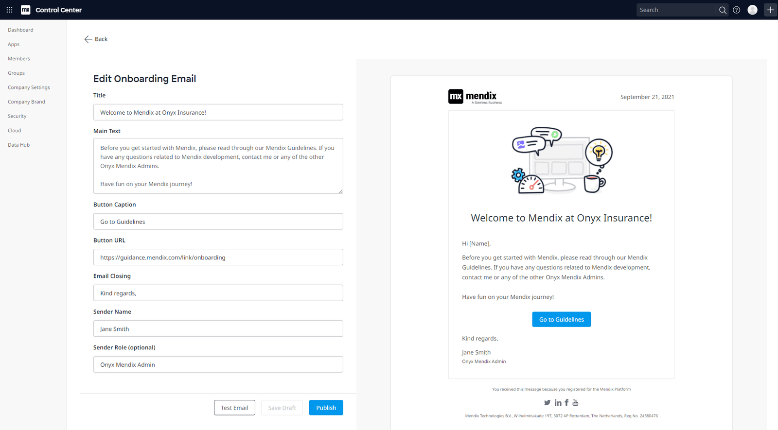
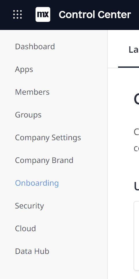
Both of these features will become available in Control Center at the end of September — to access them, just click on the “Onboarding” item in the left-side navigation menu.
Are you ready to start making?
For more details, take a closer look at all the features, improvements, fixes, and more in the release notes.