
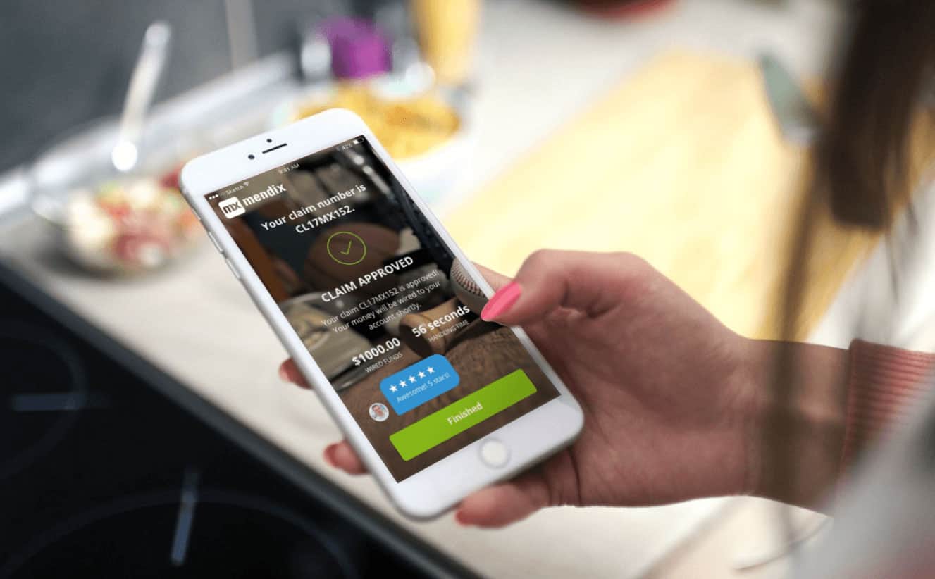
Application design is often overlooked or left until last; yet, it could literally make or break your app. While some may think good design means something that looks great, in truth there is much more to design than just look and feel. Design is a way of thinking. A design mind-set is not problem-focused; it is solution focused and action oriented towards creating a preferred future. It draws upon logic, imagination, intuition and systemic reasoning to explore possibilities of what could be and to create desired apps that benefit our end users. This level of thinking has been expressed in our latest release: a claims handling app showcasing Mendix for Insurance.
Behind every good insurance product there are many supporting applications. With every insurance claims app, there are accompanying quoting and rating apps. We are delivering an ecosystem of connected insurance apps, using the power of App Services to share functionality and data between our apps. Therefore, when our users need to submit a claim, they can do so with minimal fuss. No more hunting for paperwork or searching for reference numbers. With connection to the quote and buy app, the insurance claims app takes in your details using the returned information to build your claim, making the process of applying for a claim easier and quicker.
We have created a self-service app with personality and efficiency, able to handle claims 24/7, 365 days a year. The flexibility of the app provides our users with much-needed support after the loss, damage or theft of their possessions. The app turns a distressing situation into one of relief in a matter of minutes, opposed to traditionally waiting days or even months for a pay-out, by providing a system that is free from manual process and distrust. We don’t just automatically pay out every claim; there are some that still require review, such as a theft claim without a crime reference number and high-value possessions.
Implementing a Design-First Process
Our team adopts a design-first approach, meaning we build the app around the design from the beginning, rather than building first and designing later. Adopting this methodology was a gradual progression and has changed the way we structure our projects. Instead of working in a two-week sprint, we use a more aggressive one week sprint—a five-day process for solving design problems quickly. Typically, we spend Monday and Tuesday planning and ideating; Wednesday and Thursday decision making and prototyping; and end with a Friday showcase and review.
Ideation is key here: we use a funnel approach, where we aim to refine multiple ideas into one. Going from elaboration, where we generate as many different ideas as possible, to reduction, where we select one or a combination of the best bits from multiple ideas and refine. One of my favorite activities for this is called crazy eights, where you generate eight different design concepts and everyone votes for the idea they think is best.
Understanding Which Tools Can Enable a Design Thinking Approach
A good design philosophy is a good start if you want to be successful, but counts for little without having the right tools at hand. A tool can enable ideation, iteration, experimentation and testing. Our answer was the Atlas UI Framework.
Atlas is the latest Mendix UI Framework, a design language to apply a design thinking approach to low-code app development. Atlas consists of five key design elements: Navigation layouts, Page templates, Building Blocks, Widgets and Design Properties, and is built upon the core design principles of simplicity, harmony and flexibility. It is fully integrated with the Web Modeler, a WYSIWYG (What You See Is What You Get) App Designer.
How We Used Atlas to Build an Insurance Claims App
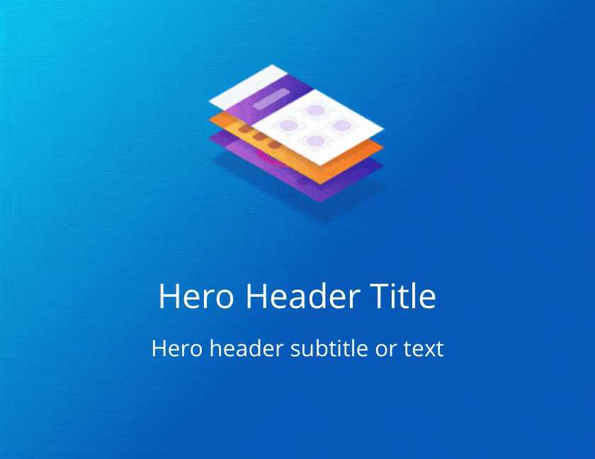
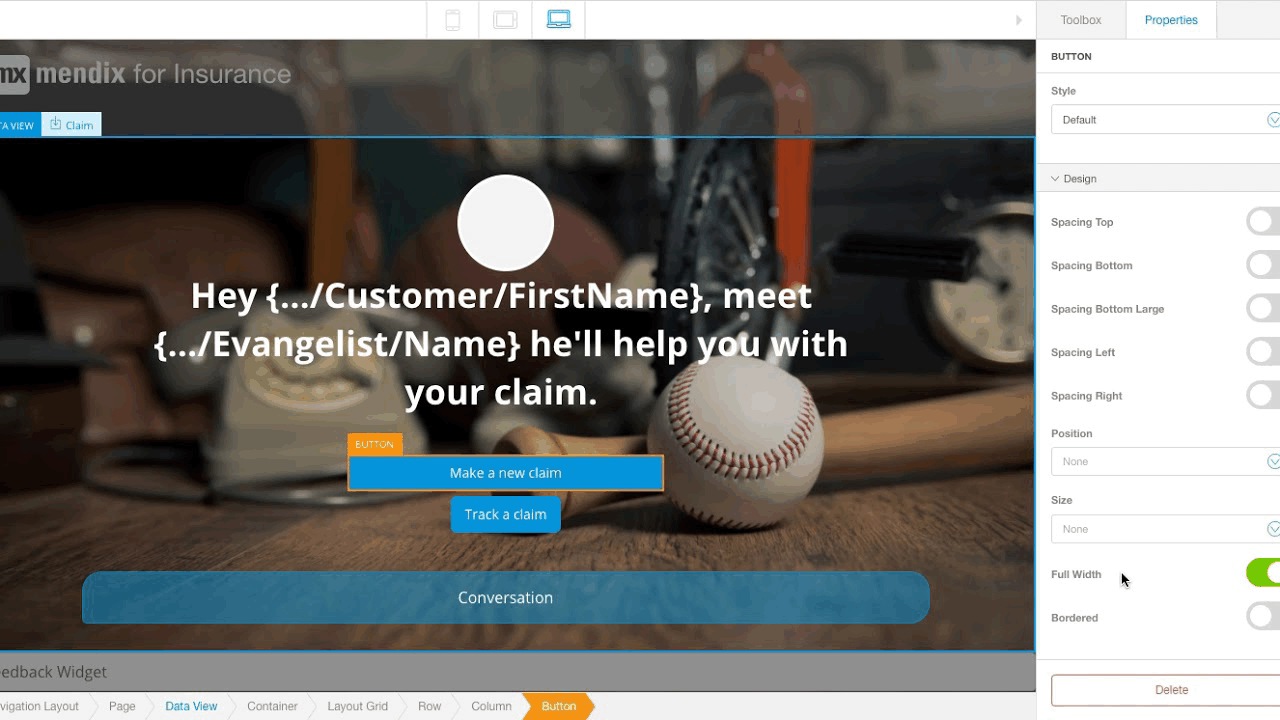
Most projects start with a blank page, a white space, and in a dream scenario these ideas would pop straight out of your head onto the page and “Hey Presto,” you have a beautiful designed multi-channel app. However, it’s not always that easy to deliver creativity on demand. Most of the time you need to be inspired! We found inspiration from Atlas’ design elements, all based on common UI patterns and currently being utilized by the best and brightest apps on the market. Our page header, featuring a profile image and conversation style message, started life as the Hero Header building block. Inheriting its top-down layout and its center alignment, we created our own custom building block. Atlas design elements can either satisfy your design requirements or ignite a spark to create your own.
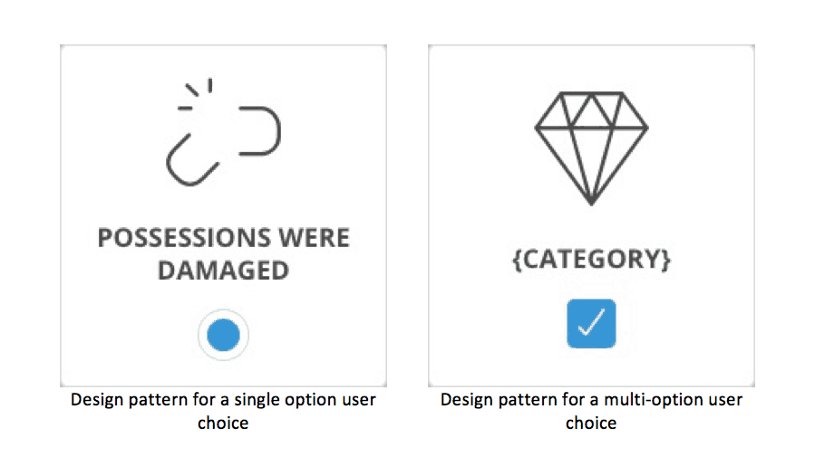
Forget page-by-page design, Atlas encourages you to think about your interface’s design in patterns or modules. Think LEGO Bricks! Just like how Lego brick can be used to build a castle, spaceship, or robot, a design element can be reused, reorganized and reassembled to create a new design concept. By designing in modules, you can not only create something unique, but consistent with an established style. Take for instance our cards for multiple and single option responses. For multiple responses, we used a checkbox, while for a single response we use a radio button. Establishing this pattern enables us to know exactly what pattern to use in the future, allowing us to move faster with our design and to continue exploration instead of striving to create a pixel-perfect design.
With a design framework like Atlas, we can not only iterate quickly, but create great user experiences. With functionality, such as the WYSIWYG UI designer, you can very easily create new ideas by changing building blocks and widgets, or by adjusting design properties of existing design elements.
For example, for the button choice of stage one, we adjusted sizes, colors and spacing until we found a design that worked. It’s not just on a design property level; we were also able to adjust the user flow and swap the stages of our app, such as moving around the order of the questions we ask. This enabled us to rapidly ideate, refine and test different design concepts, leading us to the right design faster.
It is not uncommon to be asked to justify a design decision. It’s important to all speak the same design language. Having a joint understanding of all design elements, each of us can convey function and intent to one another when exploring new concepts, thus, making discussions full of insight rather than noise and uncertainties. When designing the claim’s dashboard, we could experiment with several dashboard page templates quickly. Then we explored different positions for placing widgets collaboratively, until we decided on what worked best.
By using Atlas and its common design patterns, we focused less on the aesthetics and the nitty gritty of the design, and instead directed our attention to our key UX and project goals of claim automation, minimizing cognitive load and reaffirming trust. In the end, we created an app which is loved rather than loathed. We hope you’ve enjoyed reading about how we created our insurance claims app. Now, what will you build with Atlas UI and the Web Modeler?