Did you know that Bootstrap comes with a bunch of CSS helper classes designed to help you with your views? Are you interested in optimizing your theming activities and getting the most out of Mendix’s Bootstrap integration? If so, read on.
What A Helper Class Is
First things first, what exactly is a helper class? To fully comprehend the concept, it’s good to take a step back and look at the big picture of CSS. Although a lot of developers will argue that CSS is not a programming language, good CSS practices are pretty similar to well established coding best practices. Especially the ones like DRY (Don’t Repeat Yourself) and using the concept of an architecture to build on and with (BEM, OOCSS and Smaccs are three of the most popular ones).
In itself, CSS has a very big tendency of becoming – what every coder probably recognizes from his or her first project – ‘Spaghetti code.’ The code is all over the place, any decent structure is lacking and a combination of a lot of code repetition and unused code pieces. CSS in itself has no concept of scoping, is completely bound to the HTML (there’s a nice dependency for you), and is quite often pretty obscure due to concepts like specificity.
Quite logically, a lot people felt that – in this modern age – this is a proper no-go. So they came up with architectural concepts in order to make CSS code more modular, scalable, maintainable and reusable, even if the HTML view itself would change. Bootstrap’s CSS code is a very good example of these practices. Compare the following CSS rules:
#newButton {
display: inline-block;
padding: 6px 12px;
color: #333;
font-size: 14px;
text-align: center;
border: 1px solid transparent;
background-image: none;
background-color: #fff;
}

#deleteButton {
display: inline-block;
padding: 6px 12px;
color: #fff;
font-size: 14px;
text-align: center;
border: 1px solid transparent;
background-image: none;
background-color: #f00;
}
Imagine theming even a medium sized project with this kind of writing (we would need to target every button in the entire application, basically writing the same code over and over again). Even worse, imagine even a small redesign of the application needed to be implemented. Luckily, proper architecture and best practices like we find in Bootstrap makes life so much easier:
.btn {
display: inline-block;
padding: 6px 12px;
font-size: 14px;
text-align: center;
border: 1px solid transparent;
background-image: none;
}
.btn-default {
color: #333;
background-color: #fff;
}
.btn-warning {
color: #fff;
background-color: #f00;
}
And there we have it, completely modular CSS. It’s just a matter of combining classnames on HTML elements. (note: the benefits of this way of writing will become more clear if you style say ten buttons, but I didn’t want to bore you with that much repetitive CSS code).
Basically we stopped styling individual elements and started on adding visual behavior to elements. We’re creating a system or architecture which does all the hard labor for us. Now this is where a concept like helper classes comes in.
In its essence, a helper class can be described as “an independent visual behavior rule,” meaning it’s not tied to any specific HTML element or group of elements, and is used as an extra class on an object to help prevent repetition of code but still achieve the desired behavior. Basically, the benefit becomes clear when you need just that little extra behavior on your element, for example a button that’s positioned on the right side of the screen instead of the left side.
Although limited in numbers, Bootstrap has some pretty nifty helper classes which we can use in Mendix projects. I’ll list the most important ones and briefly describe their purposes.
Bootstrap Color Helper Classes
The color helper classes can be divided into two categories: those who alter the color of text and those who alter the color of the background.
Textual colors:
- .text-muted
- .text-primary
- .text-success
- .text-info
- .text-warning
- .text-danger
Background colors:
- .bg-primary
- .bg-success
- .bg-info
- .bg-warning
- .bg-danger
If you’ve played around with Bootstrap styling before you might recognize “primary,” “success,” “info” and such from the types of buttons or which can be used. Throughout Bootstraps, these terms are used to define a color type.
Bootstrap Positioning Helper Classes
Quite often the specific styling of an element in itself should be independent of its position on the page. To accommodate for positions which the normal layout doesn’t automatically support, we have some helper classes that help us position elements in the right place.
Float regulators:
- .pull-left
- .pull-right
- .clearfix
We can float an element in our layout by using the classes .pull-left and .pull-right, creating a left float or right float respectively. The most common problem with floating behavior is the fact that the parent container no longer knows what the dimensions of its content are. We can use the .clearfix helper class to solve this problem, giving the parent container its correct height again.
Centering content:
- .center-block
Unfortunately centering content is very dependent on the context of which it is in, especially for vertically centering contents. The .center-block helper class facilitates the horizontally centering of block-level elements with known widths.
Bootstrap Visibility Helper Classes
Apart from positioning elements, interactive applications also quite often require changes in visibility due to e.g. the state of a page we’re looking at.
Standard visibility helpers:
- .invisible
- .hidden
- .show
CSS uses two kinds of ‘hiding’ content: setting the visibility to none or setting the display to none. A visibility of none means the element is not visible but is still a ‘player’ in the page layout – taking up space. A display of none means the browser will ignore the element as if it didn’t exist. We can use .invisible to make an item invisible and we use .hidden to really set its display to none. The .show helper class is actually used to counter the .hidden class. These basic visibility helper classes can be an immense help in building custom interactive behavior via JavaScript custom widgets.
Exotic visibility helpers:
- .sr-only
- .text-hide
The .sr-only class means an element is only visible on a screen reader as a medium. The .text-hide class hides the textual content of an element and is quite often used to replace text with a background image.
An Example
Although the possibilities are endless, a small example can easily be shown. Below are two screenshots from a small application created in Mendix. A .bg-info was used on the page header together with .pull-right for the textual contents. The three tile-headers were enriched with different text color classes. All done in under a minute’s work.
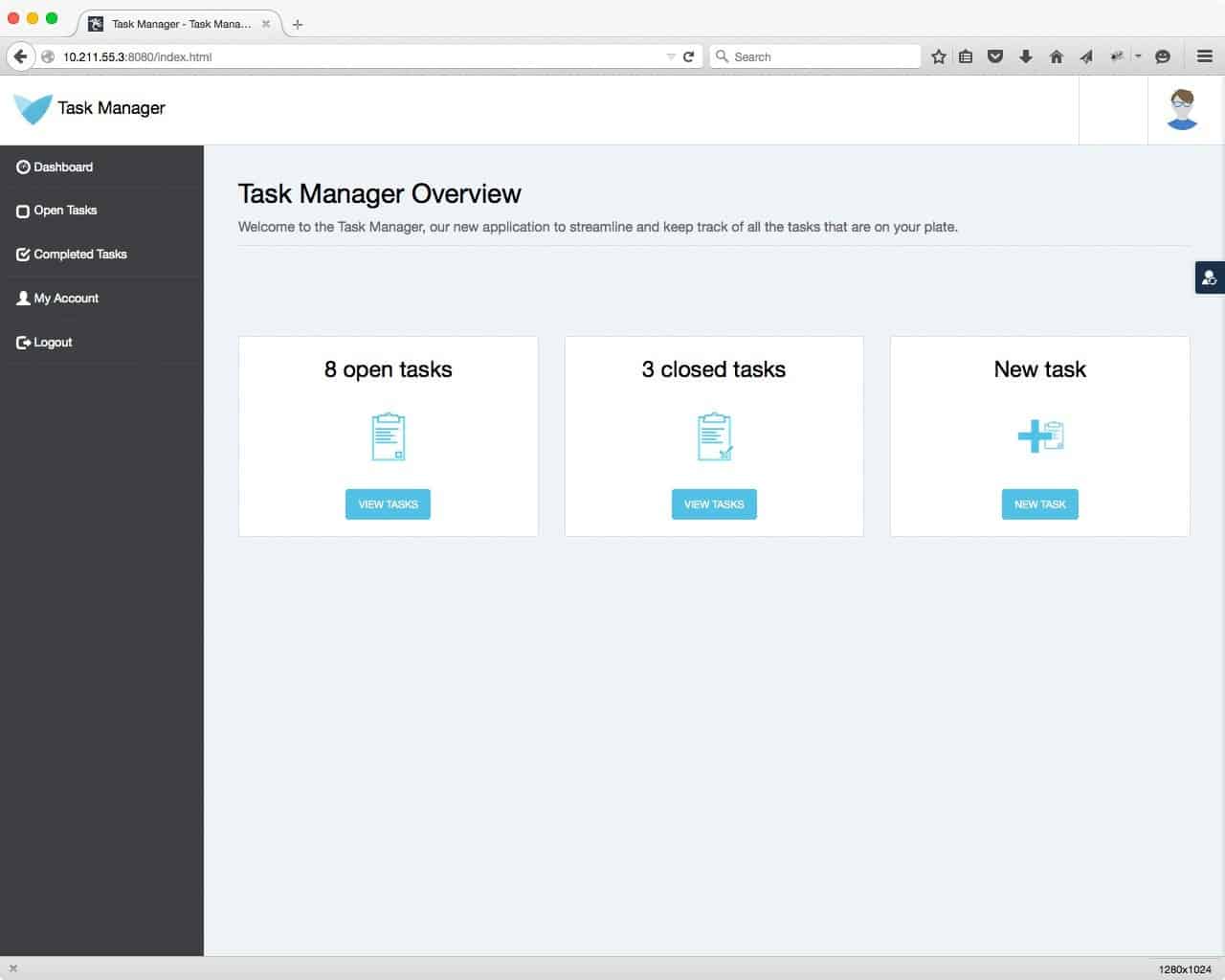
Before
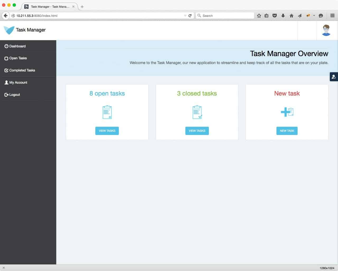
After
In Conclusion
Creating a theme in Mendix doesn’t always mean writing a lot of CSS code. Sometimes just adding a classname inside the Mendix modeler is all you need, making the most of what’s already there.
Remember, if you like the concept of helper classes in your theming work, you can always create your own and use those as well.