MX Blog
Highlighted Article


Explore topics
All Articles
-
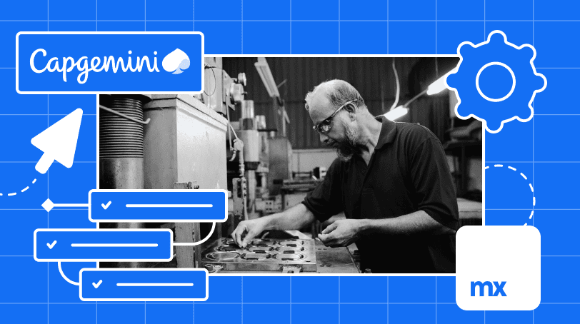
![]() Manufacture Digital Transformation with Low-Code
Manufacture Digital Transformation with Low-Code -
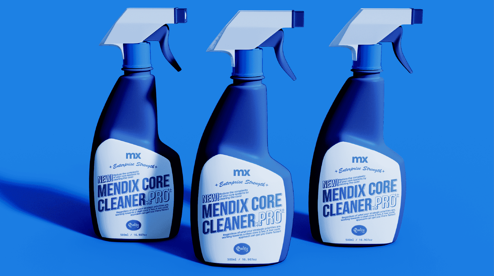
![]() Why It’s Important to Keep Your SAP Core Clean
Why It’s Important to Keep Your SAP Core Clean -
![Unlock the Gen AI Magic How to Tailor Foundation Models with Custom Data]() Unlock GenAI Magic: How to Tailor Foundation Models with Custom Data
Unlock GenAI Magic: How to Tailor Foundation Models with Custom Data -
![Agile Development Lifecycle]() The 5 Stages of the Agile Software Development Lifecycle
The 5 Stages of the Agile Software Development Lifecycle -
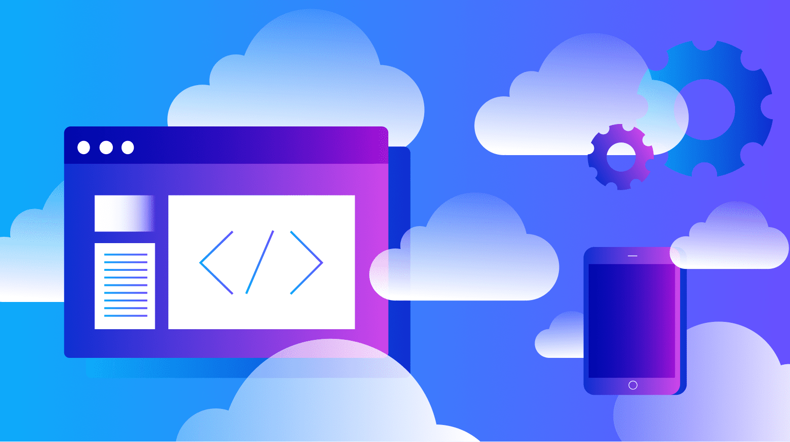
![cloud native app development]() Cloud-Native Apps: Examples, Benefits, and More
Cloud-Native Apps: Examples, Benefits, and More -
![Mendix - using Internal PR to accelerate digital transformation]() The Role of Internal PR in Digital Transformation
The Role of Internal PR in Digital Transformation -
![mendix logo background]() How to Choose the Right Enterprise Development Platform
How to Choose the Right Enterprise Development Platform -
![]() 3 Reasons You Need to Rethink Low-Code Governance
3 Reasons You Need to Rethink Low-Code Governance -
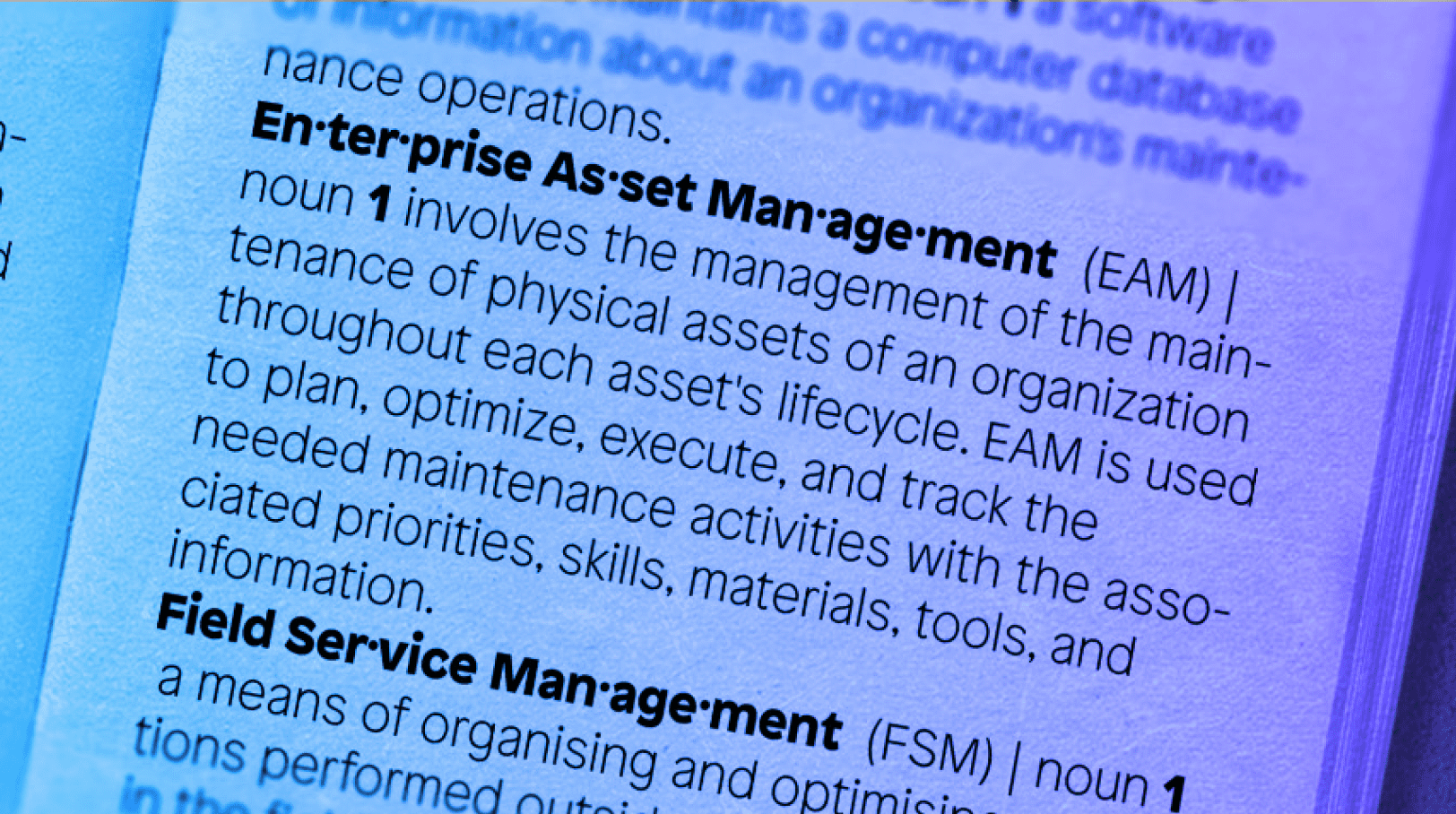
![]() CMMS, EAM, FSM, ERP: What's in a Name?
CMMS, EAM, FSM, ERP: What's in a Name? -
![4 Ways Blog Header Image]() 4 Ways Mendix Is Advancing Manufacturing
4 Ways Mendix Is Advancing Manufacturing -
![]() Mendix Release 10.9 – See What’s Inside!
Mendix Release 10.9 – See What’s Inside! -
![]() Building Your Own REST API-based AWS Connector
Building Your Own REST API-based AWS Connector