Widgets: The UI Building Blocks
In a previous article, I went over the 3 components of the domain model and how to build the foundation of an app. Now I’m going to focus on the building blocks of the user interface. The user interface is comprised of pages within which users navigate. Application pages are styled using CSS and modeled using widgets built on JavaScript.
The majority of the widgets in our App Store, such as data grids, input text, and drop downs, come out of the box. In my first article, I highlighted some of my favorite widgets. Today, we’ll delve deeper into the main widgets that help deliver a great user interface and show how easy it is to build with them.
The examples I’ll use in this post are taken from our App Store employee directory app.
Data View and Data Grid
The data view and data grid are a Mendix developer’s bread and butter. They are the foundation for displaying dynamic data to end users. The data view shows a single object in the database, whereas the data grid shows a list of objects in the database.
Consider any overview page you may need. The easiest way to create overview pages is to add a data grid in a page and select the entity you wish to display. From there, I always autopopulate and autogenerate the rest of the pages. After I create the main pages, I display only the data that is relevant to the users and fix up the interface by adding containers, groupbox or tabs.
As a Mendix developer, if you go to the Desktop_Employee_Directory page, you can see the use of groupbox and a dataview along with the listening grid. I urge you to experiment with all the tools and widgets!
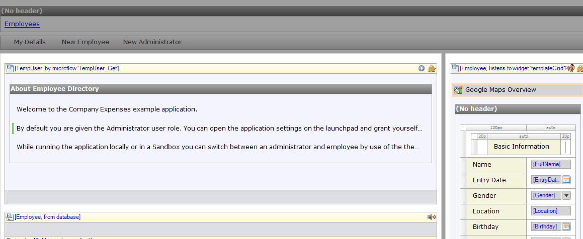
Figure 1: Example of Page with GroupBox and data view
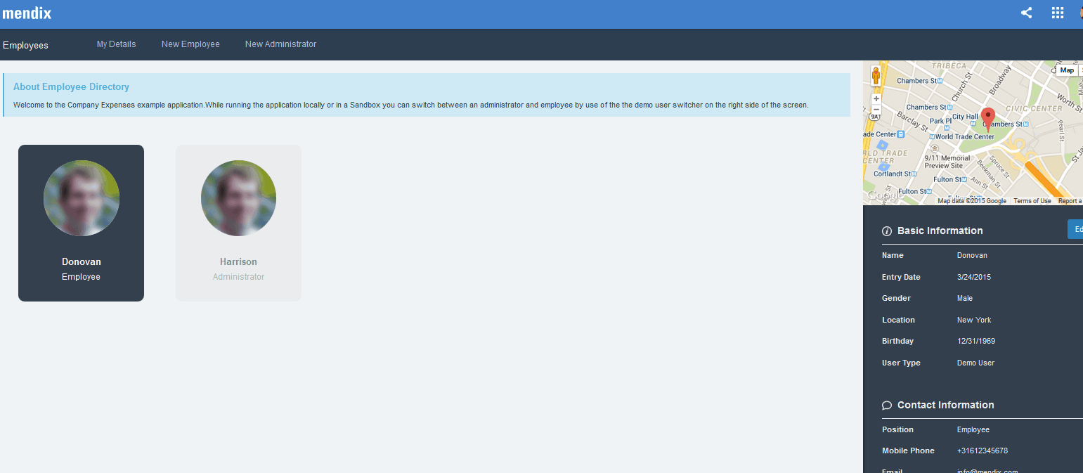
Figure 2: Example of what the end user sees
Input
Input widgets show the attributes within an entity. You can have different input fields based on the data type. In the example below, there are three types of input widgets.
- The text input widget is used for strings and other alphanumeric data types.
- The date data type shows the date the employee record was created. The same date input widget is also used to display the birth date.
- The radio button list is used to show the gender of the employee. We could have also used the dropdown input widget, but the radio button list from the App Store provides a more appealing user interface.
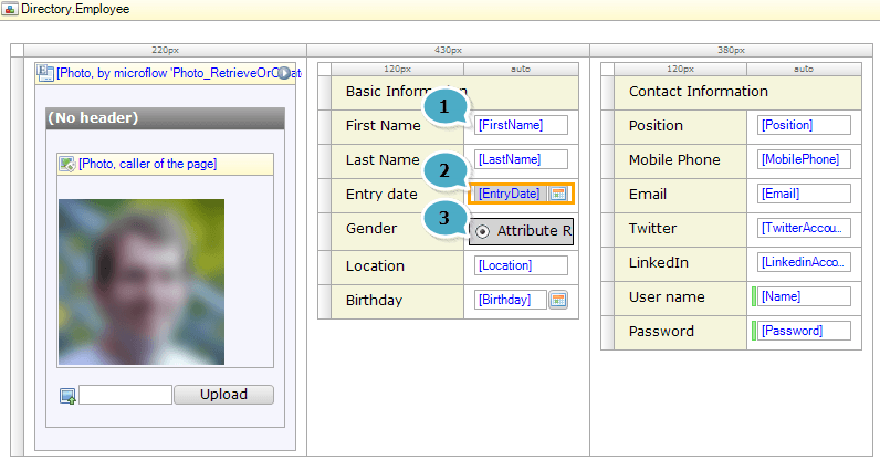
Figure 3: Example of input widgets – showing the Desktop_EmployeeSnippet

Figure 4: Example of what the end user will see
Snippets
Snippets are the greatest addition in Mendix 5+ and one of my favorite tools. The snippets widget is helpful when you want to reuse pages or layout components.
In the employee directory app, the employee information is a snippet that is used on two different pages (shown below).
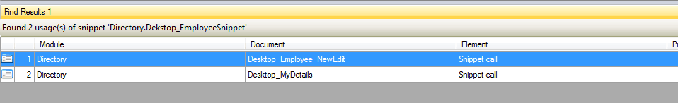
Figure 5: Number of times the employee information is called – in the Employee details and when creating new employee
Instead of generating the same information across multiple pages, you can build a snippet once and call it as many times as you want! By using the snippets, you only have to change the data view or data grid information in one spot, which makes it more efficient. Furthermore, the pages load faster!
I used snippets in a project recently and found them to be incredibly useful. For more information on how to use snippets read this helpful article! View the employee directory app and other sample applications in our App Store.
Mendix Developers See What the Users See
When it’s time to build the user interface, widgets are a must. They make UI development much easier because they are intuitive. As a Mendix developer, you see more or less what the user sees. And while the Mendix App Store has a host of pre-built widgets and components, the community is always encouraged to help contribute more ideas.